CtrlC/CtrlV: News presentation across different online platforms
New technology is changing our society at full pace. Not only does it change the way people communicate with each other, it also impacts the way information is communicated to society. People are not satisfied with reading the morning paper or watching the six o’ clock news. They want to be updated on the news whenever it is convenient to them. The demand for alternative news formats, like news websites and news apps, means that news is taken to a higher level. Or at least, this should be the case. But are news organizations using these new technologies to their full potential?
The medium is at least as significant, if not more so, as the content of a message (McLuhan 7). Platforms like websites and apps offer different possibilities to get a message across than traditional media. This should be taken into account when assembling content for a specific platform. Apps however, also offer different possibilities than websites, both in what is possible and when it is used. Both platforms are seen as interactive media, but apps have more of an ubiquitous character since they are primarily used on mobile devices. Websites are most often accessed through personal computers and laptops, which makes them less pervasive.
What is important, is how the information on these platforms are taken in by the user. The structural appearances within online environments influence the way news is comprehended (Lang 48). The mostprominent structural characteristics in online environment are interactivity, multimedia content and hypertextuality. Presence of multimedia content means it is possible to consume information in different modes, both visually and verbally. According to the dual coding theory, two or more different modes of presenting news is needed in order to optimize information consumption (Paivio). Another way of facilitating this consumption is the possibility to control content (Widing and Talarzyk 138). Interactive characteristics of online environments, for example to share or comment on content, make this possible. Another interactive aspect is hypertextuality. To intensify information consumption and increase knowledge, both external and internal links to additional information are needed (Eveland en Dunwoody). But how do news websites and apps incorporate these three structural characteristics? What are the differences between news stories published on news websites and apps? And which of these platforms offer the best experience in terms of multimedia, interactivity and hypertextuality? To assess these questions, the presence of pictures or video and hypertextuality within news articles, and the possibility to interact with the content and platform, are analyzed on a small-scale for two of the most prominent news organizations in the Netherlands: NOS and NU.nl. From the variety of categories on the homepage on both website and app, ten articles are randomly picked from each news organization and analyzed.
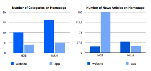
The first thing that stands out is the fact that the categories on the homepage of the apps in both cases are less extensive than those provided on the websites. NOS provides 10 categories on the website as opposed to 4 on the app, while NU.nl provides 16 categories on the website and 5 on the app. On the app from NU.nl it is however possible to access all the categories provided on the website through a separate menu, which is not the case on the app from NOS. All news articles provided on the websites were exactly the same as the news articles on the app, from text to added videos and links. Both news organizations are consistent on this aspect.
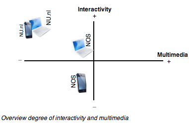
 There is however little consistency when it comes to multimedia content. Both websites have sections dedicated to video content only, but these are not in all cases connected to news articles. This is prominently the case on the NU.nl website and app, where news articles are rarely accompanied by other modes of content. From the selected news articles on the website and app from NOS, 30% was accompanied by an additional video or audio object. The interactive aspect is mostly present on the websites from both news organizations, but NU.nl does a better job here. The possibility to share the news article on social media platforms and leave a comment is possible on both the website and app from NU.nl. On the NOS website it is possible to share news articles on different social media platforms but this is not a built-in possibility on the app. Leaving a comment about a news article is not possible on both website and app from NOS. When it comes to hypertextuality, NU.nl does a better job as well. Links, mostly internal, to additional information were available in 50% of the selected news articles. This was only in 30% of the news articles the case on NOS.
 This small-scale analysis shows that differences between providing content on news websites and apps are negligible. Besides the fact that these news organizations are not fully making use of the possibilities of online environments in general, even less attention is granted to their apps. In terms of interactivity and hypertextuality NU.nl does a better job, while multimedia content is limited. NOS scores low on all three structural characteristics, but does occasionally offer different modes of content. No differences for the actual information in the news articles were found: the information is simply repeated on a different screen. This is quite striking since the mobile app is a new platform with great potential, but the content and the possibilities that are offered for this content remain exactly the same as on the website.
According to Jeff Sonderman, news organizations that simply republish their articles are missing a big opportunity. He believes that the focus in developing an app should be on its users. This way, an app could be developed that solves a consumer’s problem. After all, an application is by definition a tool to utilize, and should be applied to perform a task. The news articles are already accessible on a mobile device through a web browser, so why offer the same thing on an app if there is no added benefit? Further research could elaborate more on this topic and should be conducted on a large scale. Focus should also be on the needs of the online news consumer. Who is the online news consumer? And what are the main reasons for downloading news apps? What needs are still unmet? With this information in mind, communicating news to society can be taken to a higher level.
Valuable ideas for additional features for news apps besides providing news articles can be found on Test Kitchen and Poynter.
References
Eveland, William and Sharon Dunwoody. “User-control and structural isomorphism or disorientation and cognitive load? Learning from the web versus print.” Communication Research, 28.1 (2001): 48-78.
Lang, Annie. “The limited capacity model of mediated message processing.” Journal of Communication 50.1 (2000): 46-70.
McLuhan, Marshall. Understanding Media: The extensions of man. Cambridge: The MIT Press Cambridge, 1994.
Paivio, Allan. Mental representations: a dual coding approach. Oxford: University Press, 1986.
Widing II, Robert and Wayne Talarzyk. “Electronic information systems for consumers: An evaluation of computer-assisted formats in multiple decision environments.” Journal of Marketing Research 30.2 (1993): 125-141.
