Readers as users – an analysis of the guardians website
Considering that we have been publishing in print for more than 500 years, online publishing that has a history not much longer than a decade can only be seen as being in it´s very early stages. Newspapers that has had a profound place in print history must now adapt to this new way of publishing. This adaption to a new way of publishing is naturally not only affecting the newspapers but also readers. As a student of new media I should be a frequent user of different online news websites. However, for a long time this was not the case. I used to prefer to get my information and news by reading a “real” newspaper. But lately I have found myself more regularly using newspapers websites and one in particular: guardian.co.uk.
Background and research inquiry
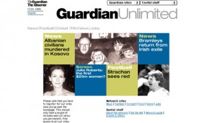
First published in 1821, the UK based magazine the guardian has come a long way. In 1999 they launched their first online edition under the name Guardian Unlimited.
Since then the website has gone through some major changes considering layout, design and structure. And the organisation have in recent years been saying to focus on development of their digital and online services. In 2007 the guardian redesigned their whole webpage claiming to give more focus to “interactive content, images, graphics and video” and in June 2012 guardian.co.uk claimed to be the third most popular website in the world.
So why is this website so attractive not only to me but for millions of users around the world? There are many ways to go about this question and I have chosen to do a descriptive analysis of the website and compare some of it´s components to the printed version of the guardians magazine. In my analysis of the website the aim is not to analyse the quality of content but the structuring of the content. How is the information on the website structured? How does this compare to the traditional printed version of the magazine? How does this affect the readers?
Methodological approach
To encounter this query, a descriptive analysis has been done. The empirical limitations were set to the first interface of the website and the first page of the newspaper. Firstly a wireframe-inspired method was used to map out the information structure of the website. After this basic mapping a few elements on the webpage were studied further to give deeper insight of the structure. Finally a comparison was made with the printed version of the newspaper.
Findings
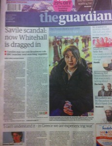
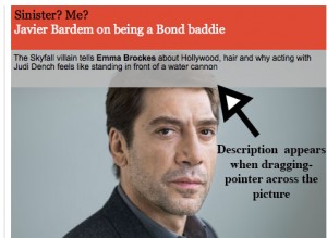
The guardian website has (except the logo) some components that indicate to the reader that it is similar to the newspaper. The content of the website is presented in columns just like the printed version and on the top left on both the print version and on the website the date is presented which indicates actuality. Both the website and the printed newspaper presents one big picture on the first page, which can be seen as a way to attract users. The website also bare resemblance to the magazine by presenting news in categories. The ‘main’ news are presented first whilst other categories such as ‘sport’ are presented in the back of the paper, or in the case of the website, if you scroll further down. Although here we can start to see some differences. On the website the different categories are also visible on the top of the site making it easy for the reader to access the news of their interest. In this section on the top of the website there is also a strong focus on ‘newness’. There is for example a presentation of the last update of the website, which indicates to the user that they are getting the latest information. In this sense they are different to the printed newspaper. This instant update that the webpage can operate with is not possible for a printed magazine. They have only one version per day and that information is what the reader gets. Another difference is that the website indicates interactivity and user engagement. One example is how the website is making readers engage with the content is the presentation of picture information. On the webpage the description of the picture only appears when dragging the pointer across the picture.
Another way of getting readers to engage with the website is that the description of the articles presented on the first page is not very long. Instead the readers have to click on one of the links in order to read more about the story. On the printed version readers are presented with a lot more information on the first page before they have to look for further information inside the newspaper. Taken together the results found indicates that the website is baring less resemblance to the printed version of the newspaper but more resemblance to an interactive media site. The readers become users. The competition of the website may not lie with the printed version of newspapers but with other websites on the Internet. And not trying to be an “online newspaper” but an innovative website that is making use of the techniques in order to present information in an interactive and engaging way might be the key to a successful news website.
Resources
guardian.co.uk, accessed 13 October 2012
the guardian, 13 October 2012, (print)


