Sleek – What does the website’s structure reveal?
Sleek is an internationally distributed fashion and art magazine, introducing contemporary art and fashion issues in a thematically manner. Since 2005, the paper edition is published quarterly in Berlin, but because of its worldwide audience Sleek is only available in English.
Sleek considers “the visual as the most important language of our times, and art and fashion as its most influential disciplines”. So in order to point out the “aesthetic and intellectual interrelatedness” of fashion and art, Sleek additionally provides an Internet platform. Here the Sleek online contributors report continuously about new happenings, events and vibes in fashion and art.
In the following I will describe the website’s structure and the meaning of the different elements. Through the description, I will analyze which purposes or intentions the structure serves.
- Sleek front-page
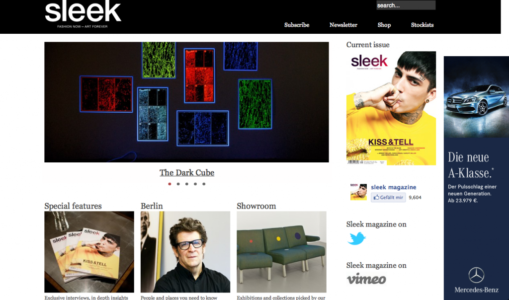
Like the name of the magazine suggests, the look of its Internet platform is “sleek” and puristic. It’s mostly hold in black and white; only showing colored images to support the articles. Everything is structured very clearly, reminding on a blog-structure with the navigations to archives and external links on the right side. The content is the center of the website, serving to entertain the user.
- The structure of the Sleek website
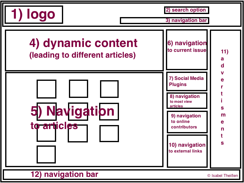
The front-page contains twelve elements, as visible in the graphic. A black banner on the top (including the logo (1) on the left plus a search option (2) and a navigation bar (3) on the right) and a white navigation bar (12) on the bottom frame the page.
Directly under the logo, a dynamic content element (4) is located, showing a selection of five different images that lead to corresponding articles. Underneath, the ten categories (5) of the platform are shown in a mosaic manner. The pattern of 3×4 cubes provides the category-name, a quadratic image of the most recent article in the category and a brief category-description.
Clicking on the dynamic content element or on one of the ten categories leads the user to a second interface, which presents the corresponding article. It includes another navigation bar under the banner that leads to the articles of the ten categories and doesn’t show advertisements. But generally, the structure doesn’t differ from that of the front-page, so I won’t describe it in more detail.
In a column next to the content elements, there are five navigation elements. The first leads to the current issue (6), followed by the social media plugins (7) to the Facebook-page, Twitter-account and Vimeo-stream and the three most viewed articles (8). Underneath, the eight online contributors (9) are listed alphabetically, just as links (10) to international fashion and art blogs, which are also ordered from A to Z.
On the very right of the website, two advertisement banners (11) build a second column. As I stated in my first impression, the composition matches a blog-structure with the main focus on the content.
WHAT’S THE MEANING? Located in the left corner, the Sleek-logo (1) catches the user’s first attention. This is the spot the user looks at most frequently, since the URL and the navigation bar of the browser are located in the same corner. It’s written white on black, which stresses its appearance in a non-aggressive way. The logo is one of most important elements of the website, since it engraves the magazine’s name in the user’s mind and always leads back to the front-page by clicking on it.
Also important, and hence equally located in the top-banner, are the search option (2) and the navigation bar (3). The search option makes the user’s live way easier by giving him the chance to quickly find what interests him. The navigation bar offers the user the opportunities to purchase and to consume Sleek as well online as printed and thus, serves marketing matters. This section provides Sleek with (new) customers and is thereby part of their income.
Since the images and articles are the main content of the website, the dynamic content element and the mosaic of the categories dominate the user’s first impression. As an eye catcher, the dynamic content element suggests a selection of 5 articles. In order to present a new outline and thus, to stimulate the user’s interest, the images of the mosaic are updated with a cover picture of the newest article. The same applies for the articles on the second interface. They fill about three quarters of the page, since they are the essential content or in other words the product of the website.
The column on the right doesn’t stand out on both interfaces. It provides only additional information to the actual content. An exception is the navigation to the current issue. This catches the user’s eye since it’s one of the few colored elements and is located directly next to the dynamic content element. It leads the user to an online selection of the current articles in the paper edition and offers an option to buy it. Just as the purchase option of the current issue, the social media plugins serve marketing purposes in terms of public relations. Hence, they are sufficiently visible as well. So for economical reasons, these two elements are located on the first interface.
The advertisement banners are located on the very right, in order to not distract the user. That gives them the appearance of not really being part of the actual website. This effect is underlined by setting the ads outside an invisible frame. The ads are only integrated on the first interface, so they don’t disturb the user by reading the articles.
The navigation bar on the very bottom leads to economic, legal and contact information of Sleek. These aren’t of interest for the regular Sleek-user and hence, written black on white and in rather small letters.![]()
SECOND IMPRESSION
After a closer look, the structure of the Sleek website reveals its economic intentions. On the one hand, it entertains the user with images and information about fashion and art. On the other hand, it inveigles him to purchase the paper edition of Sleek and to get additional information through the Newsletter, Facebook or Twitter. Hence, the platform doesn’t only serve to deliver content, but also to promote the paper edition of the magazine, since this is the source of income of the publisher.
Reference:
www.sleek-mag.com


