Information visualization within Web 2.0: Google Flu Trends and Foursquare
Every day, users on the Web generate large amounts of data. At the same time it seems that the use of information visualization has increased with the rise of Web 2.0. The term information visualization is defined by Stuart Card as “the use of computer-supported, interactive, visual representations of abstract data to amplify cognition” (7). In addition, some ideals of Otto Neurath such as the availability of easily accessible information, can still be found on the web. Furthermore, information visualization is no longer used only for scientific purposes. Individuals as well companies make use of information visualization on the web. Nowadays, people can make use of “diagrams for getting the attention of big audiences regarding a particular issue” (Zambrano and Engelhardt 1).
Google Flu Trends
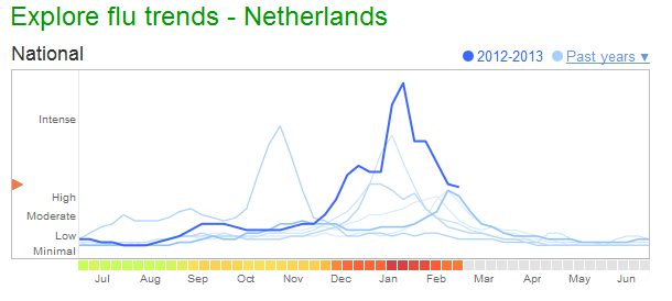
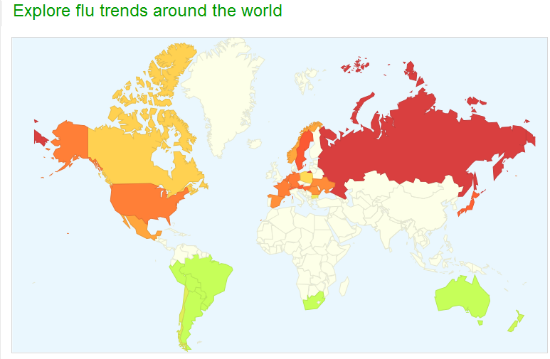
An example of diagram for the masses that I will discuss is Google Flu Trends. This is a project of Google.org and uses information visualization software. The visualizations are based on user-generated content. Google has found a strong correlation between how many people search for flu-related topics and how many people actually have flu symptoms. Users of Google’s search engine participate unconsciously by searching for flu-related topics and thus make a contribution to the visualization of influenza epidemics. Subsequently, Google uses the search results to estimates the flu activity around the world in real-time and extract this data into diagrams. This example shows that the computer provides opportunities for creating “graphics with dramatically improved rendering, real-time interactivity, and dramatically lower costs” (Card 1). Clay Shirky also highlights the role of interactivity in information visualization. He argues that “whereas charts and graphs present known data in a frozen scene, Information visualization is a way of letting the user query the data in real time” (Shirky 4). In the case of Google, the input of the search queries leads to a real-time graph showing the flu activity worldwide. In addition, the example of Google Flu Trends clearly indicates that a real-time visualization based on user-generated content can be effective. It seems that the internet user plays a more important role in the field of information visualization.

The information visualization of Google Flu Trends is available for everyone and shows that some of Neurath’s ideas are still visible on the web. The project of Google shows “a new way to convey information that could be comprehensible for a wide range of people” (Zambrano and Engelhardt 7). Furthermore, Google Flu Trends shows that information visualization is no longer only focused on scientific information. One could say that digital media and the rise of Web 2.0 in particular have led to a shift. Formerly, you could only passively viewing information visualizations. Nowadays, diagrams are not only used for viewing purposes. Nino Zambrano and Yuri Engelhardt argue that “digital media now enable users to explore, produce and even share data” (7). The rise of Web 2.0 applications allows users to become more active in the information visualization process. For instance, the search queries of Google users which can determine the Google Flu Trends visualization.
Foursquare
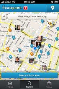
Another example where users play an active role in the visualization of information is the location-based social network Foursquare. In this case it is about the visualization of personal information. Foursquare is a web and mobile application that allows registered users to update their location. Users can use their mobile phone to check in at certain locations. A remarkable aspect of Foursquare is that the check-in data of users will be visualized on a map. Up to one year ago the map of Foursquare was based on the Google Maps API. Nowadays it is using the OpenStreetMap. Users of Foursquare can share their check-in data with other users. Foursquare also offers users the ability to comment on data from others. In addition, Foursquare’s ‘share’ feature affect the role of the user and the visualization process. This can be recognized in Zambrano en Engelhardt’s statement that “the powerfull aspect of these initiatives is that in addition to participating in the creation of visuals, the users can share their contributions with other users” (9). As in the case of Foursquare, the location of the user can be visualized on a map and shared with others over the Internet. This is why such an visualization can be defined as “diagrams for and by the masses” (Zambrano and Engelhardt 9).
Perhaps Foursquare can also be seen as a “casual information visualization” (Casual Infovis) (Pousman 1145). Casual Infovis “is the use of computer mediated tools to depict personally meaningful information in visual ways that support everyday users in both everyday work and non-work situations” (Pousman 1149). Casual Infovis is not only used in a working environment, rather it is more used for ‘casual use’. For instance, this can be found in software for visualizing personal data such as photo collections. Furthermore, Zachary Pousman explains that “visualizations of social processes, social networks, and social situations have become another emerging and exciting domain for infovis researchers” (1146). Another difference between traditional infovis systems and Casual Infovis systems is that a Casual Infovis is personally important. Furthermore, users of Casual Infovis may vary from experts to novices. They are not necessarily expert in analytic thinking, nor are they required to be experts at reading visualizations (Pousman 1149).
To gain insight into a casual infovis system, Pousman uses the Nike+ Running app as an example. The Nike+ Running app tracks distance, pace, time and calories burned with GPS and provides the user with constant feedback. Just as in the example of Nike, the social network Foursquare also visualizes information that is personal in nature. For instance, information about the locations where the user has checked-in. In addition, the user does not need to be an expert to be able to analyze the information visualization. Additionally, the application of Foursquare shows similarities with the idea that “visualization may have a catalytic effect on communication between users” (Viegas 1). In this respect, social information can be used for social purposes. Lastly, the visualization of user locations “can form the core of a wide array of social behavior, both sparking conversation and serving as a mirror or camera for social systems.”(Viegas 9).
As made clear through my examples, both Google Flu Trends and Foursquare allow the user to participate within the proces of data visualization to an active degree. Furthermore, this participation is accomplished in a way where the user is unaware of his actual contribution, turning the proces into an automatic and continious flow of fresh data which doesn’t negatively affect the user’s experience.
References
Card, Stuart, Jock Mackinlay, and Ben Shneiderman, 1999. Excerpt from chapter 1 of “Readings in information visualization: Using vision to think”. San Francisco: Morgan Stanley Kaufmann Publishers, pp. 1-34 (the chosen excerpt stops on page 7).
Neurath, Otto. 1937. Visual education: A new language. In: Survey graphics: Magazine of social interpretation, XXVI (1), January 1937, pp. 25-28.
Niño Zambrano, Raul, and Yuri Engelhardt 2008. Diagrams for the masses: Raising public awareness – from Neurath to Gapminder to Google Earth.In: G. Stapleton, J. Howse, J. Lee (Eds.). Diagrammatic Representation and Inference. Berlin: Springer, pp. 282-292.
Pousman, Zachary, John T. Stasko, and Michael Mateas, 2007. Casual Information Visualization: Depictions of Data in Everyday Life. IEEE Transactions on Visualization and Computer Graphics 13, 6, pp. 1145-1152.
Shirky, Clay. 2002. Excerpt from “Information visualization: Graphical tools for thinking about data”, Esther Dysons’s monthly report, Volume 20, no. 8, pp. 1-33 (the chosen excerpt stops on page 7).
Viegas, Fernanda, Martin Wattenberg, Matt McKeon, Frank van Ham, and Jesse Kriss, 2008. Harry Potter and the Meat-Filled Freezer: A Case Study of Spontaneous Usage of Visualization Tools. In Proceedings of the Proceedings of the 41st Annual Hawaii International Conference on System Sciences (HICSS ’08), IEEE Computer Society.

