Visualizing Emotions: Turning ‘Dry’ Data Into Stories
The best data visualizations are the ones that tell you a story. A good data visualization has the ability to show you something that you wouldn’t have seen by only looking at the data, it presents the data in a way that the viewer can explore and understand it. Transforming data to symbols causes us to see it and therefore react to it. Data is clarified, but it can also be revealed through data visualization. It can visualize the impact of something or give the viewer a sense of the degree of ‘seriousness’ of certain statistics. As Stephen Few notes, the saying that a picture says more than a thousand words is only true in the case of data visualization if the graphic is designed well (( Few, Stephen. “Data Visualization for Human Perception.” The Encyclopedia of Human-Computer Interaction, 2nd Ed.. Soegaard, Mads and Dam, Rikke Friis (eds.). Aarhus, Denmark: The Interaction Design Foundation, 2013. )). Therefore, well-designed data visualizations have the potential to provoke emotions or add an emotional layer to statistical data that alone are just facts and figures.
Feelings and emotions are a recurrent subject for data visualizations, which either provoke or depict them. I find this interesting as data visualizations that do either of these two things therefore focus on something that is very rare when looking at dry statistics. The visualized or experienced emotion is a layer of something not visible to the human eye but present in every viewer of the visualization. Or, as Alberto Cairo argues, the visualization functions as a tool to facilitate comprehension and to evoke emotions in the viewers’ minds (( Cairo, Alberto. The Functional Art: An introduction to information graphics and visualization. New Riders, 2012. )).
The following projects are a few examples that focus on emotion, through either portraying human feelings as data or using data to provoke human feelings.
Emotions as data
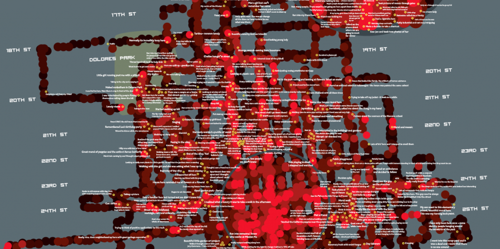
The book Emotional Cartography (2009) is a collection of essays discussing the desire to map emotions, by visualizing intimate biometric data and emotional experience. The book was originally intended in order to form a deeper understanding of the 2004 project Bio Mapping, by Christian Nold (who also edited the book). The Bio Mapping project is a visualization of data gathered through a specifically designed portable device. The device records data on the changing in sweat levels on the fingertips of the person who is wearing it, the so-called Galvanic Skin Response (GSR). This GSR is described by Nold as a simple indicator of emotional arousal. Through these devices, a person’s emotional arousal can be measured together with their geo-location. The Bio Mapping project maps out the points of high and low physiological arousal. The following image is an excerpt from the full emotion map of San Francisco. The San Francisco Emotion Map (2007) is an abstracted map of the city, constructed by the geo-location and GSR data also showing the device carriers’ personal annotations as to what they were doing or experiencing at specific data points.
– San Francisco Emotion Map | Copyright Christian Nold
These emotional maps visualize the journey of the person wearing the device, combining the geographical journey with the emotional journey the person underwent. The visualization of the statistical data not only portrays feelings but also provokes them. It combines the objective data with the subjective stories of what created the data. As Nold describes in Emotional Cartography, the project sparked the interest of a large variety of commercial instances, from car companies wanting to know the stress level of their drivers to advertising agencies wanting to emotionally re-brand entire cities (Nold 4). Nold describes his reaction to this unforeseen response (( Nold, Christian, ed. Emotional cartography: Technologies of the self. 2009. p: 4 )):
I was shocked: my device, or more correctly, the idea or fantasy of
my device had struck a particular 21st century zeitgeist. A huge range of
people had imagined ways of applying the concept, some of which I felt
uncomfortable about. I realised that ‘Mapping Emotions’ had become
a meme that was not mine anymore, but one that I had merely borrowed
temporarily from the global unconscious.
Since Bio Mapping many more projects have visualized the ‘global unconscious’, turning the invisible layer of emotions into a visible and explorable graph. As described by Natalie Dixon in this previous Masters of Media post, social media plays an important role in communicating emotions, while often functioning as a means to vent ones feelings. Dixon argues, “Social media confirms that other people share your feelings”. Therefore social media also function as an emotions database.
Where Nold uses specifically designed devices to gather his data and has their carriers personally annotate several data points, many projects use readily available public data on feelings. The 2005 project We Feel Fine by Jonathan Harris and Sem Kamvar is a well-known example of harvesting publicly available emotions from the blogosphere, gathering thousands of sentences containing “I feel” or “I am feeling” every ten minutes and visualizing them in a playful application that enables the viewer to explore the expressed emotions in an (almost) real-time database.
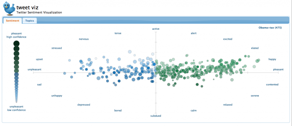
Another way of crawling publicly available data containing feelings or sentiment is by using Tweets as data. Tweet Viz, a project by Siddarth Shankar Ramaswamy and Christopher G. Healey, that visualizes Twitter sentiment does such a thing. The application arranges Tweets by word recognition and categorizes them by sentiment and by topic. Tweets arranged by sentiment are shown in a psychology diagram, Tweets arranged by topics are clustered together. The Tweets are color coded by “pleasant/high confidence” (green) to “unpleasant/low confidence” (blue).
– Tweet Viz query “Obama”+”tax” | Copyright Siddarth Shankar Ramaswamy and Christopher G. Healey
The results are two graphs visualizing sentiment expressed in Tweets, after querying for single or multiple keywords, which therefore shows the state of mind regarding the queried keywords at that very second. No two graphs are the same. The realtime generated graph allows the viewer to explore the Tweets by clicking on them and therefore being able to view them.
Experiencing emotions through looking at a graph
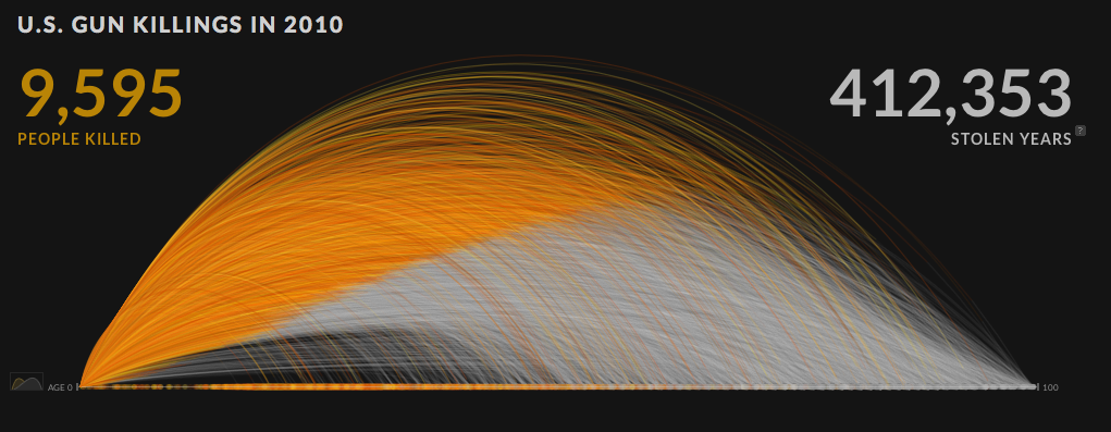
Projects such as the ones mentioned above use subjective, human emotions as data in order to visualize them, making the invisible visible. Another way of adding emotion to a data visualization is by using objective, “official”, statistics but visualizing them in a way that impacts the viewer’s emotional experience. A recent project by Periscopic that was developed in early 2013 does this very well. “U.S. gun killings in 2010” shows data from the FBI’s Uniform Crime Report combined with demographic statistics in order to visualize the murders committed by gun violence in 2010 in the U.S. and the “stolen years” of the life expectancy per victim.
– U.S. Gun Killings 2010 | Copyright Periscopic
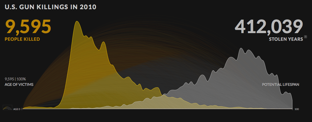
Exploring the application, while showing statistical data (and self-calculated data to produce the “stolen years” dataset), becomes an emotional experience. This is due to several factors of the graph. The use of tags, such as “stolen years” and “could have lived to be XX years old”, the dramatic effect of the counter of “stolen years” and “people killed“ while loading and the labels revealing details of the murder and at the same time the life expectancy of the victim, had he or she not been murdered all add to this emotional experience. The emotional experience is also strengthened by the optional second graph: two line charts showing the amount of victims per age and the amount of possible victims per age according to lifespan demographics. The graph visualizes a story of too many lives taken too soon.
– U.S. Gun Killings 2010, age of victims vs. potential lifespan of victims | Copyright Periscopic
Data visualizations provoking or depicting emotions focus on making the invisible human emotions visible, turning data into stories. The added emotional layer of a data visualization can therefore enrich not only a visualization, but also its viewer.


