What to do with all that big data?
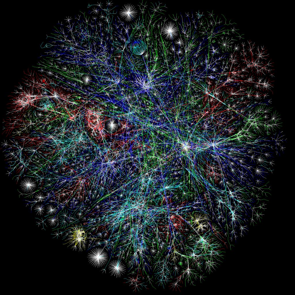
 “Big data will be bigger in 2013” according to the article on the website of Telegraph written on the 26th of December 2012. Even though ‘big data’ was ‘big’ in 2012, they predict that it will be bigger in 2013. Big data has a very broad definition, but you can describe it as the information that is openly available for everyone. It is the information that ‘buzzed across social media channels’, people can read it, analyse it and learn more. It gives everybody possibilities to explore for example social media, because ‘it exists everywhere.’ Wikipedia holds the definition that ‘big data’ is a collection of very large and very complex data sets. Because of the amount of data it becomes difficult to deal with all this data and ‘the challenges include capture, curation, storage, search, sharing, analysis and visualization.’ Big data’ comes from everywhere, for example you could think of social media sites, digital pictures and videos, sensors used to gather climate information, cell phone GPS signals etcetera.
In a report of Gartner Research, the global IT spending in 2012 came close to $96 billion, and the predictions are that this number will rise to $112 billion in 2013. And if it keeps rising it will extend to an extraordinary $232 billion by 2016. Which sounds like huge amounts, but not compared to the amount of data we are speaking of. We create 2.5 quintillion bytes of data a day. A tremendous growth considering that 90% of the data that exist in the world today is created only in the last two years. According to entrepreneur.com one of the trends of 2013 will be the improved data visualization. Improved data visualizations came in fifth place of the online-marketing trends of 2013. Visualizing complex and big data sets is a great way to display facts in a way that other people can see and understand better. The representation of the data in a visual form will let them understand the underlying structure and the hypothesis about the data (Rober, 2000). Entrepreneur.com quotes that last year we saw big data catch fire, but they believe that this year we need to make that data accessible to everyone.
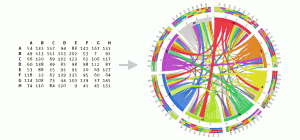 So on the one hand we have big data, data sets with an enormous pile of data available. And on the other hand we have data visualization, which could give insights in this enormous pile of data. The question of how to use visualizations, new visualization software and technique to keep up with this data-driven culture are asked in large numbers?
Suzie Ivelich, managing director at Landor, kept a talk last December about the ‘Trends‘ in data visualisation. She starts her talks about big companies like Google, IBM and GE, which are diving deeply into the data visualisation.These online orientated companies are way ahead of all the other companies, especially the ones that use online as an extra sphere, aside their originally offline sphere. Simultaneously with this displacement from ‘only offline’ to ‘also online’, many new businesses emerged. A lot of new organisations and agencies are offering their knowledge, supplies and service to help other organisations with their online adventure.
 What better way is there to help those organisations than by visualizations? Because if you visualize the particular data that they are interested in, you can help them. Suzie Ivelich tells us a good way to think of it: ‘How do I engage my customers with data that they want to engage with?’ The newer organisations will help inexperienced organisations with this new online experience. Ivelich compares visualisations with a car that you really enjoy riding: ‘you want to drive it because you enjoy it and you can explore the road with it.’
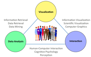
The organisations, which are displacing and shifting to the online sphere, will certainly come into contact with the big data and probably also with data overload. The data that will result from their online actions can be captured and measured, and this results in very interesting and useful information for them. But what is the best way to read and interpret these measurements? The answer is: Data analysis. Specialized data analysts will collect all the data and then translate it in useful and understandable information. Because graphics provide an excellent approach for exploring data and are essential for pre- senting results, this can be very beneficial for the organizations. And is this a new fact? Not at all: In fact, the graphic representation of quantitative in- formation has deep roots. These roots reach into the histories of the earliest map making and visual depiction, and later into thematic cartography, statistics and statistical graphics, medicine and other fields (Chen et.al, 2008).
So we can conclude that it is not by accident that Entrepreneur.com also places ‘more analytics’ in their top ten, on the eighth place. It will be advantageous to use the measurements and use these for optimizations of the online activities. It will even go one step further; to marketing analytics. This will let big data help the company, to make better decisions. A recent study of IBM and MIT even show that companies that make use of the opportunities of big data, benefit from it enormously. They perform three times as well as companies that do not.
And we are making progress, because there are now improved ways to visualize collected data, for example by using Tableau Software, founded in 2003. Capturing, analyzing and visualizing the data, is a difficult challenge, mostly because of all the potential data out there that could be used. You have for example the K(ey) P(erformance) I(ndicator)’s that will tell you all the little details, about for example the site of the organization, that you want to know. This will give you some guidance in the data jungle.
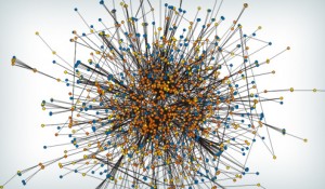
And like Stephen Few said ‘anyone who has ever actually worked with data in an effort to make better decisions, knows that most of the data that surrounds us is noise.’ Good luck with finding the usable data parts. Because thereafter the data analyst have make a number of steps to finally come to a good visual result. Subject that they need to keep in account are the visual hierarchy, visual flow, grouping, color, typography and many more (Myatt, 2006). We can understand that it a quite difficult task.
Chen, Chun-houh, Wolfgang Karl Härdle, and Antony Unwin, eds. Handbook of data visualization. Springer, 2008.
Myatt, Glenn J. Making sense of data: A practical guide to exploratory data analysis and data mining. Wiley-Interscience, 2006.
Rober, N. (2000). Multidimensional analysis and visualization software for dynamic spect. Mas- ter’s thesis, Otto-von-Guericke-Universitat, Magdeburg.
