Focusing on the future: Visualise the ‘tsunami of data’
If journalism is to die, at least it dies in a better shape. By help of interactive visualizations, journalists have new means to tell stories and build context around them. It is already a few years since data journalism has found its way into the newsrooms. Popular newspapers such as The Guardian, The New York Times, The Economist, Wall Street Journal have already adopted data visualizations in their articles and have large departments dedicated to infographics. However, in many European countries data journalism is relatively new.
Also known as computational journalism or data driven journalism, this new way of reporting requires a new type of journalists, called programmer journalists or innovative journalists, namely those who are not afraid of numbers, who know how to use a spreadsheet and work with the latest visualisation tools (Rogers, Facts are sacred). The WikiLeaks releases on Afghanistan, Iraq and the US embassy cables, the UK MP’s expenses scandal, the global recession and even the swine flu reports were possible due to reporters who knew how to look into large datasets, ask the right questions and tell a meaningful story from the huge amounts of datasets.
There is a promise in data
There are voices in the industry in favor of the idea that journalists should prepare for a future in which data have become a medium. It is a new way of seeing things, suggests Geoff McGhee, in a video post called “Journalism in the Age of Data”. Following the same line, Mirko Lorenz, a very well known information architect, talks about “a promise” that journalists could find in data. “This is what excites newsrooms and makes them look for a new type of reporter” (Lorenz, Why journalists should use data). Data journalists are already a sought-after group of employees, not only in the media. Companies and institutions around the world are looking for “sensemakers” and professionals, who know how to dig through data and transform them into something tangible (Lorenz). In his view, to be a “data journalist” does not necessarily mean to be a programmer. The bigger task is to think about data like a journalist and to easily sense the story “hidden” behind it.
In the next years, journalists might be working side by side with hackers, developers, designers and coders. “It’s a transition that requires serious capacity building and we need news managers who “get” the digital/journalism connection to start investing in the build (Carlisle). What makes it different to the rest of journalism is the possibility to combine the traditional ‘nose for news’ and the ability to tell a compelling story, with the huge amount of digital information that is now available (Bradshaw).
The role of visualizations in journalism
A fundamental consideration is related to the role of visualizations in journalism. Are they eye-catching illustrations, or do they provide the flesh to the story and to the point made by the journalist? In newspapers and magazines, infographics have traditionally been created within art departments and for this reason they were perceived mainly as “pretty things”, accompanying a story (Cairo, Functional Art xxi). However, infographics are not mere ornaments which make a page look more attractive for audiences. “The relationship between visualization and art is similar to the linkage of journalism and literature. A journalist can borrow tools and techniques from literature and be inspired by great fiction writing, but she will never allow her stories to become literature. That notion applies to visualization, which is, above all, a functional art” (Cairo, Functional Art xxi).
No matter how fancy a visualization is readers want in the end to explore and analyse facts, to understand complex situations better. “If you don’t present your data to readers so they can see it, read it, explore it, and analyze it, why would they trust you? This is a question many journalists, particularly those who write opinion columns, should ask themselves more often” (13). In Cairo’s view, a visualization should strive for objectivity, precision and functionality, as well as beauty (25).
Visualizations can be used to create a clear understanding for very complex situations, such as the economic crisis, the global unemployment rates or the war in Iraq or Afghanistan. Generally speaking, the datasets are getting massive and journalists should look for opportunities in the data, since this enable them the possibilities to tell great stories in a very complex way. “Less guessing, less looking for quotes — instead, a journalist can build a strong position supported by data and this can affect the role of journalism greatly” (Lorenz).
However, working with data is often like stepping into a vast, unknown territory. This is one of the first lessons that a beginner might learn. Data does not necessarily hide in an Excel spreadsheet on the Internet. One still has to do research as well as a journalist does on a daily basis. Searching for websites, reading documents, interviewing sources are part of this research activity. This might also involve contacting people from different institutions. In a nutshell, gathering a database is a time consuming task and it could take hours or days to make datasets work together. “Data journalism is a workflow that consists of the following elements: digging deep into data by scraping, cleansing and structuring it, filtering by mining for specific information” (Lorenz).
Complex stories built around visualizations of datasets
When the information is gathered and processed, it requires the talent of telling a story and of visualizing it as clear as possible. As Amanda Cox, Graphics Editor at the New York Times, put it “data journalism is not just numbers floating around, you got words, movement, sound effects. It is different from what you see in a printed version of a newspaper. A good visualization can make people see the world in another way” (Cox, Journalism in the age of data). In her view, the ultimate goal of a visualization is to change what you think about the world and to make you see something different. The main advantage is that data can be used to create deeper insights into events and into how they might affect us. Thus, the job of journalists shifts its main focus from being the first ones to report to being the ones telling us what a certain development might bring about (Lorenz).
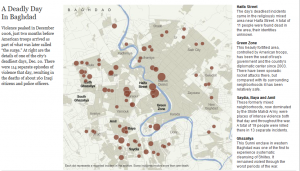
Ample investigations, such as WikiLeaks cables or MP’s expenses in UK would not have existed without large data sets behind them.  When WikiLeaks released 400,000 classified military documents about the war in Iraq, one of the main challenges for the news organizations was to produce interesting stories and visualizations from the massive amount of information they got. There have been so many approaches that it was impossible to count them, which shows once again the diversity that visualizations can bring in the media landscape. Der Spiegel, for instance, made an interactive map of a single day of violence. The New York Times team designed maps of violence in Baghdad, while The Guardian chose a Flash animated map of one day in Baghdad and wrapped it in a very emotional way.
The Guardian also made some experiments and challenged the readers to make their own visualization, by using Google maps and Google Fusion Tables and to compile all of the deaths reported. 
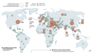
The map is still on The Guardian website and it has many more page views than the editors ever expected (Kirchen). El Pais made a static visualization and the examples may continue with publication that visualized the cables by social graphs or simple charts. As one can obviously see, in the WikiLeaks story, each media organization strove to make the original data more accessible through interactive visualizations and to tell the story the best way possible.
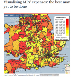
Another good example of a story that made use of visualizations, in order to deliver a strong message to its audience was the scandal of MP’s expenses in the UK. In this case, the British journalists used for their investigation computational techniques, crowdsourcing and visualizations, in order to engage their readers with this issue, which finally lead to resignations, prosecution and sentences.
The Guardian was one of the newspapers which had an interesting coverage of the story that made use of data journalism.
One of the things that the Guardian team did in order to engage its users was to make available all the spreadsheets with MP’s expenses. Making use of Guardian Open Platform datastore, the journalists encouraged users to create mash-ups and send links to Guardian staff. Given the amplitude of the project, some mistakes sneaked in the report. For instance, one of the reviewers of the datasets misread a claim receipt as being for a tanning center when it was in fact for a training center. This shows that data journalists, just like traditional journalists, should strive to check facts more effectively in order to avoid such embarrassing situations.
Final thoughts
Writing about such complex issues has made me think about the prominent press scandals that could not use the opportunity of infographics at the time they became public. I wonder how the Watergate story or The Great Depression would have looked like if they had been accompanied by well executed infographics. What would it have looked like to see all the connections or, in the second case, the unemployment and the poverty rates?
The investigations mentioned above and this short imagination exercise make me confess my faith in the power of visualizations to revive the investigative journalism, the only one that can help democracy to develop. Data visualizations can incite creativity, curiosity, comprehension, but more than that they can provide proofs, reveal the connections between the government contracts, businesses, responsible ministers, politicians, lobby groups. To see the truth, users just have to click on the right button. In my opinion, visualizations can make things more transparent and they can be a way to force governments to communicate the truth. Just by displaying the data, journalists have the means to influence politics. For the users, data journalism brings a knowledge surplus, since they are now able to better read figures and to discover realities that otherwise would have been invisible.
Works Cited
Bradshaw, Paul. “What is data journalism”. Data Journalism Handbook. Open Knowledge Foundation. <http://datajournalismhandbook.org/1.0/en/introduction_0.html>
Cairo, Alberto. Functional Art. An Introduction to information graphics and visualization. Pearson Education and New Riders. 2012.
Carlisle, Wendy. “The ABC’s Data Journalism Play”. Data Journalism Handbook. Open Knowledge Foundation. <http://datajournalismhandbook.org/1.0/en/in_the_newsroom_0.html>
Cox, Amanda. “Journalism in the age of data”. http://datajournalism.stanford.edu/
Kirchen, Lauren. “Visualizing the Iraq War Logs”. <http://www.cjr.org/the_news_frontier/visualizing_the_iraq_war_logs.php>
Lorenz, Mirko. “Why journalists should use data”. Data Journalism Handbook. Open Knowledge Foundation. 17 March 2013, <http://datajournalismhandbook.org/1.0/en/introduction_1.html>
McGhee, Geoff. 2010. “Journalism in the Age of Data”. www.standford.edu. 15 March 2013, <http://datajournalism.stanford.edu/>.
Rogers, Simon. Facts are Sacred: The power of data [Kindle version]. Guardian Books. 2011
Wikipedia. “Data driven journalism”. Wikimedia Foundation. 2012. http://en.wikipedia.org/wiki/Data_driven_journalism
For more details, please also check Marije Roose‘s article Interactivity in the Online Graphics of The New York Times and The Guardian