Tracking a nations mood through Twitter: visualizing how you feel

There has been a shift from static to dynamic information visualization. Lately, information visualizations are being created by user generated input. Datasets can be created by scraping Twitter for certain keywords. The project “Pulse of the Nation” has visualized the mood of the U.S. during the week. Can we use the results to say or do something about our mood at a certain time?
At first, information visualization was only used by scientists. Nowadays, user generated content becomes more and more important in our online presence. While information visualization could not be understood by the average citizen, more and more tools became available with little to no learning curve on how to use and understand them. The latest shift towards web 2.0 has allowed for user generated information visualization. Otto Neurath, an Australian philosopher of science, has already predicted this shift in his work from 1920, when he became an ardent logical positivist and was the main author of the Vienna Circle manifesto. Web 2.0 has allowed users to contribute.
Twitter as a source of user generated input for information visualization
Twitter, a social media platform created in 2006 which allows its users to broadcast short messages consisting of 140 characters or less, can be used to create datasets which in turn can be used as input for data visualization. Visual representations of datasets are essential to understand them. They aid us to cognition and knowledge. But what tends to be a good one? “[T]he essence of good graphical presentation is the encoding of multiple variables into a single display of information in a way that rewards the user for spending time looking, rather than confusing or distracting him” (Shirky 6). This means the interface has to be intuitive, rather than difficult to learn.
Graphics are the visual means of resolving problems. Because it is really hard for a human – or even impossible – to detect patterns in large datasets, graphics have to be used. This medium reveals hidden patterns assembled from an almost unlimited amount of digital data. The data was previously only available for scientists, but through the use of the web, business, scholarship and education can benefit from it.
Measuring moods: the “Pulse of the Nation” project
“Pulse of the Nation: U.S. Mood Throughout the Day, as inferred from Twitter” is a project from students of the Harvard University in which they have mapped out the moods of the nation.

One graph of the visualization is a line graph containing the days of the week. If we zoom in on a day itself, we can see that the line consists of little corners, corresponding to the hours of the day.

They analyzed 300 million tweets, scraped from September 2006 to August 2009 and used a scheme to filter on words that describe a persons’ moods, the ANEW word list. Because of the fact that most of the tweets are geolocated, which means that the location of the tweet or of the user is being logged with the tweet. This way, the researchers were able to plot the tweets on a map. Because of the time difference within America itself, one of the conclusions of the project was that the people of the west coast were significantly more happy than the people on the east coast. By using a cartogram – a map in which the true land area is substituted by the number of tweets – the researchers were able to plot the tweets on a graph that showed the amounts of tweets in combination of the mood of the tweet. They recorded this data over the span of a week and created a time-lapse video of the morphing maps.
I really like the idea of a global mood. It shows us that we not only talk about our moods in real life, but we like to share it on the internet as well. By using certain keywords for certain moods, we let the rest of the world know how we feel. I think it is interesting to see that there is a noticeable difference between the two coast lines and how people are feeling during a given day. But where is the interaction in this visualization? I really miss extra information about some details in the larger weekly graph. What are the exact hours things are happening? Would we be able to see trends within the graph itself, in the form of a “Monday sucks”, “Thank God it’s Friday” and “Lazy Sunday” for example. Would we be able to derive certain terms from the tweets at peak hours? What do people tweet about on those hours? This remains a mystery.
Comparing visualizations and detecting anomalies
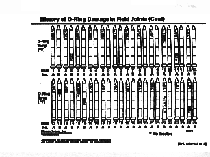
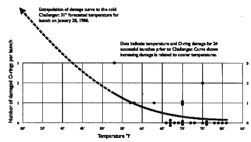
Referring back to Neurath’s prophecy of user generated informational visualizations, Zambrano and Engelhardt argue that this “future possibility has become a reality: digital media have enabled, on a previously unimaginable scale, the fulfillment of Neurath’s vision” (11). It is clear we have entered the “infovis 2.0” era. The “Pulse of the Nation” project has certainly shown that user generated input can be visualized and can be interpret by the mass. I think it gives a pretty good overview of peoples moods at certain times of the day and at certain times during the week. As I mentioned before, I would like to propose to look deeper into the anomalies that arise when we take a better look at the line chart during a given week. Card et al. describes the human findings as follows: “This medium allows graphic depictions that automatically assemble thousands of data objects into pictures, revealing hidden patterns” (1). First, I want to refer to another example I encountered last year and on which I stumbled upon again last week: the visualization of the O-ring damage of the space shuttle Challenger. Edward Tufte, professor emeritus in computer sciences at the Yale University, is the man who critiqued the O-ring damage visualization.

As we can see in the first image, nothing becomes clear about the dangers which lie ahead.

The second visualization is Tufte’s version, in which it becomes clear that there are great dangers when temperatures become lower. The anomalies are easy to spot to the human eye now and the disaster with the space shuttle could have been prevented.
Can we change our mood in advance?
Seeing the difference between visualizations and how different visualizations can point out certain problems or difficulties, can we improve our moods by analyzing the graphs of the Pulse of the Nation? “Monday sucks”, as the cliché tells us… Why not keep that in mind and do more happy activities on Monday? Is it possible to turn the workday around so that we feel better, in order to be more effective and productive – and happy? Or the other way around. Why do we feel so good on “Lazy Sunday”? Can’t we do those things on other weekdays, for example on Thursday evening, when our mood is significantly low? Is it possible to even our mood out throughout the week, using counter actions? It sure has it benefits… No more cranky people! But will we be able to acknowledge them when we find out? Or will we get used to the new rhythms and fall back into our old patterns? Many questions arise, although we are not sure if we will feel that way at that moment, even if we might know it in advance. Just as the Oracle told Neo: “Don’t mind the vase.”
Literature
Card, Stuart, Jock Mackinlay, and Ben Shneiderman, 1999. Excerpt from chapter 1 of “Readings in information visualization: Using vision to think”. San Francisco: Morgan Stanley Kaufmann Publishers, pp. 1-34 (the chosen excerpt stops on page 7).
Neurath, Otto. 1937. Visual education: A new language. In: Survey graphics: Magazine of social interpretation, XXVI (1), January 1937, pp. 25-28.
Niño Zambrano, Raul, and Yuri Engelhardt 2008. Diagrams for the masses: Raising public awareness – from Neurath to Gapminder to Google Earth.In: G. Stapleton, J. Howse, J. Lee (Eds.). Diagrammatic Representation and Inference. Berlin: Springer, pp. 282-292.
Shirky, Clay. 2002. Excerpt from “Information visualization: Graphical tools for thinking about data”, Esther Dysons’s monthly report, Volume 20, no. 8, pp. 1-33 (the chosen excerpt stops on page 7).
Image sources
Mood visualizations: http://www.ccs.neu.edu/home/amislove/twittermood/
Challenger visualizations: http://www.asktog.com/books/challengerExerpt.html