“Color is difficult”
The title of this blogpost is part of a somewhat famous quote in the world of information visualization from Moritz Stefaner. The full quote “Position is everything, color is difficult” is especially promoted by Noah Iliinsky (co-author of the books Designing Data Visualizations and Beautiful Visualization) in different talks held by him as a summary of how to visually encode data well. With these six words Iliinsky explains that, as a rule of thumb, the most important data variables in information visualization should always be encoded by some form of positioning. Spatial dimensions like placement, length and size differences are easier for humans to perceive and to compare than differences in color. This more or less corresponds with a more analytic principle of infovis identified by Lev Manovich; that infovis privileges spatial dimensions over other visual dimensions. So what follows for Iliinsky is that the use of color to encode properties of the data should only be used for secondary variables because color is difficult. That color is difficult can also be learned from visualization guru Edward Tufte in stating that:
“[…] even putting a good color in a good place is a complex matter. Indeed, so difficult and subtle that avoiding catastrophe becomes the first principle in bringing color to information: Above all, do no harm.”
from: Envisioning Information, Edward Tufte, Graphics Press, 1990
This blogpost is about the several ways in which color is difficult and provides some tips as well to avoid color catastrophe.
Color is not ordered in the brain
As Noah Iliinsky explains it, some visual encodings are ordered in the brain and others are not (Iliinsky has a useful diagram on his website on different visual encodings and their properties). If a particular visual encoding is ordered in the brain, it means that it is not something that has to be learned or that can be unlearned. Visual encodings that are ordered in the brain are automatically processed with very high precision. Automatically we our brains can deduct hierarchies and orderings from these visual encodings.
Color as a visual encoding for data is not ordered in the brain. This is the main reason why color is difficult. Although the spectrum of colors visible for humans can be ordered according to wavelength, this ordering makes no sense to the human brain until it is learned. Spotting color variations is not something that is automatically processed in the brain and hence not something which humans are very good at. This makes color not so useful for encoding quantitative or ordinal data. For categorical data color can effectively applied. But what colors to choose for the different categories is complicated by the fact that also the symbolic and emotional meaning of different color hues are not hardwired in human brains, they have to be learned.
Color and meaning
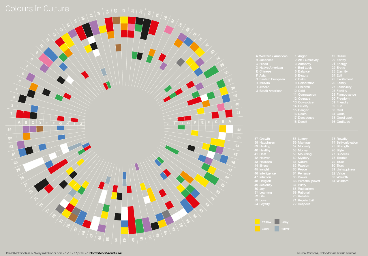
The fact that color meanings are learned introduces a second reason why color is difficult. Color is learned differently by different people and hence there are no universal meanings of colors. Color meanings vary among cultures age groups, professions, sexes and so on. Furthermore are color meanings affected by differences in experiences and tastes from person to person. And to complicate things even more, color meanings are also context specific. Below is a (somewhat difficult to read) visualization of differences in color associations.

source: www.informationisbeautiful.net
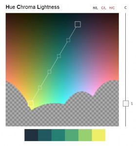
Another compelling example of how color is learned and can be very profession specific, is discussed a great datastori.es podcast by Enrico Bertini and Moritz Stefaner on color. They talk about how color gradients encompassing the whole color spectrum (like in the example below) should never be used. Interestingly enough they found out that scientist who do use these, because it happens to be a default in their software, have become very skilled in reading these full color spectrum scales.

source: eusoils.jrc.ec.europa.eu
So using color in design is a complex task, like for example logo designers know all to well. Color use in information visualizations can lead to different interpretations by different viewers. If color is used it is therefore good to know the targeted audience and their color associations. This is of course easier when an audience can be clearly defined. Furthermore it is important to provide context for the visualization, so that certain associations can be stimulated.
Perceiving color
A last reason why color is difficult that I want to mention is about how humans perceive color. Or how people don’t perceive color. If color is used in a visualization to show differences in the data it is good to make sure that people with color blindness can also perceive the differences in color and hence the differences in the data. A useful tool for non-colorblind people to test if a design is colorblind safe is Color Oracle. This software allows for altering the screen display according to the various forms of colorblindness.
Another difficulty involving color perception is the problem of equidistance. When encoding quantitative data with color in equal subgroups it is important that the different colors used represent the data categories well. So that the perceived distance between colors corresponds with difference between the data values. The javascript library chroma.js by Gregor Aisch helps generating a good equidistant color palette. The HCL colorpicker and the iWantHue tool (that both use chroma.js) make it even easier by providing direct output of color values of a created palette.
The color advice tool Color Brewer is also a very useful way of obtaining a good equidistant color palette. Predefined sequential, divergent or qualitative palettes can be selected and adjusted to the specifics needs at hand. A good feature of this tool is that the selection of palettes can be narrowed down by colorblind, color print, photocopy and LCD friendliness. The downside is that the predefined palettes are a bit dull and limit freedom in design.
Use color!
That color is difficult should not discourage visualization designers to use it of course. For color is maybe the most important aspect that makes information visualizations look good and compelling. It may also be an important reason for newspaper readers for example to take a look at a particular visualization in the first place. So this post was certainly not to daunt the the use of color in information visualization, but more a encouragement to use it well and wisely.
» more on color and information visualization: datastori.es podacast by Enrico Bertini and Moritz Stefaner
» more on cultural factors and information visualization (on this blog): Cultural Bias in Data Visualization by Jorrit Schaap

