The Innocence of Infographics

Interactive infographics are becoming a major trend in data visualization. Infographics are a relatively new way to simplify complex stories, data and findings. They can be very useful in organizing a large amount of information in an easy to absorb display. In the present, bloggers, researchers and even news portals use infographics on a daily basis. One of the easiest ways to create successful infographics is to use a simple and accessible tool or application. Infogr.am is one of them. “Infogr.am is the world’s simplest applications for making infographics”- claim the developers. Infogr.am was launched on February 9, 2012 at TechCrunch Baltics in Riga, Latvia. Seven month after launch, in August, 2012, Infogr.am celebrated the 100,000th infographic created. After three month this number was doubled to 200,000. Today, with more than 500,000 users and more than a million infographics created, Infogr.am is the fastest growing data visualisation community in the world. 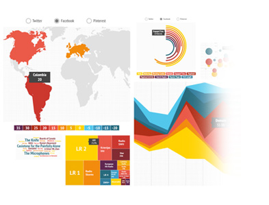
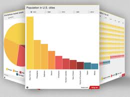
Infogr.am is a web-based tool for creating infographics. It allows to user to create charts and infographics in few simple steps in an aesthetically ‘pleasing’ way. All you need to do is select preferable template, insert the information you want to share and you are done. It’s very simple. Infogr.am is the best weapon if you need to present data. It allows you to illustrate the data with standard bar, lines, matrixes and pie charts as well as a big selection of customisable templates and many interactive elements (fonts, colours, quotes, titles, templates). It allows you to add maps, images, text and even video to your infographics. For example, if your data has a geographical element you can incorporate a zoom able map. If it involves sorting people into different groups or demographics, you can present that with a cloud of color-coded human outlines.
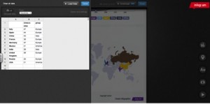
Infogr.am has a very simple interface – it does not require any programming or designing skills. It is basically drag-and-drop interface that lets you slide elements onto the ‘canvas’. You can also add your own data – the application allows you to insert any data that can be imported from XLS and CSV. You can easily share it on social networks or on your own blog/web site. You can choose to share it through Facebook, Twitter and Pinterest. And, even better, instead of generating a static graphic, Infogr.am generates embed code that you can implement into your blog. There is an option to upgrade your free account to a Premium one . A Premium account on Infogr.am allows you to download your infographics as PDF and PNG files.
(One of the developers talks about the philosophy behind the tool, fast growing popularity of it, importance of it for educational processes, and why it is free)
Visualisations are great? So why Infogram?
An application/tool like Infogram becomes increasingly important in the present. With the increasing demand for clear overviews of complex data, Infogram becomes a valuable tool for a lot of users. With the increase of the availability of data we also need methods that help us deal with this abundance. Through visualisation a lot of information can be processed in a relative short time frame and connections between objects can become clear in seconds. In the present where data and efficiency are key concepts, visualisation can become crucial in some cases, simply because there is too much information (Mazza 2009).
A tool like Infogram lends itself for the presentation of data, the communication of data. An infografic is in principle strong to the notion of exploration because of its interactivity. An infographic makes it possible to learn something about the data and visualisation tools can be underlined as a way to do research. Instead of a static experience it becomes an interactive process, trying to find out things in the data through visualisation.
Because of the accessibility of infogram, the tool makes it possible for a lot of people to use it without being an expert in the field. Infogram goes beyond exell because the charts can be imbedded into other webpages. You can actually edit the data, and the visualisation changes. Keeping the data up to date, without having to change the visualisation itself. It combines the notion of the chart and the Infographics. Once embedded it stays interactive.
Some critique regarding infographics
Basic information about infographics:
– Relatively new (+- 20 years)
– Direct relation to Graph theory
– Intrinsically related to computers (stead of by hand)
– A lot of (complex) algorithmic work
– Less well understood in terms of
- Cognition, interpretation, quality standards. (Researchers did a lot of testing; how do people interpret visualisations)
- Technology, technical complexity
Visualisations reduce information
Visualisation is part of a reduction process; in the end we can express information by using “points and lines”. Many different things can be formalised or modeled as graphs. This process means that certain entities are represented as nodes and certain relationships as links. However, with the reduction of information, information can be lost (Unwin 2008). 
Not an innocent tool
Visualisations in general contain a narrative element. This is dangerous exactly because infographics also tend to have a notion of objectivity since they ‘only’ visualize data. Infographics are not only innocent tools. Since there are no official (visual) standards they can even be manipulative or confusing. Visualisations in general fit really well with the network society: they can be seen as representation of the neoliberal of social control and optimisation (Mayer 2012).
Closing comments
There is quite a big hype around visualisation. Visualisations are sometimes used where they are not necessarily needed; they suggest a form of complexity. We have to look at the real possibilities of analysing representations, and also have to ask ourselves, is the hype of visualisation going to far? This surge in visualisation has really contributed to our understanding and how we look at the networks of information around us.Visualisation is becoming a way that we use to make decisions, to make sense of what happens. This understanding is not neutral. Visualisations are more than that. They are caught up in struggles in conflicts and controversies. Somebody makes them. Most visualisations have the component of argumentation and contain narrative elements. Visualisations make an attempt to structure. Behind the question of visualisation alone lies the larger question of new media; in what way are media transformers and mediators, transforming the world, and not only representing?
Bibliography
Mayer, K. (2012) Objectifying social structures: Network visualization as means of social optimization. Theory & Psychology 22(2), pp.162-178
Mazza, R. (2009) Introduction to Information Visualization. London: Springer-Verlag (Chapter 1 “Introduction to Visual Representations”)
Unwin, A. (2008) Good Graphics. In: C.-H. Chen, W. Härdle, A. Unwin (eds.) Handbook of Data Visualization. Berlin, Heidelberg: Springer-Verlag, pp.57-77