Listen to This: Don’t Miss the Sound to Convey Data!
Aristotle wrote in his work Metaphysics that sight is man’s most significant sense. “We understand because we see”, Alberto Cairo similarly states in his book The functional Art. Philosophy has tried to understand sight and the relation between images and human perception since the beginning of our times. While in the seventeenth and eighteenth century observation was tied to the body and the observer was only focused on the object, in the nineteenth century the concept of our own subjectivity when seeing things was introduced (Crary 31). With little exceptions, philosophers seem attached to a fixation on sight as the best approach to understand what things are, oftentimes neglecting sound in their observations (Smith 188).
Once, paining, photography and the cinema were the apparatus to capture our words, while nowadays, in the era of big data, information visualization –an increasingly growing field in computer science, digital media art and social science– has become an effective tool to see the world “with new kinds of glasses” (Stefaner). Again, we chase to see the world rather than to listen to it. As in philosophy, sound is rather ignored in data visualizations.
Both infographics as well as visualizations have a presentation and an exploration component (Cairo 16), and it is precisely in the latter that sound can be of great help for the user. The visual information seeking mantra states: “Overview first, zoom and filter, then details-on-demand” (Shneiderman, 1996). Thus, why should sound not be a detail-on-demand to be considered? An interaction element that could add value to the final outcome of a visualization? Although I agree with Alberto Cairo regarding that the main goal of information visualization is “to be a tool for your eyes and brain to perceive what lies beyond their natural reach”, the sense of hearing should not be completely ignored in the functionality of visualizations.
By overlaying sound I am referring to two different multi-modal approaches (text and audio in combination with images) in data visualizations to enrich the user’s experience and learning when exploring the data. On the one hand there is the possibility to introduce a narrative voice which purpose would be to help the user discover the data; and on the other hand there is the chance to introduce sounds or music in order to offer the user the option to experience the visualization differently, not only seeing but also “feeling” the data, a concept used by Andy Kirk, a freelance data visualization specialist.
The Positive Effects of Multimodal Presentations
Regarding the first scenario, the professor of Journalism of the UvA Media & Culture Institute, Bas Broekhuizen, exposed an interesting point during the course ‘Show me the data 2012’: How data visualization can benefit from audio disciplines? His argument is that data visualization could learn from the positives effects that multimodal presentations (text and audio in combination with images) have had in multimedia learning (Broekhuizen). This idea is well presented by Richard Mayer in his book Multimedia Learning. The author proposes a theory of multimedia learning based on the assumption that humans have separate systems for processing pictorial and verbal/sound material, and that people learn better taking advantage not only of visual modes of presentation, but also of auditory modes (Mayer 33). Accordingly, Broekhuizen encourages data visualizers to experiment with “interactive explanimations”, data visualizations that combine visual representations with voice narrative (Broekhuizen), inexistent so far in the data visualization scene.
The Sonification of Data
In a different light, another multimodal approach is the sonification of data, which can help to improve the user’s understanding of data visualizations. But, what does sonification actually mean? According to the “Sonification Report: Status of the Field and Research Agenda”, the concept means:
“Sonification is the use of nonspeech audio to convey information. More specifically, sonification is the transformation of data relations into perceived relations in an acoustic signal for the purposes of facilitating communication or interpretation.” (Chair et al.)
In design, for instance, sound is used quite often to convey information in lots of fields. A car makes a noise when you are out of battery or you left the door open. But you can also add sound to a car to indicate that it’s an electronic vehicle. As nowadays’ electronic vehicles go silent, motor companies have to create sounds to ensure pedestrians can hear them (e.g. a musician composed a sound for AUDI’s new model e-tron with the aim that people could clearly identify it as an energy efficient vehicle) (Kirn). On contrary, though, designers have not been successful in use sound to convey data in interactive visualizations. Which is a shame, because in interactive visualizations sound could help to understand and feel the information differently.
Normally, audification works when the data that needs to be sonified is quantitative (Hildebrandt et al, 248) and time indexed (Hermann 6). In their article “Beyond visualization: on using sonification methods to make business processes more accessible to users”, Hildebrandt et al. argue that sonification techniques might enhance process visualizations. For instance, the authors explain that a process event such as “customer has paid his invoice” could be conveyed by playing the sound of the opening of a cash register (a sonification technique called auditory icon); and, comparable, the sound of a shopkeepers’ bell could indicate the gain of a new customer (249). Hence, they defend that it would be possible to identify errors in the business processes by changes on the sounds that are being played in a different order or pattern (250). Consequently, if data visualization is a tool that allows readers to explore the data (Cairo 16), sonification could help/support this exploration, or at least help the data visualizer himself in his exploration of patterns in the data.
Regardless of the underuse of sonification in current data visualizations, the media and some data artists have explored with the sound of data in combination with graphical representations. Below I present some examples in this regard, in which all of them use quantitative and time indexed data to sonify. The results and purposes of these works, though, differ depending on the author.
Fractions of a Second: An Olympic Musical, by the New York Times
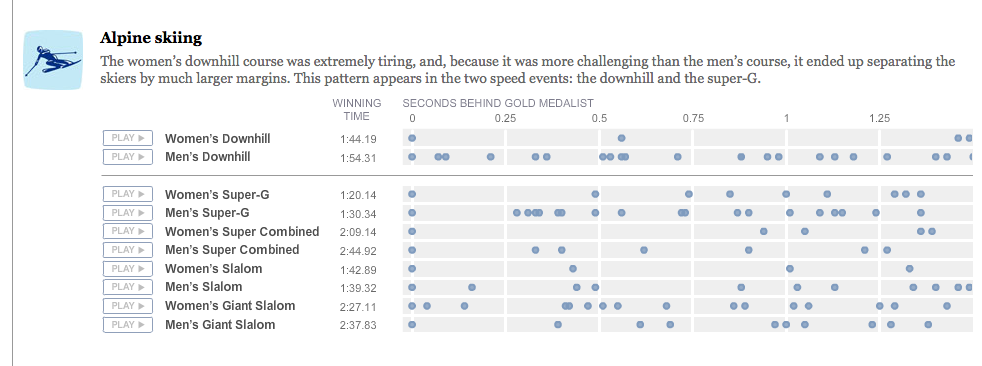
On February 26 of 2010, The New York Times published a sonified visualization to exemplify the small fraction of time that can separate different athletes from wining the gold medal. The author, Amanda Cox, could have encoded this data in a graphic representation –eg. a graph chart indicating the different fractions of seconds-, but instead she used sound to help the reader understand the closeness of the race, which otherwise is hard to perceive. In this case is precisely because of the sound that the visualization –represented as a simple table- makes sense. The user perceives the temporal variation (Hermann et al.) of the information presented thanks to the sound. The time between sounds indicates the closeness the athletes were in winning the gold medal or being in the forthcoming positions.
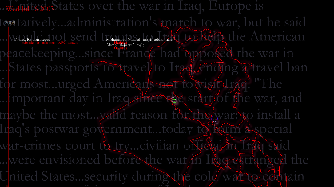
Hard data is a data-mining and sonification project by the artist and composer Luke DuBois. This performer built a database based on different journalistic sources of all the casualties from the Iraq war (men, women, children, soldiers, and displaced and missing people) during one year. The concept of the piece is to evoke how this statistical information would sound. “What is the sound of lost? What is the sound of 3.000 soldiers dead? Or of thousands of civilians dead?”, asks DuBois himself in an interview from the documentary “R. Luke DuBois: Running Out of Time” by H. Paul Moon. What he finally did is to sonify all the casualties’ metrics and ended up with a 7 minutes movement. The final visualization, that combines an explanatory short text and a geospatial map in which the casualties appear with the composition, evokes the type of urgency or violence occurred during the war in a unique form that changes the user’s perception. Here, the pitch, the volume and the duration of the sound vary depending on the number, intensity and type of casualties.
Listen to how the S&P 500 performed throughout 2013, by the CNN
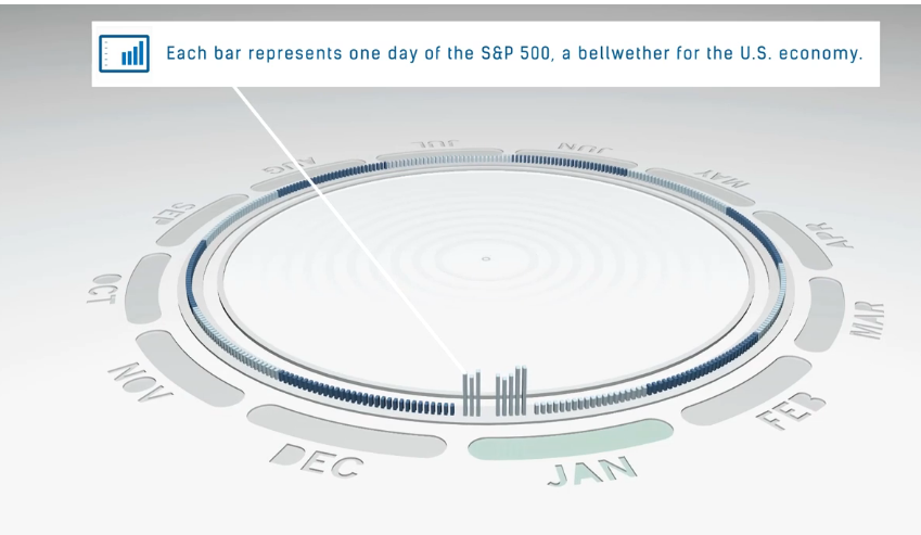
Sometimes, there is some data that is difficult to represent. The CNN money recently published an animated data visualization –a bar chart- that transforms the rise and fall of the 2013 stock market into musical notes (CNN Money). The authors used for every day a piano, an organ, and a guitar to compose reggae-like chords on the off beat of the song. A higher-pitched indicates days that ended with market gains, and a lower-pitched encode the days that ended in a loss (CNN Money). This information could have been represented only with the bar chart, but the music helps to “perceived relations in an acoustic signal for the purposes of facilitating communication or interpretation” (Chair et al.). It adds value and the user can understand the sounds because there is an explanation about the significance of the pitch variations.
Listen to Wikipedia, by Stephen LaPorte & Mahmoud Hashemi

In this visualization –a bubble chart-, Stephen LaPorte and Mahmoud Hashemi sonified recent entries in Wikipedia, in which bells are additions and strings are subtractions (LaPorte & Hashemi). This project is based on Listen to Bitcoin, a sonification by Maximillian Laumeister and, as in Laumeister’s project, the pitch changes according to the importance of the edit; the larger the edit, the deeper the note (LaPorte & Hashemi). This example shows a different way to visualize the functioning of the web-based free-content encyclopedia, and also offers the user a new type of interaction: people can welcome new users by clicking the blue banner and adding a note on their talk page (LaPorte & Hashemi).

In 2013 the artist Qian Liu made the work Cloud Bridge, a project that explores a history of checked-out items by patrons of the Seattle Public Library developed through the “Making Visible the Invisible” artwork by George Legrady. Liu’s work examines how data can be visualized and sonified to enable discoveries, comprehend and scrutinize information by using multi-dimensional depiction in an original way. Instead of creating a static visualization, Cloud Bridge allows the user to query the dataset and create its own visualization (Liu). The use of sound in this artwork, according to its author, its to let the data resonate into the user’s bodies (Liu).
Overall, these examples show how data visualization can be an analytical tool by not only using visual elements, but also auditory means that can convey data by playing with the pitch, volume, intensity and duration of a sound. Some questions remained unanswered, as regarding the concept of data visualization when incorporating sound. Could we still talk about data visualizations or should Academia name it differently? Data visualization scholars have an exploratory path to further research on sound and data, and potentially this considerable amount of unexploited investigation could lead to more interactive, multimodal and innovative information visualizations/sonifications.
References
Aristotle. Metaphysics (Ann Arbor Paperbacks). New York: University of Michigan, 1952.
Broekhuizen, Bas. “How e-learning research can benefit dataviz design”. Basbroekhuizen. 30 March 2012. 15 March 2014. <http://www.basbroekhuizen.nl/2012/03/30/how-e-learning-research-can-benefit-dataviz-design/>
Cairo, Alberto. The Functional Art: An Introduction to Information Graphics and Visualization. Berkeley, CA : New Riders, 2013
Chair, Gregory Kramer et al. “Sonification Report: Status of the Field and Research Agenda”. International Community for Auditory Display. 1999. 15 March 2014. < http://dev.icad.org/node/400>
Crary, Jonathan. “Techniques of the Observer.” October 45 (1988): 3-35. JSTOR. Web. 15 Mar. 2014.
DuBois, Luke. “Hard Data”. Turbulence. 2009. 15 March 2014. <http://turbulence.org/Works/harddata/>
Hermann, T. “Model-based sonification,”. The Sonification Handbook. Logos Berlin, Dec. 2011: 399 – 428.
Hermann, C. Niehus, and H. Ritter, “Interactive visualization and sonification for monitoring complex processes,”.Proc. of the 2003 Int’l Conf. on Auditory Display (ICAD). International Community for Auditory Display, 2003: 247–250.
Hildebrant, Tobias. et al. “Beyond visualization: on using sonification methods to make business processes more accessible to users”. Proceedings of the 18th International Conference on Auditory Display, Atlanta, GA, USA, 18-21 June 2012. Ed. Michael A. Nees, Bruce N. Walker, Jason Freeman. The International Community for Auditory Display, 2012. 248-249.
Kirn, Peter. “Designing the Sound of a Real Car: An Audi, from Silence to Noise”. Createdigitalmusic.org. 11 April 2012. 9 April 2014. <http://createdigitalmusic.com/2012/04/designing-the-sound-of-a-real-car-an-audi-from-silence-to-noise/>
Laumeister, Maximillian. “Listen to Bitcoin”. 10 April 2014.
< http://www.listentobitcoin.com/>
LaPorte, S and Hashemi, M. “Listen to Wikipedia”. Hatnote. March 2014. 10 April 2014. <http://blog.hatnote.com/post/56856315107/listen-to-wikipedia>
Liu, Qian. “Cloud Bridge”. 2013. 10 April 2014. < http://www.mat.ucsb.edu/qian/index.php/currentworks/cloud-bridge/>
Meyer, Richard E. Multimedia Learning. Cambridge: Cambridge University Press, 2001.
Smith, F. Joseph. “Insights Leading to a Phenomenology of Sound”. Southern Journal of Philosophy 5 (1967): 187-199.
Shneiderman, Ben. “The Eyes Have It: A Task by Data Type Taxonomy for Information Visualizations”. Proceedings of the IEEE Symposium on Visual Languages. Washington. IEEE Computer Society Press, 1996: 336-343.
Stefaner, Moritz. “Words, not stories”. Well-formed data. 2 March 2014. 15 March 2014. <http://well-formed-data.net/archives/1027/worlds-not-stories>
Sumikawa, D. A. Guidelines for the Integration of Audio Cues into Computer User
Interfaces. Lawrence Livermore National Lab., CA (USA), 1985. www.osti.gov.
Web. 10 Apr. 2014.