Nothing to Represent Something
On the 6th of September 2014 the conference “Visualise it!” took place in Utrecht. One of the speakers was Andy Kirk, his presentation ‘The Design of Nothing‘ focused on the question: ‘what do the gaps mean?’ In other words: What is the story behind the point of emptiness – often represented as a blank space – in data visualisations?
Kirk studied in what ways the absence of data can reveal a story, and forwards the notion that ‘the gap is the story’. In his presentation he discusses two issues concerning the absence of data. On the one hand he explored one of the practical challenges faced by designers working with data: how to embody something physical when one wants to represent nothing? On the other hand he emphasized the importance of analysing the stories behind blank spaces within data visualisations for the field of humanities. To illustrate the importance of blank spaces, he showed examples of data visualisations concerning social issues that lacked data and suggested illuminating explanations. I will present two examples of the slideshow of Kirk, but first let me explain a bit more about the notion of ‘nothing’.
‘Nothing’ is a difficult term to grasp, just try to define it in a couple of sentences. In what way can one be possibly aware of ‘nothing’? And how could one support the hypothesis ‘there is nothing’? Throughout history, different cultures encompass a widely varied understanding of nothing. For example, in the Buddhist culture the state of nothingness refers to supreme emptiness; being free of sensual desires and greed. While in the West, nothing refers moreover to physical emptiness; to non existence or absence, instead of a state of mind.
The study of the ‘meaning of  gaps’ or ‘absence of data’ implicates that a lack of data is visible because the blank space is surrounded by information. In this sense ‘nothing’ indicates absence of data, discernible through presence of data. The image on the left gives an example of a visual blank space. In 1977, a ‘Top 10 Singles’ list presented a noticeable blank space behind number one. Questioning the lack of data leads us to the story of the English punk band ‘Sex Pistols’ who released their song ‘God Save the Queen’ simultaneously with Queen Elizabeth II’s Silver Jubilee. On account of the lyrics, BBC banned the record of the airplay and several official charge lists represented a blank space instead of ‘God Save the Queen’. It is assumable, that the censorship of the record, moreover, has been the reason for the mainstream popularity.
The example above is self-evident as first of all the blank space is obvious and secondly, the story behind the blank space was easy – and became even easier – to catch. During the presentation Andy Kirk provided data visualizations where the blank spaces are not that easy to identify and, now and then, the relation between presence and absence data allow a various of interpretations.
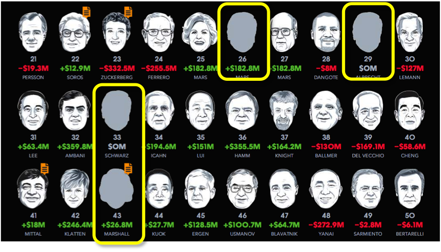
One of Kirk’s examples is the ‘Billionaires’ visualization, by Bloomberg Visual Data. Kirk points to the ‘generic blank faces included among the illustrations of the top 200 billionaires’ (n. p. Kirk). In his presentation he mentioned that he contrived the blank faces somewhat mysterious as they managed to keep a certain anonymity. Moreover, the inclusion of the blank faces can also make you question something about the illustrated faces, did they choose to be recognizable in the Billionaires visualization?
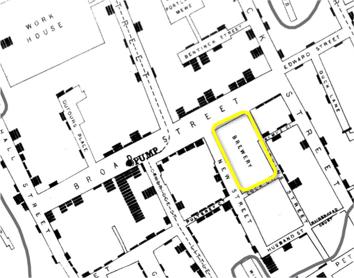
The next example is the original map of John Snow of the outbreak of cholera in London in 1854. The black bars on the side of the streets indicate the deaths from the outbreak. In the middle of the map (encircled in yellow), you see the brewery. If you look another time see that there are no deaths registered at the brewery. Through the map Snow had identified that the source of the outbreak was the public waterpump on Broadstreet. It was believed that the only reason for the blank space at the brewery is that the people, working in the brewery, did not drink any water.
Andy Kirk published the slideshow of the presentation ‘The Design of Nothing’ online. Click here in order to see more examples of Kirk’s presentation.
Resources
Kirk, Andy. ‘Visualizing Zero: How to Show Something with Nothing’. 7 September 2014. http://blogs.hbr.org/2014/05/visualizing-zero-how-to-show-something-with-nothing/


