G is for Google, F is for friendly and I is for innocent

The 11th of August this year Google announced a big change; Google from now on will be part of a new parent company Alphabet which will cover all of Google’s activities. For some this might be a surprising move as Google is such a strong brand. To some extent the point of the new conglomerate is for some companies to disconnect with the Google brand. Larry Page explains:
‘’We are not intending for this to be a big consumer brand with related products –the whole point is that Alphabet companies should have independence and develop their own brands’’ (Page).
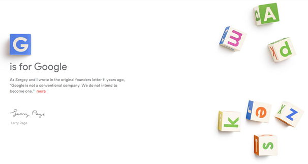
Because of this Alphabet will replace Google as the publicly-traded unit. Alphabet’s name stands for all the different companies which Google already owns and within that alphabet ‘’G is for Google’’.
Over a month after this big announcement on the 1st of September Google introduces another huge change; a new logo. The new logo has three different versions (as seen at the top of this article) which are especially designed to fit different media devices. However, wearables and mobile devices definitely aren’t new anymore. That is why I am arguing that Google’s new logo isn’t just a logical step in a world of seamless computing across different devices, but more than that is the next step in Google’s re-branding process which started with the announcement of Alphabet.
Google seems to be trying really hard to look innocent and simple. The big change into its interface is a part of this. As Lev Manovich explains: ‘’By organizing computer data in particular ways, the interface provides distinct models of the world. (…) Far from being a transparent window into the data inside a computer, the interface bring with it strong messages of its own’’ (76). As the interface brings a strong message of its own, changing the interface might mean changing the message. In the case of Google the logo changed from an old-fashioned style to a simple and clean style. In an article explaining the new logo’s, Google’s designers state the following:
”Today we’re introducing a new logo and identity family that shows you when the Google magic is working for you, even on the tiniest screens” (Google Design).
Google’s simple interfaces hide a black box of difficult algorithms, making its workings seem like ‘’magic’’. However, as Siva Vaidhyanathan explains ”(…) We might live better with Google once we see it as a mere company rather than as a force for good and enlightenment in the world” (1). He explains how googlization, a term introduced in 2003 to describe a growing fear of Google’s technologies and aesthetics in so many different contexts, is visible in almost every part of life. Google’s system is designed to favor maximum data collection and to make everything available everywhere, every-time. So on the one hand Google is a strong brand, but at the other hand there seems to be a rising awareness about googlization. One example of this raising fear for conglomerates like Google is visible in the TV-series Mr. Robot (2015). In this series the protagonist is a hacker who, together with a group of hackers, tries to bring down one of the largest multi-national conglomerates in the world, called E.Corp or ‘Evil-Corp’: ”a powerful group of people secretly ruling the world”.
https://youtu.be/Ug4fRXGyIak
I am not suggesting Google to be like E.Corp, but merely giving an example of a changing discourse; people seem to be more and more aware of the idea that big conglomerates like Google, but also Apple or Facebook are so ubiquitous in daily life. This might be one of the reasons why Google is re-branding their company. As this Wired-article explains: ”The company wants you to think of it not as an all-knowing, all-powerful entity, but as a benevolent guide to this new world, one that considers humans, not machines, the most important thing” (Rhodes n.p).
Just take a look at a screenshot of Alphabet’s new webpage in which Larry Page explains the move to Alphabet.

The alphabet can be seen as an universal reference to children learning to read and write. To make this reference to the innocence of a child even stronger, the page is filled with children’s building blocks. Google’s new logo adds to this, as the designers of the logo illustrate:
”The Google logo has always had a simple, friendly, and approachable style. We wanted to retain these qualities by combining the mathematical purity of geometric forms with the childlike simplicity of schoolbook letter printing” (Google Design).
Not surprisingly the new design kept the famous Google-colors, which the designers in the same article refer to as ”the multi-colored playfulness”, another reference to innocence and friendliness. Google’s name appeals to the imagination and the term googlization is not something new anymore. However, Alphabet doesn’t and also the term ”alphabetization” is not a thing. I think that together with the change to Alphabet.Inc, Google’s logo is an attempt to strengthen Google’s reputation as a friendly brand as innocent as a child instead of a powerful, all-knowing company.
______________________________________________________________________________________________________
References
“Alphabet.” 11 Sept. 2015 <https://abc.xyz>.
Esmail, Sam. Mr. Robot: Official Trailer – New Series on USA. 2015.
“Evolving the Google Identity.” Google Design. 7 Sept. 2015 <https://design.google.com/articles/evolving-the-google-identity/>.
“Google’s Look, Evolved.” Official Google Blog. 11 Sept. 2015 <http://googleblog.blogspot.nl/2015/09/google-update.html>.
Manovich, Lev. The language of new media. MIT press, 2001.
Rhodes, Margaret. “Google’s New Logo Is Trying Really Hard to Look Friendly.” WIRED. 2 Sept. 2015. 13 Sept. 2015.
Vaidhyanathan, Siva. The Googlization of everything:(and why we should worry). Univ of California Press, 2012.