Mapping Shelter
Reorienting Digital Infrastructures to Help Homeless Individuals Access Shelters and Services
Mapping Shelter proposes a critical new media intervention in the way we think of public space in regards to homeless people. The currently prevalent hostile architecture produces a virulent, toxic environment for marginalized communities. Our concept aims to break this trend by repurposing interactive tourist maps in public spaces, guiding homeless people towards shelters with available beds. Through a design that is subtle yet visible, homeless people aren’t driven off into invisibility, but acknowledged and provided with directions.
Shelter Shortage, Invisibility and Scattered Facilities
The amount of homeless people in the Netherlands has doubled over the last decade. Of the over 40.000 homeless, 37% reside in the four biggest cities, likely because aid agencies and facilities are perceived to be better in cities. In reality shelter demand exceeds the supply. This week, Salvation Army chairman Cornel Vader warned for even more homelessness in the future due to governmental cuts. A few months ago he already stated that shelter locations are packed: “We have to deny access to new homeless people, resulting in them ending up on the streets.” Nearly every shelter in Amsterdam has waiting lists, and other cities report getting aid requests from Amsterdam based homeless people. Homeless activist Frank van der Linde: “Night shelter is so packed that it’s rare for a spot to open up. Even if they have a bed available, you have to call them between seven and eight. At one past seven the line is already dead.”
Last summer, activist group Daklozen Actie Kollectief (DAK) organized a sleepover in front of the city hall to raise awareness for the shelter shortage. A reporter asks some of the activists why, compared to cities like Paris and Berlin, the problem isn’t as visible in Amsterdam. One of the activists responds: “Because they’re being shooed away or fined by the police. This makes it invisible, you have to do it secretly.” According to homeless activist Frank van der Linde, dozens of people sleep in the Vondelpark every night: “It is tolerated. Enforcers say: as long as you are not in sight. This is how homeless people are pressed into invisibility. In terms of dignity, I think that goes very far.” The way the homeless are deterred from appearing in public space could explain why the problem is perceived to be less pressing than it really is.
“It is tolerated. Enforcers say: as long as you are not in sight. This is how homeless people are pressed into invisibility. In terms of dignity, I think that goes very far.”
Homeless activist Frank van der Linde on sleeping in the Vondelpark
There are many aid organizations in Amsterdam providing different types of help. The main ones are HVO Querido and the Dutch Salvation Army (Het Leger des Heils in Dutch). They offer shelter, supervised housing and daytime activities for people who (temporarily) cannot get by on their own. In addition to shelters, there are other types of aid facilities. For medical care there is the Kruispost, with a walk-in consultation hour for those without health insurance. Likewise, Dentist for Humanity offers free dental care and for legal matters there is the Straatjurist. Other services include free haircuts, sports and special events during the holidays. ‘Street pastor’ Luc Tanja explains: “There is a lot of aid in Amsterdam, but it is very scattered, in different locations and time slots. This is hard to keep track of.” How would one go about presenting this kind of information in an accessible, orderly fashion?
Past Attempts to Reach the Homeless
Fairly recently, two students Information Sciences from VU Amsterdam designed a smartphone app for homeless people, providing them with links to online information sources. In 2016, The Salvation Army launched a texting-service for homeless people in multiple Dutch cities, sending them updates on locations and weather forecasts. Although these ideas are a step in the right direction, relying on a (smart)phone can be problematic. Some of the issues include:
- Access to (smart)phones: even though a fair amount of homeless people own a phone, they are often unable to get a subscription or internet access (due to not having a home address, bank account or fixed income).
- Dead batteries after longer periods of having no access to electricity.
- Financial problems, drug or gambling addictions can make it tempting to sell the device when in need of quick cash.
- A general distrust in technology/a desire to remain ‘off the radar’ for (debt) authorities.
- The HVO Querido and Salvation Army websites provide no practical information on shelter availability.
In Stockholm, advertising company Clear Channel partnered with the city to give digital ads throughout the city a new purpose: offering homeless people directions to the nearest shelter. When it gets dangerously cold, churches and community centers open their doors to at-risk communities. The locations of these temporary shelters aren’t always known, and new ones fill up quickly. Digital billboards can offer a dynamic solution in this regard. According to David Klagsbrun from Clear Channel, not only have new faces shown up at the shelters, but there are also more volunteers and necessities donated than before. This concept shows how existing, dynamic infrastructure can be repurposed to serve marginalized groups (and apparently giving up some precious ad space might not be too much to ask for either).
Theoretical and Practical Considerations
Product design for this project was driven toward addressing a series of theoretical and practical considerations. These considerations influenced the scope and direction of this intervention functionally, as well as thematically in guiding our overarching aims and vision. Understanding this foundation helps contextualize the ways in which this project reclaims public spaces for the public.
Hostile Architecture and Recent Social Trends
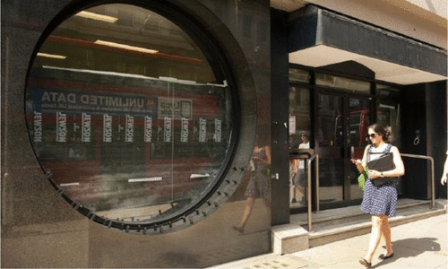
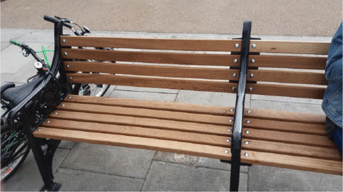
Space and architecture link inextricably in their organization of the homeless within a surrounding society. Homeless individuals often rely on public spaces to fulfill basic needs, but relatively recent trends of hostile architecture highlight the need for new media interventions in social services and architecture. The term ‘hostile architecture’ refers to the relatively recently emergent trend that describes the various structures used to dispel or drive off unwanted groups of people. While the most innocuous examples concern anti-skating installations, more common are those that actively vilify simply existing as homeless, an architectural approach that includes “fitting benches with ugly brackets making it impossible to lie down, installing benches with no backs, and replacing seats at bus and tram stops with ledges for people to lean on,” (Deben, 2003).

These structures isolate and expel homeless individuals from public spaces, continuing a trend that effectively “sends out an unmistakable message to poor, vulnerable and marginalized communities: you are not welcome in the social community,” (Bocchialini, 2019). Many examples of hostile architecture may not be immediately recognizable to those not directly influenced, which makes their influence all the more concerning, as they can even prevent the homeless from finding and receiving aid by pushing them toward the periphery of the social environment (Stevens, 2017).
Intervention as Alternate Reality
Hostile architecture comes as part of larger trends in neoliberalism “which seek to commodify public space,” (Zanotto, 2012). Commodification of public space undercuts the ability for a space to serve a wider variety of individuals in favor of accommodating the most financially profitable groups. The influence of this trend is particularly poignant in Amsterdam, where many of the most visible public spaces also serve as tourist hot spots. The growth of homelessness in the Netherlands thus coincides dangerously with heightening anti-homeless sentiments and the emerging practice of hostile architecture to produce a virulent, toxic environment for marginalized communities.

Our project proposes an alternate reality in which the implementation of inclusive architecture can serve the interests of both tourists and the homeless alike; this intervention will utilize existing map boards (that currently display advertisements, and public maps when activated by a user) to display dynamic information for homeless throughout the city. These boards will direct individuals to information regarding shelter options, availability and food resources. This intervention is driven primarily by the potential benefits of inclusive architecture, which “raise awareness and also manage to capture and convey a sense of an alternative reality that most people find far more appealing” than hostile architecture that fosters disheartening sentiments toward the homeless community (Bocchialini, 2019). Beyond directly benefiting the homeless by pointing them toward the existence and availability of resources, these boards also work to deconstruct the stigmatization and social weight of homeless by producing an awareness of need. Awareness of need is the first prerequisite for philanthropy and can increase charitable giving by as much as 85% (Bekkers & Wiepking, 2007). For the homeless, this can mean access to necessary resources.
Design Drivers: Inspiration from Theory and Practice
Our project was therefore guided by three categories of design drivers: theoretical, practical, and feasible. Our theoretical approach was based primarily on theories of accessibility, availability, and stigmatization. Research shows that the stigma of homelessness can be considered a barrier for success in social service projects (Boylston & O’Rourke, 2013), particularly for the newly homeless and young adults (Ha et al, 2015). Ultimately, we decided on a balanced approach to destigmatize homelessness while tending to user preferences and caring for potential user shame. Our project hopes to confront and dispel this stigma by simultaneously addressing homelessness without shame while refraining from spotlighting users who may feel uncomfortable.
The practical approach for this intervention revolved around the explicit purpose of these dynamic boards. In this category, we held a focus on functionality, navigability, and usefulness. More than anything, these boards needed to provide a legitimate functional purpose in order to reorient it as inclusive social architecture, and our vision of helping the homeless access resources is intentionally guided toward this output. Homeless individuals often note “the challenge of getting to shelters before even knowing if she would be able to stay,” (Ha et al, 2015). Despite the extensive nature of public transport in Amsterdam, this problem fits our project as well. For those individuals unable to access those systems of public transportation, traveling across even the inner ring to multiple shelters presents a daily challenge. As such, our boards will help homeless individuals make shelter decisions before exhausting themselves by informing them about the availability of beds and resources.
Finally, our intervention had to remain feasible. As such, we developed two paths of development for the introduction and utilization of these changes. Given the scope and responsibility of this topic, our intervention weighs equally the ideal scenario in which our structure could be implemented to maximize the project’s potential, as well as proposes more immediate options for consideration.
Designing Solutions
In the following we will demonstrate how we tried to address the above-mentioned categories of design drivers and what challenges we faced as a consequence of them.
Using Existing Infrastructure
Accessibility, availability, and stigmatization, a triumvirate that, in order to be addressed, first required a study of the already existing infrastructure. In December 2015, the largest outdoor advertising corporation in the world JCDecaux (JCDecaux, Number One) launched the so called Mupi-network in Amsterdam (JCDecaux, Mupi-netwerk). It added 15 high resolution 84 inch screens with moving images to the already existing and highly visible network of printed advertisement billboards and wrapped public transportation vehicles (JCDecaux, Mupi-netwerk). Located in key tourist, cultural and social areas of the city such as the Damrak, the central station, the Museumkwartier, Leidseplein, P.C. Hoofdstraat, and Beethovenstraat, these digital billboards offer high visibility as well as flexibility for advertisers. At Damrak, for example, an average of 60’000 daily passersby are exposed to them (JCDecaux, Amsterdam). As many of the potential advertisement viewers are tourists, a more recent addition to the Mupi-network was made. In collaboration with amsterdam&partners – more commonly known as Iamsterdam – some of the 84 inch screens have been outfitted with a white touch capacitive button. If tapped, the advertisements get replaced by a temporary tourist information page showing a map with the closest attractions.
Crucially, those key tourist, cultural and social areas of Amsterdam are not only frequented by tourists and local passersby, but also by homeless people – as can be seen not only by encountering people in need but also by the hostile architecture characteristic of those spaces. As we have already established, making a new media intervention accessible to them comes with certain challenges. More often than not there is no access to electricity, no access to a smartphone or the internet and a rather well-established suspicion of digital media. The re-appropriation of the Mupi-network and its extension of an additional non-ad-interface allows us to address those challenges. The digital billboards are widely available across the city centre and easily accessible 24 hours seven days a week. They can be used anonymously and free of charge.
Finding an Aesthetic
What needed special attention and heavily influenced our design, however, is the problem of stigmatization. As is evident with the hostile architecture, homelessness is not tolerated in public spaces such as the Leidseplein. By proposing an alternative use of advertisement billboards to show information about close-by food and shelter, our intervention would radically render visible what is preferably kept invisible. In addition, viewing our interface would possibly induce a sense of shame for the user. The problem is therefore two-fold. Our design needed to be visually subtle and pleasing enough to a) cater to the aesthetic of amsterdam&partners and b) to provoke a curiosity in passersby without drawing too much attention to the viewer. Finally, we also needed to make a dogmatic decision by prioritizing the potential help our intervention could offer over the potential loss in display time for advertisements. After all, our interface would still be hidden behind the tap of a button – just as the tourist information map is.
How It Works
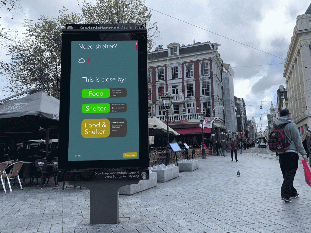
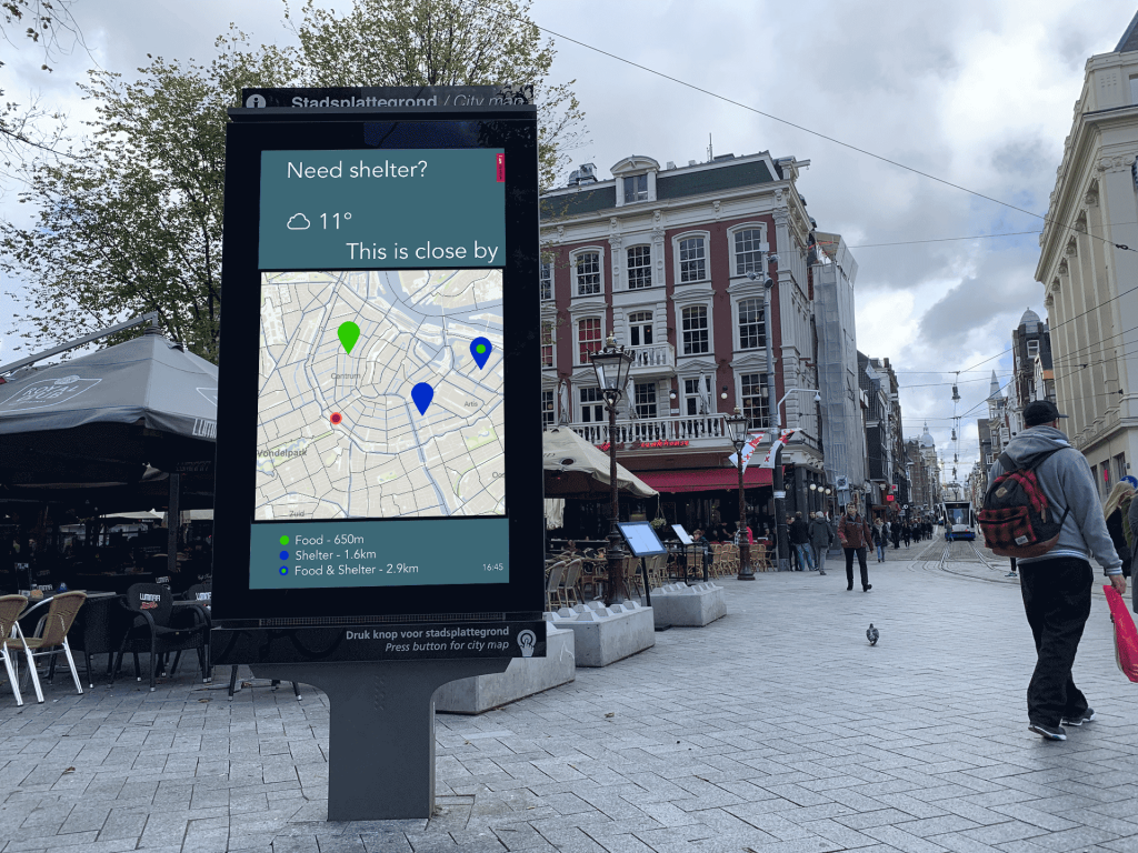
In terms of functionality and navigability, our project tried to be self explanatory and easily understandable at a glance with both implementations. The first envisions a more radical intervention that would require a modification to the infrastructure. It involves a fully functional touch screen that can be interacted with and therefore allows us to display more useful information. The second envisions a more easily implementable and therefore more feasible intervention, as it strictly follows the limitations of the infrastructure already in place. Both interfaces can be reached via the same white button. Instead of the short tap to reach the tourist information page, our interface can be reached by tapping and holding the same button.
With saturated accent colors for available and more subtle colors for shortly available options, it is immediately obvious if help can be found close by. By using the same font as is used for the tourist information map, consistency across both non-ad-interfaces is ensured.
However, we chose not to use the bold font style and red accent color for the title of our interface as it would draw too much attention. In addition, the word choice was important to us. Instead of asking “are you homeless” we opted for a more general “do you need shelter”. By finally positioning the shelter map at the same location it would be on the tourist information page, a smooth transition without too abrupt of a visual change between both interfaces can be achieved.
Conclusion
Our goal was to propose a critical new media intervention by reorienting existing digital infrastructures to help homeless individuals access shelters and services. In embarking on our project, we first had to gain an understanding of the situation of homelessness in the Netherlands generally and in Amsterdam more specifically. Our research showed, that there was an exceeding need for more easily accessible information on the availability of homeless shelters and for public awareness of homelessness as a social reality. Many previously attempted interventions had failed due to challenges concerning the possession of smartphones, the use of computers, and a widely spread suspicion in relation to digital media in general. By approaching our design via the three categories: theory, practice, and feasibility, we were able to address many of the challenges facing such an intervention. Our proposition is widely available, easily accessible, cheaply implementable, and can be used anonymously as well as free of charge. We believe that the potential help our design could provide far outweighs the potential loss in display time for advertisement and could, in turn, itself act as an advertisement for the city of Amsterdam.


References
Bocchialini, Matteo. “The Growth of Hostile Architecture: How Developments in Urban Design Are Exacerbating Social Injustice – A-Id.” Agenda for International Development, 30 Mar. 2019, www.a-id.org/2019/03/30/the-growth-of-hostile-architecture-how-developments-in-urban-design-are-exacerbating-social-injustice/.
Boylston, Mary T & O’Rourke, Rosemarie (2013) Second-Degree Bachelor of Science in Nursing Students’ Preconceived Attitudes Toward the Homeless and Poor: A Pilot Study. Journal of Professional Nursing. [Online] 29 (5), 309–317.
Crisis bij daklozenopvang Amsterdam: opnamestop bij Leger des Heils. https://nos.nl/l/2289066. Accessed 22 Oct. 2019.
Daklozen Pikken Het Niet Langer En Eisen Meer Opvangplekken. YouTube, https://www.youtube.com/watch?v=qT51UaIhCfg. Accessed 22 Oct. 2019.
Deben, Leon. “Public Space and the Homeless in Amsterdam.” Amsterdam Human Capital, edited by Sako Musterd and Willem Salet, Amsterdam University Press, Amsterdam, 2003, pp. 229–246. JSTOR, www.jstor.org/stable/j.ctt46mv3p.16.
Effting, Maud. “Dan maar in het Vondelpark kamperen, want ‘wij als daklozen kunnen ’s nachts niet verdampen’.” de Volkskrant, 22 Aug. 2019, https://www.volkskrant.nl/gs-bbb48c0d.
Ha, Yoonsook et al. (2015). “Barriers and Facilitators to Shelter Utilization Among Homeless Young Adults.” Evaluation and Program Planning 53: 25–33. Web.
JCDecaux. JCDecaux: Amsterdam. 23 Oct. 2019, https://www.jcdecaux.nl/amsterdam.
JCDecaux. JCDecaux introduceert digitaal Mupi-netwerk Métropole. 1 Dec. 2015, https://www.jcdecaux.nl/nieuwsberichten/jcdecaux-introduceert-digitaal-mupi-netwerk-metropole.
JCDecaux. JCDecaux: Number One Outdoor Advertising Company in the World. 9 Feb. 2011, https://www.jcdecaux.com/press-releases/jcdecaux-number-one-outdoor-advertising-company-world.
Jonk, Erik. “Sms-dienst voor daklozen: info en hart onder de riem.” Metronieuws.nl, https://www.metronieuws.nl/smsdienst. Accessed 22 Oct. 2019.
Nieuwenhuis, Marcia. “Aantal daklozen verdubbeld: ‘Iedereen kan het worden.’” Het Parool, 23 Aug. 2019, https://www.parool.nl/gs-b58f02d8.
Sms-Dienst Voor Daklozen Amsterdam “heel Nuttig” – RTL Nieuws. YouTube, https://www.youtube.com/watch?v=vQvYsvnCHpY. Accessed 22 Oct. 2019.
Stevens, Simon (2017) Life and Letting Die: A Story of the Homeless, Autonomy, and Anti-Social Behaviour. Organization Studies. [Online] 38 (5), 669–690.
“Stijging aantal daklozen in Amsterdam nog groter dan landelijk.” https://www.at5.nl/artikelen/196298/stijging-aantal-daklozen-in-amsterdam-nog-groter-dan-landelijk. Accessed 22 Oct. 2019.
“Their story, our care.” HVO-Querido, https://hvoquerido.nl/english/. Accessed 22 Oct. 2019.
Visser, Welmoed. “Studenten maken app voor daklozen.” Advalvas, https://www.advalvas.vu.nl/nieuws/studenten-maken-app-voor-daklozen. Accessed 22 Oct. 2019.
Zanotto, Julianna Marie. (2012). Public spaces, homelessness, and neo-liberal urbanism: A study of ‘anti-homeless’ strategies on redeveloped public spaces. Retrieved from https://etd.ohiolink.edu/
Bekkers, René & Wiepking, Pamala. (2011) A Literature Review of Empirical Studies of Philanthropy: Eight Mechanisms That Drive Charitable Giving. Nonprofit and Voluntary Sector Quarterly. [Online] 40 (5), 924–973.