Visual vernaculars, Brad Troemel and the Instagram Infographic Industrial Complex

Brad Troemel and the Instagram Infographic Industrial Complex
Brad Troemel is an American artist whose work belongs to the ‘post-internet art’ movement. Concerned with the implications of digital culture, Troemel has been reappropriating digital practices within pop culture to provide commentary on several issues, including the art market and cultural institutions. Often blurring the line between memes and art, his satirical works have sometimes become viral images whose uncertain provenance caused much confusion. In April 2020, Troemel posted this presidential campaign advertisement on his Instagram that depicted Joe Biden next to the slogan “His brain? No, his heart”. Both Biden and Trump supporters later earnestly shared the image who believed that the advertisement was real. In a later post, Troemel explains that the reason why so many people shared the photo was because the ad was believable. It successfully played with the expectation of users across platforms of what political messages could look and sound like.
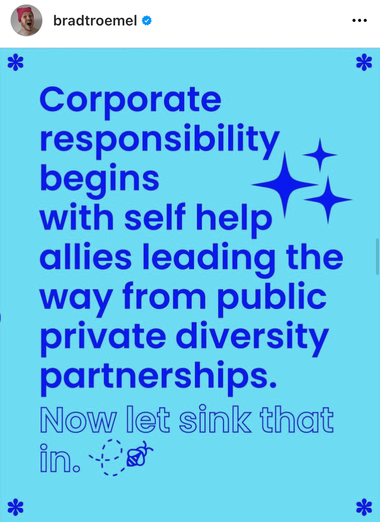
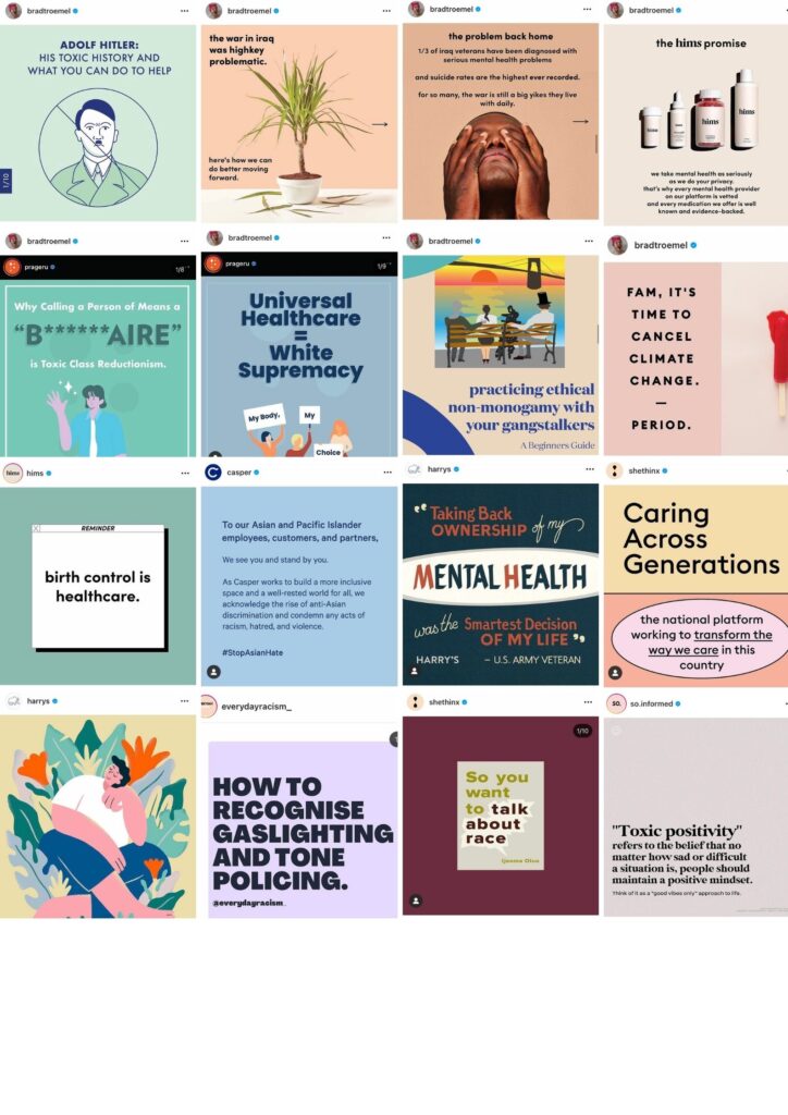
In line with his previous works, Troemel has used Instagram to share absurd collections of images that visually resemble infographics created by activists active on the platform (Figure 1). Pastel coloured illustrations of cartoonish people with disproportionate limbs are intertwined with inspirational messages filled with buzzwords, often creating nonsensical text. Some posts lecture on “why calling a person of means a “b******aire” is toxic class reductionism”, others over-use slang to explain how “the war in iraq was highkey problematic”, and others don’t even attempt to make sense and read: “yes, why race russia’s centering insurrection amplifies fascist calls into allies on”. Such practice and style of posts have been occasionally referred to as the “Instagram Infographic Industrial Complex”, ironically pointing out the tropes of the activist communities that employ such aesthetics. These design tropes not only belong to digital activism on Instagram but can also be often found in the branding strategies of companies with a millennial consumer base. Troemel hosts a series on this topic titled ‘pastel hell: a guide to millennial aesthetics’, which links millennial audiences with a particular visual grammar, as he explains in this video.
Further demonstrating the link between the two, in a 2020 Vox article by Terry Nguyen, activists explained how in their posts they had appropriated “content packaging” techniques from companies’ branding strategies with “corporate-minded, girl-boss feminists” audiences (Nguyen 2020). In the following sections, the practices, vernaculars and aesthetics of what has been ironically referred to as the “Instagram Infographic Industrial Complex” will be unveiled, as well as how artist Brad Troemel has subverted such expectations.
The whole picture
Metapicturing involves several research practices that take groups of images as data points. To avoid excess levels of abstractions from groupings, single images are to be retained and analyzed, meaning that metapicturing allows for both close and distant reading (Rogers 2021). According to Rogers, metapicturing lends itself particularly well to vernacular platform research (6). Platform vernaculars are cultural or subcultural practices belonging to digital communities that have developed contingently to the platform they inhabit. The term, introduced by Gibbs et al. (2014), refers to a wide range of “styles, grammars, and logics” (257) that arise from how users adapt to but also subvert and appropriate the affordances of social media platforms. Hence, the aesthetic and visual vernaculars of communities can be illuminated through metapicturing, rendering these techniques particularly effective for the study of platforms that heavily rely on visual content, such as Instagram. While the use of software to create such image composites goes beyond the scope of this blog post, the metapicturing approach suggests a type of sensitivity that is a helpful starting point for further research.
Instagram’s aesthetics
Instagram’s visual style has been the object of research throughout the platform’s development, with work such as the one of new media theorist Lev Manovich (2017), analyzed the platform’s aesthetics to be its defining feature: “if Google is an information retrieval service, Twitter is for news and links exchange, Facebook is for social communication, and Flickr is for image archiving, Instagram is for aesthetic visual communication” (41). Other scholars such as Leaver, Highfield, and Abidin (2020) attempted to track the development of Instagram’s aesthetics, taking into consideration the structural constraints of the app, but also “contextual and historical factors” linked to the evolution of mobile and digital technologies and the visual cultures that arose from them (63). Their work poses interesting questions over the existence of an ‘Instagram aesthetic’ as such, and it is safe to say that no singular style can be attributed to the whole of the platform. Different communities have developed their grammars of visual communication (Leaver, Highfield, and Abidin 2020, 62). While some styles might be more endemic to Instagram, multiple aesthetics coexist and display platform-crossing dynamics. The aesthetics investigated today seem to oppose the aesthetics of the Internet Ugly directly. According to Douglas (2014), the Internet Ugly is a style in digital visual culture that embraces the messy, mundane, and amatorial image over the smooth, beautiful and commercial one. Douglas argues that, whereas commercial attempts to appropriate the Internet Ugly have almost always failed, all other internet aesthetics can be easily co-opted by corporate entities, demonstrated in the case of the “Instagram Inphograpahic Industrial Complex”. But what does this aesthetic look like?

A brief analysis
As outlined by Rogers, studying style could be done through software that groups images by similarity, ordering them according to formal properties (Rogers 2021, 5). These formal properties can also become apparent through placing infographics and brand’s posts found on Instagram side by side. For example, let’s take hims, a beauty and health company, and so.informed, a popular Instagram account that shares information relating to progressive politicss. The @hims logo seems to use the same font as many of @so.informed’s posts. The tones and hues of @hims overall brand are muted beiges, pale yellows and light greens, the same colour palette of @so.informed.
These two Instagram accounts are just a tiny sample within a much greater wealth of content published on Instagram every day by companies and activists alike. While it is a limited amount of data, these posts provide a cross-section of Instagram aesthetics that are strangely employed for commercial and informational purposes, posing questions over the complicated relation of branding to online activism (Figure 2). These slideshows deal with similar issues, calling for increased awareness on problems such as mental health or reproductive rights, climate change, feminism and much more. They are also carefully designed with sleek, minimalist colour schemes, occasionally accompanied by illustrations belonging to the genre often referred to as ‘Corporate Memphis’ (Gabert-Doyon 2021). These visual and textual practices have given rise to a specific aesthetic vernacular that has been carefully observed and reappropriated by Brad Troemel.

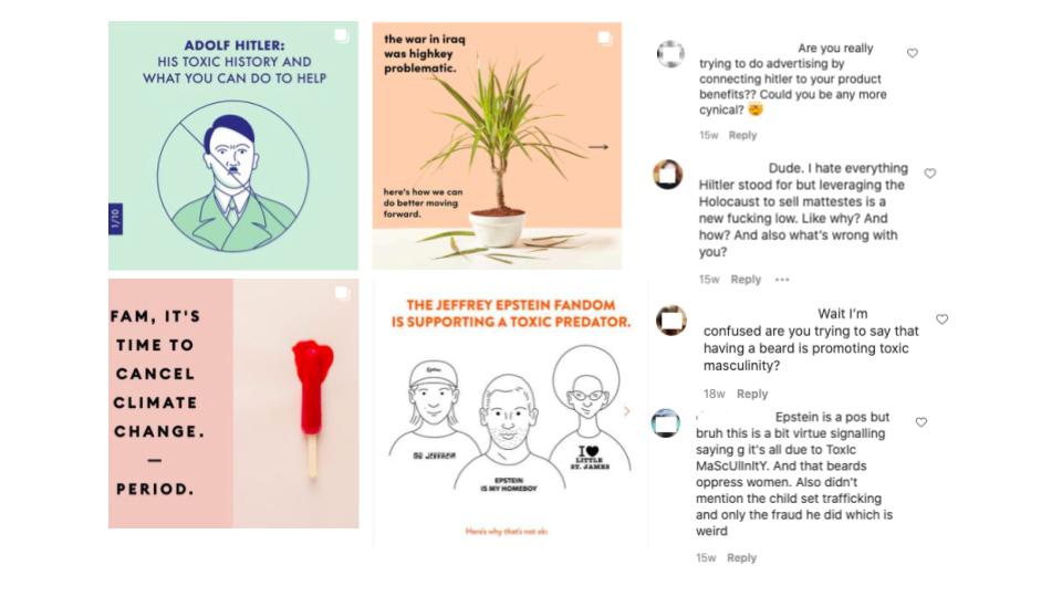
These four slideshows (1, 2, 3, 4) represent perhaps the epitome of Troemel’s work. They all begin with infographics tackling various issues, such as climate change and the war on Iraq, and all ending with advertisements for companies. The post is an absurd yet believable meme-like artefact. Jeffrey Epstein, toxic masculinity, and shaving products are all linked in Troemel’s imaginary. Demonstrating how much these visual vernaculars are embedded in the expectations of Instagram users, the comments (Figure 3) reveal a level of confusion amongst people not familiar with the artist who take these ads at face value. Parody and pastiche, then, seem to work perfectly well online, where subcultural practices are so deeply embedded in aesthetic vernacular.
Bibliography
Douglas, Nick. 2014. “It’s Supposed to Look Like Shit: The Internet Ugly Aesthetic.” Journal of Visual Culture 13 (3): 314–39. https://doi.org/10.1177/1470412914544516.
Gabert-Doyon, Josh. 2021. “Why Does Every Advert Look the Same? Blame Corporate Memphis.” Wired UK, January 24, 2021. https://www.wired.co.uk/article/corporate-memphis-design-tech.
Gibbs, Martin, James Meese, Michael Arnold, Bjorn Nansen, and Marcus Carter. 2014. “#Funeral and Instagram: Death, Social Media, and Platform Vernacular.” Information, Communication & Society, December. https://www-tandfonline-com.proxy.uba.uva.nl/doi/abs/10.1080/1369118X.2014.987152.
Leaver, Tama, Tim Highfield, and Crystal Abidin. 2020. Instagram: Visual Social Media Cultures. Newark, UNITED KINGDOM: Polity Press. http://ebookcentral.proquest.com/lib/uvanl/detail.action?docID=6027966.
Manovich, Lev. 2017. Instagram and Contemporary Image. http://manovich.net/index.php/projects/instagram-and-contemporary-image.
Nguyen, Terry. 2020. “PowerPoint Activism Is Taking over Your Friends’ Instagram Accounts.” Vox. August 12, 2020. https://www.vox.com/the-goods/21359098/social-justice-slideshows-instagram-activism.
Rogers, Richard. 2021. “Visual Media Analysis for Instagram and Other Online Platforms.” Big Data & Society 8 (1). https://doi.org/10.1177/20539517211022370.