A New Frontier for Data Visualization: Political Campaigning on Social Media Platforms
Infographics, bar charts, projections — leading up to the German general election last week, social media feeds were flooded with a plethora of different visualizations in order to mobilize voters. Especially among young voters, social media has become a battleground for political campaigning.
For many parties, particularly infographics and data visualizations, conveying complex issues and comprehensive party programs in easily digestible formats and bright colors, have become a preferred medium. Not only does this new form of political campaigning challenge our understanding of the importance of different types of media, but it also reconfigures the role and the value of data visualization.
Data visualization, in the traditional sense, is the reduction and schematization of abstract data, to relay complex patterns and relations between objects (Manovich 2011, 38). In his book The Visual Display of Quantitative Information, Edward R. Tufte describes data visualization, or ‘data graphics’, after the 1970s as “[…] instruments for reasoning about quantitative information.” (Tufte 1983, 53). Manovich extends this definition for his ‘information visualizations’, arguing that not only quantitative information, or numerical data, can be represented visually, but also non-numeric data, “[…] such as text or networks of relations.” (Manovich 2011, 37).
At its core, however, both authors would argue that data visualization attempts to objectively and accurately represent complex data through the use of spatial variables, such as size, position, or shape (39). Especially Tufte condemns the use of decorative elements that would distract from the representation of data, or even distort it (Tufte 1983, 59). While Manovich does not share that opinion, the author does argue that other visual dimensions of information visualization are secondary to spatiality (Manovich 2011, 40).
The Political Power of the Infographic
Both authors make compelling points, especially in their respective historical contexts. With the rise of social media as a dominant form of communication, data visualization, information visualization, and infographics have gained new meaning and a new value. Rather than simply visually representing large data in an easily comprehensible format, visualizations on social media are used to mobilize, convince, and bring attention to important issues (Amit-Danhi & Shifman 2018, 3554; Otten et al. 2015, 1901). This issue is particularly interesting to look at, since the past year, the United States and Germany saw a large number of digital natives participating in large-scale political elections for the first time.
Social media has become a primary source for young people to consume news and receive political information (Ohme 2019, 121), which ultimately can affect crucial decisions like the choice to vote for a specific party. Many candidates and parties have realized the importance of social media channels for information acquisition among young voters, leading to an increased presence of political actors, and direct contact between politicians and the electorate (120). With that, visualization of data gains new meaning. Spreadable data visualizations can be an important tool in “[…] aiding a political actor in gaining headway in the competition over the dominant narrative of a political reality.” (Amit-Danhi & Shifman 2018, 3545).
As a result, from impersonal, objective visualizations of data sets, political data visualization and infographics on social media now aim to appeal to voters and emphasize charisma and personality, adding an emotional dimension (3545) to the formerly static and cold data graphics of Tufte. While emotional appeal does not work for every political candidate, those outside the political mainstream that are considered ‘anti-establishment’, see success in employing emotional triggers, such as anger, or fear (Amit-Danhi & Shifman 2020, 14). Furthermore, in the same article, Amit-Danhi and Shifman also show that comparative rhetoric is a useful tool in the use of infographics (12).
Data Visualizations and First Voters in the 2021 German General Election
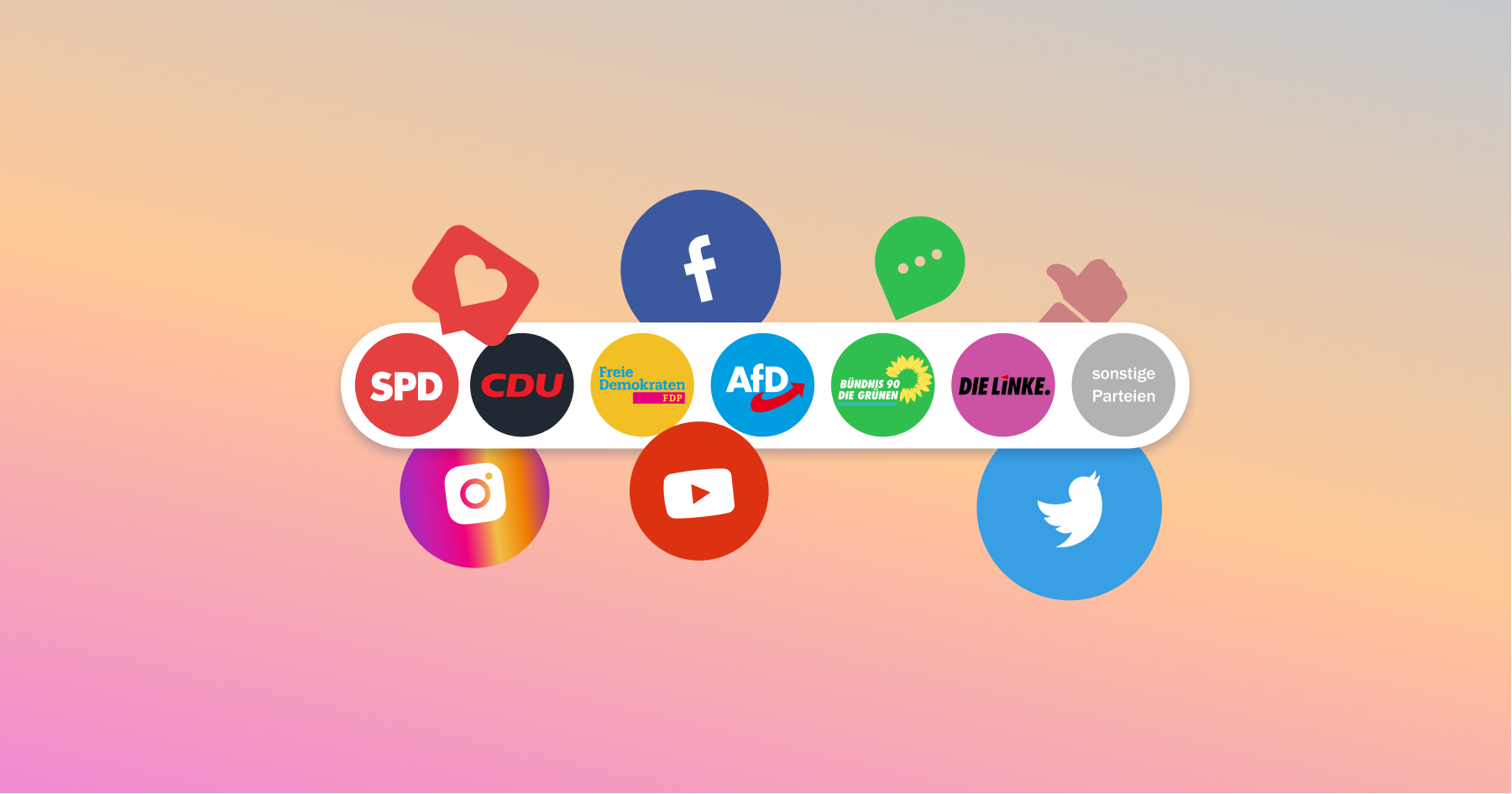
For the 2021 election, political parties have invested more money than ever in social media advertising. Germany’s Green Party, one of the smallest parties in the parliament, spent over one million euros on advertising and paid promotions across social media channels (Meyer et al. 2021). Political parties, but also individual politicians replicate TikTok trends and engage in discussions on Twitter, but the most important tool for digital campaigning is Instagram (Weinmann 2021).
Particularly Infographics are a useful tool to quickly and concisely convey core issues and positions of political candidates to the electorate. Like traditional data graphs that try to schematize numerical data into accessible formats, infographics aim to summarize and reduce party programs, which with up to over 60.000 words sometimes constitute large, complex data sets, in order to skew political opinions.
However, it seems like the most popular visualizations are not the classical formats of pie charts, scatter plots, or line graphs, like discussed by Tufte and Manovich, respectively (Tufte 1983; Manovich 2011), it is more so the visual dimensions that Manovich regards as secondary (Manovich 2011, 40), which are now the primary focus of these graphics. These include the use of colors, but increasingly, iconography and symbols from internet vernacular, like emojis or likes are employed. In a study by Boutet et al. on the influence of emojis on digital interactions, it was discovered that emojis effectively convey emotions, and also increase the speed and efficacy of processing (Boutet et al. 2021, 11). Especially in a context that aims to influence political opinions, and therefore requires a precise and fast understanding of complex issues, the use of simple symbols that are borrowed from the vernacular of digital natives, is an effective strategy.
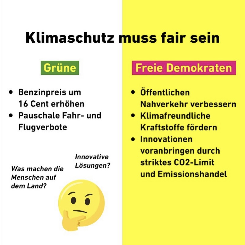
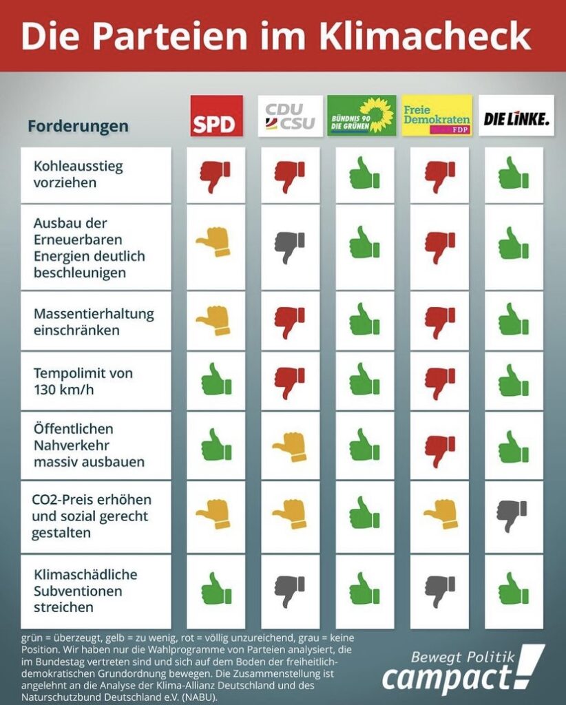
Fig. 3 instagram.com/joerg_spengler Climate policies of the five major political parties. Their efficacy is indicated by the direction and color of the thumb.
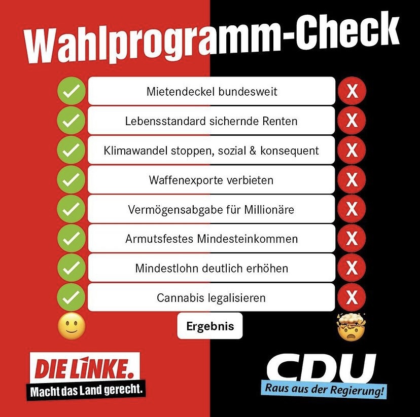
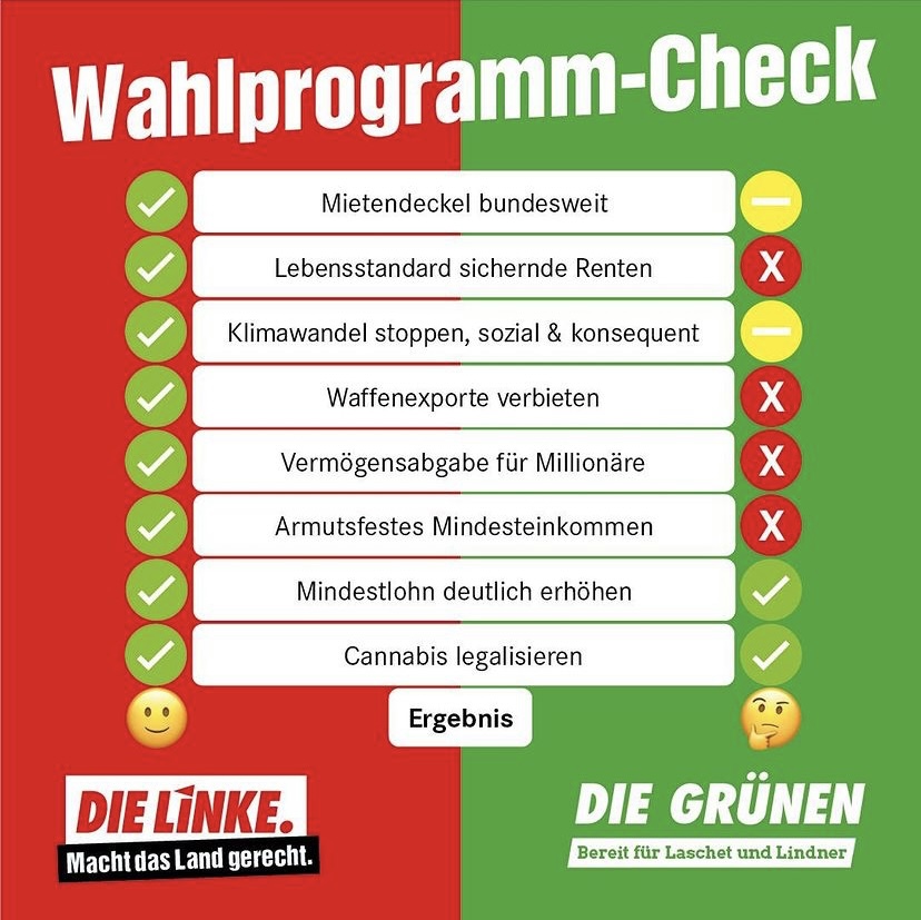
As examples, shown here are a few infographics/Visualizations from different accounts around climate- and general policies of the major German political parties. A major theme among these types of graphics is the use of comparisons, which have been identified to be particularly effective (see fig. 1).
Furthermore, colors like green and red, to symbolize approval and disapproval, are often used. Additional to these colors, which evoke emotions, Emojis, and other symbols show a clear position. A thumbs-up, similar to a Facebook ‘like’, shows good policies. A thumbs down, the opposite (see fig. 3). Smiling emojis show a general content with policies, a questioning emoji seems to be unsure about a party’s program (see fig. 2), the ‘mind blown’ emoji shows utter shock and complete disapproval.
Conclusion
Social media seems to be taking on a central role in political campaigning, as digital natives slowly make up larger parts of the electorate. Information visualizations and Infographics constitute a large amount of political content consumed on social media, and their efficacy and influence are not to be dismissed. The unique vernacular of social media channels and young voters requires a new visual langue, however. To convey data is not to simply represent complex relations through spatial variables.
The role of the infographic is to convince, mobilize, and bring awareness to issues. This new frontier requires an updated understanding of the role and value of visualization. However, we also have to critically evaluate the increasing impact of this form of visualization, as data visualizations never tell the entire story, and especially in the political arena, nuance and important differentiations get lost. As Manovich fittingly expresses: “We throw away 99 per cent of what is specific about each object to represent only 1 per cent […].” (Manovich 2011, 38).
Bibliography
Amit-Danhi, Eedan R, and Limor Shifman. 2018. “Digital Political Infographics: A Rhetorical Palette of an Emergent Genre.” New Media & Society 20 (10): 3540–59.
Amit-Danhi, Eedan R., and Limor Shifman. 2020. “Off the Charts: User Engagement Enhancers in Election Infographics.” Information, Communication & Society, May, 1–19. https://doi.org/10.1080/1369118X.2020.1761858.
Boutet, Isabelle, Megan LeBlanc, Justin A Chamberland, and Charles A Collin. 2021. “Emojis Influence Emotional Communication, Social Attributions, and Information Processing.” Computers in Human Behavior 119: 106722-.
Manovich, Lev. 2011. “What Is Visualisation?” Visual Studies (Abingdon, England) 26 (1): 36–49.
Meyer, R., N. Niedermeier, and M. Zajonz. 2021. “Bundestagswahlkampf: So werben die Parteien auf Social Media.” ZDF. September 22, 2021. https://www.zdf.de/uri/927337f2-2767-46e6-af49-d7a3b5220635.
Ohme, Jakob. 2019. “When Digital Natives Enter the Electorate: Political Social Media Use among First-Time Voters and Its Effects on Campaign Participation.” Journal of Information Technology & Politics 16 (2): 119–36.
Otten, Jennifer J, Karen Cheng, and Adam Drewnowski. 2015. “Infographics And Public Policy: Using Data Visualization To Convey Complex Information.” Health Affairs Web Exclusive 34 (11): 1901–7.
Tufte, Edward Rolf. 1983. The Visual Display of Quantitative Information. The Visual Display of Quantitative Information. Cheshire, Conn: Graphics Press.
Weinmann, Lea. 2021. “Instagram: Wie Algorithmen den Bundestagswahlkampf beeinflussen.” Süddeutsche.de. September 16, 2021. https://www.sueddeutsche.de/politik/instagram-facebook-wahlkampf-politik-parteien-social-media-ingrid-brodnig-datenanalyse-algorithmus-bundestagswahl-1.5410300.