Data Visualization and the Aestheticization of Activism on Instagram
In Kennedy and Hill’s article “The Pleasure and Pain of Visualizing Data in Times of Data Power” the way data is communicated through visualization is explored along with the ideological work that is involved, the ways in which data visualization can create space for agency in access to information and how this can connect to “a politics of possibility” (10). Kennedy and Hill emphasize the importance of critical thinking when approaching data visualization due to the nature of encoding knowledge and the potential for misinformation.
As a visual social media platform Instagram has become an ideal medium for users to post and share user-generated data visualizations. Instagram is a photo and video sharing app launched in 2010 that has an estimated 1.41 billion users globally (Iqbal). Users, 70% of which are under the age of 35, use the app to share daily stories, post pictures to their feeds and engage with various brands, celebrities or causes. Users can post one to ten photos accompanied by a caption and geo-location. When posting multiple photos it is displayed as a carousel where other users need to scroll horizontally to see the next picture. Interactions between users include liking and commenting on posts, sharing others posts in the Stories feature, tagging users in pictures or Stories, reacting or sending private messages through the Stories feature and direct messages through the messenger function. Stories of followed accounts are displayed horizontally as outlined circles at the top of the feed and posts need to be scrolled through vertically. All the functions available on the platform are communicated through simple symbols. There is very little text visible on the interface making the main focus the images posted by users, either on the main feed or on Stories.
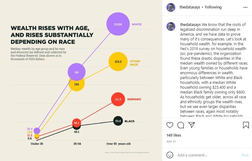
Instagram is a “image-driven platform” which has, along with its users, created and conformed to a very specific, evolving aesthetic (Rogers 3). The platform “is grounded in visuality and ‘aesthetic visual communication’” (Shahin 2). For this reason it has emerged as the perfect medium to display and circulate data visualizations by data journalists and artists. Through the utilization of this platform “the interactive and communicative capacities of DVs [data visualizations] has become all the more prominent” (Shahin 2). The importance of aesthetics on the platform has pushed for more creative and artistic ways of displaying data. Utilizing Instagram as a knowledge sharing platform became popular using infographics, bold text on pastel-coloured backgrounds explaining complex topics such as medical racism and defunding the police. These infographics prioritize aesthetically pleasing colour schemes and images in order to bypass an algorithm that favors inspirational quotes on simple backgrounds and stylized images.
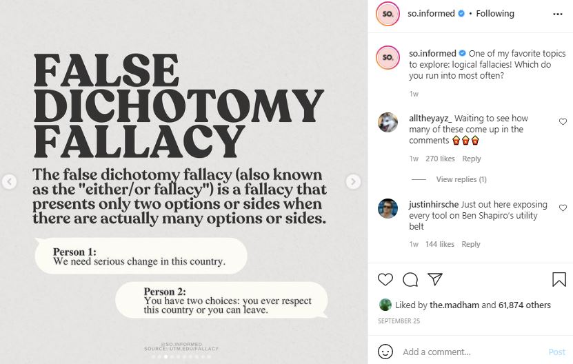
The large-scale circulation of these infographics became possible when Instagram added the function of sharing other users’ posts within the Stories feature in 2018 (Ables). This gained much more traction in the wake of the Black Lives Matter movement. Activism became more prevalent off and online, “as protests took hold across the country, Instagram became a home to thousands of informational slideshows, graphics, and art” (Corbett). The format of this information sharing was more accessible for users which coupled with Instagram’s focus on aesthetics has led to the “aestheticization of activism” (Corbett) on the platform. Issues are broken down into digestible point-form informational slides that will still look good on users’ feeds or Stories. The visual aesthetic has the potential to be prioritized over the real social issue being discussed.
Digital activism and data visualizations have joined forces in data journalism on Instagram. Aesthetic art-based data journalism is a popular way of communicating data to highlight a particular social justice issue. The interactivity of Instagram allows for an engaging digital space where data journalists are able to tell a story through visualization:
“The power of the DV lies not in the data, but in its storytelling capacities at the hands of a storyteller”
(Shahin 5)
Kennedy and Hill spoke to data visualizers who strongly believe in the power of DVs to “promote data transparency and awareness” (9). They name data activism and advocacy as one of the pleasures of visualizing data and state that “as data acquire new power, a space for agency in relation to data structures opens up” (10). This is where the ‘politics of possibility’ comes in, data agency creates a new distribution of power and has the potential to “establish a ‘new political imaginary’” (10). Using DV as an act of resistance can “redress the balance” (11) of power, it can be a social justice tool. However, relatedly, the storytelling through DV is political and it is subjective which Kennedy and Hill believe has the potential to do the opposite, the work presented is ideological, it can “perpetuate existing power relations and create new ones” DVs are never neutral as they only tell the story that the creator has chosen to tell. Often they are presented as “neutral windows onto data” (5) which is not the case. This is why in the article Kennedy and Hill stress the fact that when presented with data visualizations users need to be aware of the necessity to engage critically, “asking themselves what has been left out, what point of view is privileged over others” (6). For this reason there are a lot of activists who question the value of infographics as a form of digital activism and the aestheticization of it; they do not want the movement to end with the sharing of an Instagram post that has the possibility of spreading misinformation.
These issues need to go beyond the information presented on Instagram, it is important for users to do their own research once they are introduced to the topic through the aesthetics of the app (Corbett). The same issues arise with data journalism, because as Kennedy and Hill state:
“Data visualizations are simplifications, when they become the primary way to communicate research, the rich complexity of research is reduced and only a partial story is told”
(Kennedy and Hill 8)
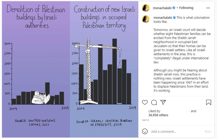
In the article “Seeing Data, Feeling Data: The Visual Language of Numbers in Mona Chalabi’s Instagram Infographics”, Fatma Shahin explores the way data journalist Mona Chalabi is able to create visuals where “data is not simply viewed, it is experienced” (8) and that this form of digital advocacy uses “storytelling, emotion, and interactivity to highlight the politics of data” (9). It is not framed as objective and provides the reader with sources and context in the caption which is a way of utilizing the platform to encourage readers to do further research. Data visualization on social media is a powerful tool and has the potential to use “the medium’s storytelling capacities to foster an activist digital space” (5) but can also be falsely perceived as objective and spread misinformation (Kennedy and Hill 5) while encouraging performative activism.
Works Cited
Ables, Kelsey. “Selfies and Sunsets Be Gone: The Latest Instagram Trend Is PowerPoint-Style Presentations.” The Washington Post, WP Company, 16 Aug. 2020, https://www.washingtonpost.com/technology/2020/08/15/instagram-race-activism-slideshow-graphics/.
Corbett, Erin. “The Aesthetics of Activism: How Instagram Changed Protesting.” How Instagram Aesthetics Changed Activism Forever, Refinery29, 25 May 2021, https://www.refinery29.com/en-us/2021/05/10335757/instagram-activism-aesthetics-impact.
Iqbal, Mansoor. “Instagram Revenue and Usage Statistics (2021).” Business of Apps, 22 Sept. 2021, https://www.businessofapps.com/data/instagram-statistics/.
Kennedy, Helen, and Rosemary Lucy Hill. “The Pleasure and Pain of Visualizing Data in Times of Data Power.” Television & New Media, vol. 18, no. 8, 2016, pp. 769–782., https://doi.org/10.1177/1527476416667823.
Rogers, Richard. “Visual Media Analysis for Instagram and Other Online Platforms.” Big Data & Society, vol. 8, no. 1, 2021, p. 205395172110223., https://doi.org/10.1177/20539517211022370.
Shahin, Fatma. “Seeing Data, Feeling Data: The Visual Language of Numbers in Mona Chalabi’s Instagram Infographics.” The IJournal: Graduate Student Journal of the Faculty of Information, vol. 6, no. 2, 2021, https://doi.org/10.33137/ijournal.v6i2.36455.