

Roads in You – the Visualization of Research
In “What is Visualization” Lev Manovich discusses the changing role of information visualization (hereby referred to as infovis) as a result of computational advancements. To which he focuses on the practice of ‘direct visualization’ as a more contemporary technique that breaks away from the “traditional principles” of visualization and offers a way to present data that preserves its original form. Drawing on this text, I will demonstrate how the data visualization project “Roads in You” by Yoon Chung Han exemplifies the relevant themes within the text.
“Information visualization is becoming more than a set of tools, technologies and techniques for large data sets. It is emerging as a medium in its own right, with a wide range of expressive potential.”
(Rodenbeck in Manovich 36).
Data and information visualization
Before diving into Manovich’s text, the significance of data visualization should first be understood in relation to data. Data is defined as units of information that “inform what we know about the universe” (Gitelman 1). Data enables us to observe and represent our world through graphical representation, enabling us to derive meanings and express phenomena in an effective manner. Furthermore, Gitelman posits that “data need to be imagined as data to exist and function as such” (3), in this sense, data visualization can also be thought of as the result of the imagination of data. Therefore, how we utilize and create meaning from data is important to knowledge production.
Visualization Methods as historically situated
Data visualization is a powerful tool and should be recognized as “an important part of living with data” (Gitelman 12). Defined as a “mapping between discrete data and a visual representation” (Manovich 37), it follows two core principles: the reduction of data into graphical vectors and spatial variables (Manovich 36). However, there has been a shift in what constitutes as data visualization, from one that was more definitive to one that encompasses a broader scope, where data visualization can be “any interface” (Gitelman 12) or “any transformation of digital material into a visual rendering” (Wright 1). This expands considerably the notion of what characteristics or process data undergoes to become classified as a visualization. Yet, what exactly brought about this change in perspective?
To that end, Manovich highlights how the two principles that govern how data visualization is practiced are historically specific, as a result of constraints imposed by graphics technologies available at the time. Through this, it can be inferred that practices of visualization are historically situated, whereby technological capabilities in a particular enable certain forms of visualization while placing constraints on newer forms of visualization. With the development of computers with higher processing capacities, newer practices such as direct visualization have emerged alongside the more traditional methods of visual representation.
Direct Visualization
Direct visualization is described in length by Manovich as the creation of new visual representations through the reorganization of data or media objects (41). This method deviates away from the principle of ‘reduction’ and presents the possibility of revealing patterns in data while preserving media objects’ original forms. In doing so, individuals are given the capability to visualize large amounts of ‘original; data, unlike more traditional forms of visualizations that purport reduction and spatial dimensions as its core. This therefore opens new opportunities for research and expression for researchers in different disciplines from the humanities to the sciences and the arts as a more contemporary research method (Manovich 47).
“Roads in You” by Yoon Chun Han (formerly called The Roads of Your Veins)
“Roads in You” (2020) is an interactive biometric-data artwork by Yoon Chung Han that exemplifies direct visualization. While other works that employ direct visualization draw on examples that mainly revolve around visual or media analysis (Colombo 2017; Rogers 2021). ‘Roads in You’ illustrates how direct visualization is more than a method for reorganizing images. As data-driven artwork, ‘Roads in You’ is similar in style to ‘Listening Post’, yet more sophisticated in the sense that the type of data and ways of repurposing the generated data are more intricate and complex, yet still adheres to what constitutes as direct visualization. Moreover, this project shows the benefits and opportunities that newer forms of visualization present, while retaining the “core idea(s) of visualization” (Manovich 2011).
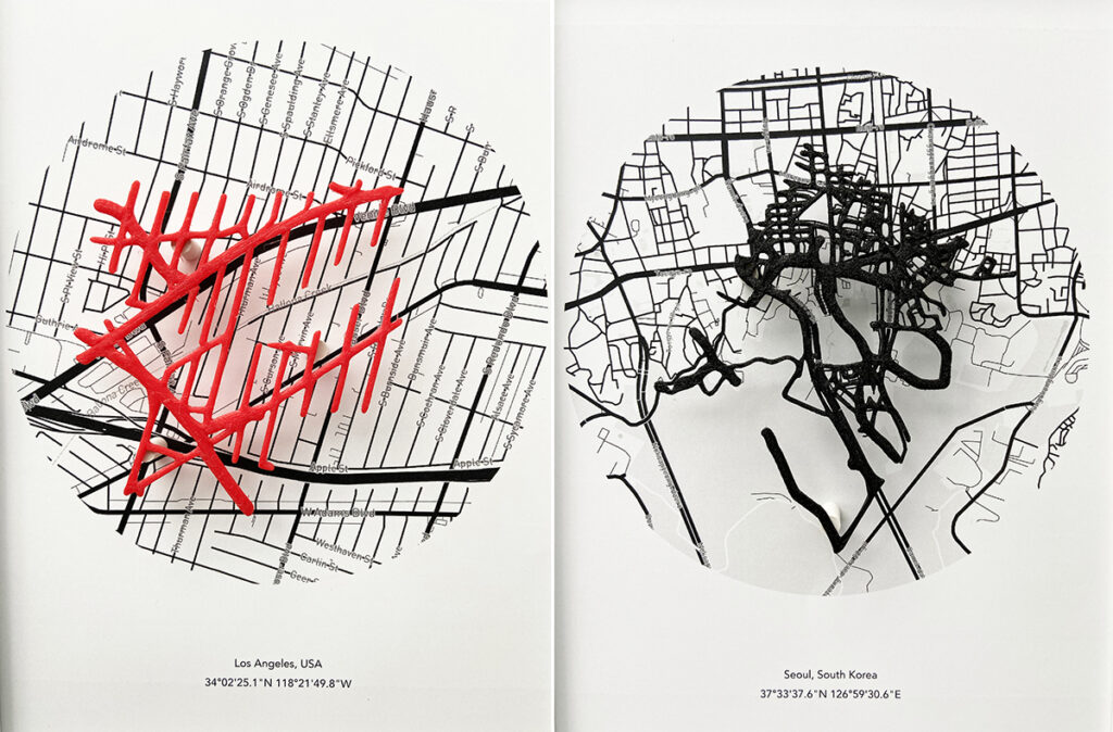
“Roads in You” combines vein-mapping data and geological data to create a map of how users’ biological data fits in to the real world, inspiring thought into the connection between the individual and the environment. The aim of this project is for users to “explore the correlation between individuals and environments using the hidden patterns under the skin and the vein recognition techniques and image processing” (Han and Nguyen 1). Thereby producing alternative perspectives about our surroundings through the repurposing and manipulation of available visual data online as a means of reconnecting and relating with our environment (Colombo 8).

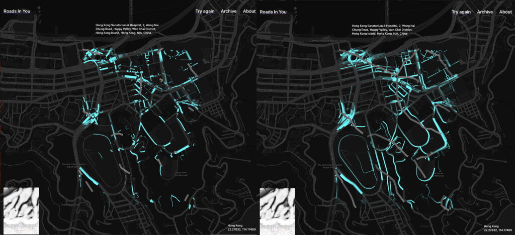
The project demonstrates how developments in technology provide new ways to contextualize, analyze and present data and media without having to follow principles of reduction. Through a combination of AI, vein-capturing and mapping technology (sonification) and geological data, ‘Roads in You’ demonstrates the various techniques and technologies that can be employed to create visualizations that offer diverse insights and provoke thought in both researchers and users. As it creates new visualizations while preserving the original data format, it can convey more detail and allow for the audience to construct a narrative in a manner that not only enables understanding of the information being presented, but also provoke consideration of the usage and connection between ‘naturally-generated’ and ‘artificially-generated’ data (Han and Nguyen 3).
Despite this, there are still other considerations and issues that should be taken into account when conducting research using direct visualization. While the data for ‘Roads in You’ were collected from volunteers, other projects that revolve around methods such as visual analysis need to consider ethical issues that arise alongside methodology and data practices. Boyd and Crawford highlight issues when conducting research using ‘big data’, relating to access to data, users consent towards data collection, analysis and interpretation of data outside their various contexts and digital divides that arise with data collection practices. These questions and considerations should also be addressed when creating visualizations, as data and data visualizations go hand-in-hand.
In conclusion, the text “What is Visualization” by Lev Manovich considers the evolving role of data and information visualization in cultural practice. Situating direct visualization as a new form of visualization alongside more traditional and digitized methods of visualization, which are historically situated and ever changing.
References:
boyd, danah. and Crawford, Kate., 2012. Critical Questions for Big Data. Information, Communication & Society. 15(5), pp. 662–679.
Colombo G, Ciuccarelli P, Mauri M., 2017. ‘Visual Geolocations. Repurposing online data to design’. Big Data Society. doi: https://doi.org/10.1177/2053951717702409 (Links to an external site.).
Gitelman, Lisa. (ed.) 2013. Raw Data Is an Oxymoron. Cambridge: MIT Press. Introduction chapter.
Han, Yoon Chung, and Nguyen, Nhat., 2020. ‘The Roads of Your Veins: Visualizing Map and Vein Data Matching’. Extended Abstracts of the 2020 CHI Conference on Human Factors in Computing Systems, ACM, pp. 1–4. DOI: https://doi.org/10.1145/3334480.3383153.
Han, Yoon Chung., ©2021. Yoon Chung Han: Roads in You. http://yoonchunghan.com/portfolio/Veins.html
Manovich, Lev., 2011. ‘What is visualisation?’. Visual Studies. 26(1), pp. 36–49.
Rogers, Richard., 2021. ‘Visual media analysis for Instagram and other online platforms’. Big Data & Society. doi:10.1177/20539517211022370
Rondet, Bart., ‘The Listening Post’. 21st Century Digital Art. URL:http://www.digiart21.org/art/the-listening-post.
Wright, Richard. ‘Data Visualisation’.In: Matthew Fuller (ed), Software Studies, MIT Press, 2008.

 thought: why data visualization should be used more in the classroom?")