Analyzing Black Lives Matter Infographics on Instagram: Instactivism or Real Impact?
Assignment A2
New Media Research Practices WG3, group 10
Group Members:
Joey Schreuders
Chenjie Zhang
Hanyu Cheng
Yasmine Ben Abdessalem
Word Counts: 2750
Introduction
The burgeoning use of social media platforms with digital tools and visualization techniques is central to recent years’ societal movements, enabling “bottom-up, distributed forms of protest mobilization, organization, and communication” (Poell and Dijck, 2018, p. 547). Infographics is one way of information visualization composed with one or more visualizations of information or data, dedicated to presenting perplexing data or statistics in a comprehensible way to the public (Schroeder, 2004). The use of infographics in digital interfaces constructs a mode of communication that makes public discourses easily accessible and comprehensive, and thus enables the public to discuss and understand politics differently.
This paper focuses on the vast use of infographics on Instagram in the Black Lives Matter (BLM) movement. The discussion of data visualization will not be limited to whether infographics have been an efficient tool for societal action. Rather, this project will examine the force of infographics on Instagram, and how it becomes a medium of the message and creates a type of environment that remaps social activities. At the same time, the BLM protest is a multidimensional society action in which different social and political identities interact with each other and combine to create effects in a complex way (Jackson, 2016), so this paper will also be accounting for the usefulness of infographics in empowering marginalized groups on Instagram.
Context
Infographics have seen an increase during the past few years as social media has become a more politicized place, with the average user seeing at least one political post after scrolling for two to five minutes 93% at the time (Price, 2020). Through this politicization of social media, there has been more awareness found for social issues as the two intertwine. One of the heights of social awareness on social media in recent years was reached after African American citizen George Floyd was suffocated by European American police officer Derek Chauvin on May 25th of 2020 (Bailey, 2021). His death went on to become one of the biggest protests on social media, as well as physically, to combat police brutality and racial injustice, with his final words “I can’t breathe” being an important quote during these protests (Silverstein, 2021). The death of George Floyd went on to flood social media for the rest of the Summer of 2020, with people asking to defund the police, to give people better insight or how to be a better ally to the “Black Lives Matter” movement (Frazer-Carroll, 2021). It has been shown that this type of digital activism results in actual structural change as it starts online, becomes physical protests, and eventually leads to the conviction of Chauvin (Bowman Williams et al., 2021).
Relevance
The relevance of this topic is two-fold. First, it stems from a rise in the use of infographics on social media, especially during contentious political events, such as the BLM movement, or the Sheikh Jarrah attacks. Second, the use of data visualization has sparked debates in academia in recent years.
When looking at Manovich’s conceptualization, data visualization is a “transformation of quantified data which is not visual into a visual representation (Manovich, 2010, p. 45)”. But, there are still debates on how to define information visualization, and what makes it distinct from “scientific visualization and information design” (Manovich, 2010, p. 37). Some scholars would argue that scientific visualization is unique in the sense where it must use numerical data, while information visualization encompasses more options, such as “ as text and networks of relations” (Manovich, 2010, p. 37). For the purpose of this assignment, we will follow Manovich’s conceptualization of data visualization.
Moreover, when it comes to visuals, there are also some differences between the use of visuals on Instagram and in academia. Choices regarding the designs in Academia are carefully examined. Data visualization can be heavily impacted by colors and design. Minor decisions about “axes scales, and graphical symbols (and their related forms and areas)” are pivotal in the representation of data (Kennedy and Hill, 2017 p.4). As explained by Kennedy and Hill “In professional visualization, these are similarly driven by the meaning that emerges from the data rather than aesthetic or decorative considerations”. However, it is unclear if it is the case for visualization on Instagram, where sometimes decorative considerations seem to be more important (Kennedy and Hill, 2017 p.4).
Methodology
First, the margins-as-methods framework will help us look at relevant infographics produced in the BLM protests period. The range of posts is limited by time, from George Floyd’s protest (which began on May 26, 2020) to August 2020. This framework allows for marginalized voices to be heard and to their own narratives. It has a stronger emphasis on bottom-up approaches to build the narrative and helps deconstruct power and co-create knowledge (Hesse-Biber & Piatelli, 2012). The researchers ultimately decided how to represent the participants when learning about marginalized communities, regardless of the form that the analysis required (Clark-parsons, & Lingel, 2020). Using qualitative and explanatory methods, we take the publicity of the infographics and the identity as well as the aspirations of the uploader into consideration.
Instagram is considered as the most relevant social media platform for online images and their analysis (Rogers, 2021), and because it moderates images horizontally across both individual and the explore pages, users’ interaction and engagement depend more on the visual effects of the images, instead of text. This article will use visual analysis as the main method to look at the visual elements of Instagram infographics, including colors, lines, textures, to analyze their meaning and also how they convey the meaning.
Inspired by the research Digital political infographics: A rhetorical palette of an emergent genre by Sedan R Amit-Danhi and Limor Shifman. They set up a framework for two-dimensional rhetorical categorization of infographics, from the point of view of both the goal of conveying information and the subjective feelings. Inspired by that, we found three typical categories and our question is thus: “ “How did personal, organizational, and in-depth infographics each contribute towards the Black Lives Matter movement?”
Analysis of personal infographics
Personal infographics often call for people to do better, it is not targeted for immediate action like protests or donations where people come together to fight for justice. It is also not based on historical actions or systematic actions but rather emotional actions for one to educate themselves personally.
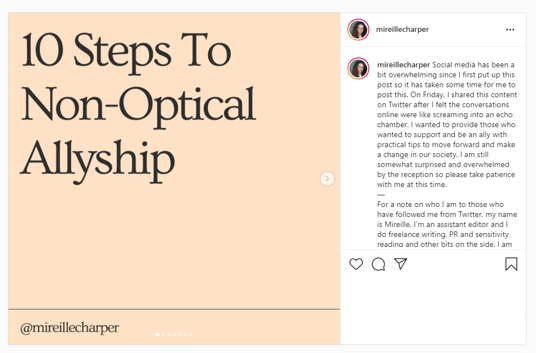
Figure 1.1
The infographic above refers to non-optical allyship divided into several points: understanding non-optical allyship, checking in on your black friends, being prepared to do the work, reading anti-racist literature, avoiding sharing traumatic content, supporting initiatives, not centering the narrative about yourself, keep supporting after protests, stop supporting hateful organizations, and starting a long-term strategy. This self-made infographic has a simple layout with two points on each slide, with a yellow background and a black font. The layout is easy to read with a colloquial approach which makes it feel like a one-on-one conversation.
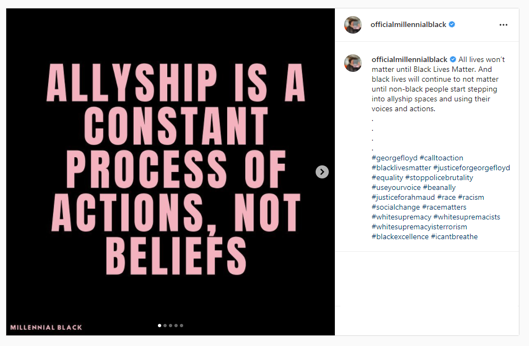
Figure 1.2
A different infographic that dives into allyship also highlights not resharing traumatizing content. Besides this it tells to check if their minority friends have the emotional capacity before unloading, understanding the impact of their voices compared to minority voices, and allowing minority people to feel a full range of feelings. This infographic is rooted in personal frustration to make people do better. It has a very simple layout with one sentence on each slide with a black background and pink lettering. It is very easy to read and definitely gets people to notice as the letters are very big and it is a fairly short infographic.
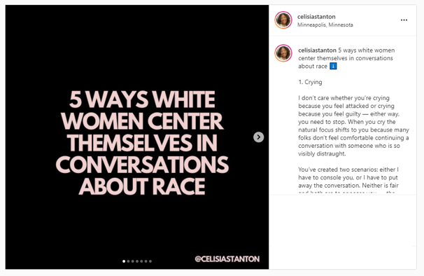
Figure 1.3
Another infographic talks about five ways that white women center themselves in conversations about race. It talks about the following ways that white women tend to do so according to this infographic: crying, redirecting their trauma, bringing up times when they were a good ally, credentialing by using people of African American descent, and expressing guilt. This is an infographic based upon experience and shares no data, but there is further explanation after every statement which addresses people from an individual standpoint. The slides have a black background and font expressed in bold, with the headlines being in pink and the explanations in white. This causes the attention of others to be caught as it has a very clear and clean layout that stands out.
All in all, these types of infographics are very personal and based on experience and emotion. They are often very simple infographics with a clean aesthetic and no data used. These infographics are asking people to do better and address the individual by trying to address them very informally, with multiple steps which makes it more approachable for the individual. These posts have a lot of expression in common but there are differences. Different people are addressed amongst different infographics, with calling out specific groups may it be gender or race. There are also conflicting differences in the message, with some of them recommending asking people of African American descent about injustice whereas others tell you not to because it is traumatizing. This is a result based on these infographics written from a place of personal experience, but regardless it has a harmonizing message of being anti-racist and an ally.
Analysis of organizational infographics
This section aims to analyze infographic posts on Instagram that call for immediate actions to engage with the BLM protest. Instead of merely providing objective and fact-orientated information, by using persuasive but also emotional content and visualization techniques, infographics were utilized to convince people to support the movement through multiple ways, such as donation and protesting. In this way, infographics become a politicized medium that helps create an environment that encourages people to be politically engaged.
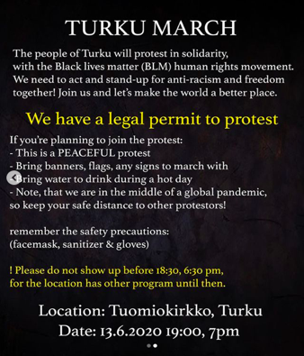
Figure 2.1
Infographics were used to display information of direct instruction on how to participate in the BLM protest for Instagram users. Infographics with succinct information and clean aesthetics inform users with ways of protest both locally on the street and in the digital sphere. Figure 2.1 shows some examples of infographics that call for people to act offline. This infographic displays information of a planned protest in Turku. With concise information and simple aesthetics, the infographics empower people who are willing to participate by telling them what they should do to participate in the protest. Infographics in Figure 2.1 demonstrate how infographics enable protests to be framed in a strategic manner and connect individuals and groups through the platform of Instagram.
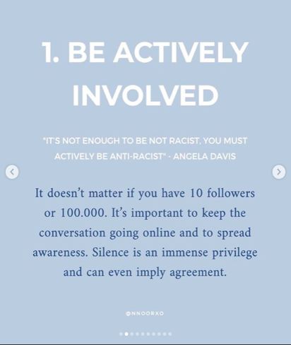
Figure 2.2
Ways of protesting in the digital sphere were also covered by infographics. Infographic posts in Figure 2.2 articulate ways people could engage with the protest online. It calls for people to stay actively involved in the BLM movement by posting online. Instagram allows users to easily engage with the protest by providing quick access to sharing, reposting, and adding hashtags. Thus, the interface of Instagram and the use of infographics allows people to be active in the BLM movement, and to build narratives as well as claims around the issue of racial injustice online.
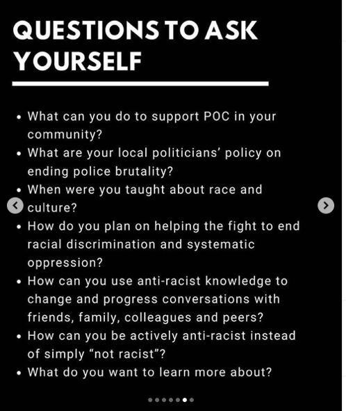
Figure 2.3
Moreover, infographics were adopted for delivering emotional and persuasive information which intend to convince people to participate in the BLM protest. Figure 2.3, shows an infographic with a persuasive narrative that would nudge people to participate in the protest. It layouts multiple interrogative sentences, forcing people to situate their daily lives in the context of fighting for racial injustice. The black and white visual of the infographic dramatized the racial discrimination setting. By interrogating “How can you be actively anti-racist instead of simply ‘not racist’?”, this infographic persuades people to think that being silent and not racist is not enough and they have to be actively engaged with this political discourse, which increases the force of infographics for political persuasion.
Thus, the use of infographics exemplifies how social media has created a new environment for political activism, enabling both online and offline protest practices. At the same time, infographics on Instagram functioned not only as an objective information display but also as a politicized persuasion tool.
Analysis of in-depth infographics
This category includes political digital infographics from the BLM movement that illustrate the relationships between facts, events, and outcomes by employing visual approaches through anatomy and temporality (Amit-Danhi & Shifman, 2018), which is still in the scope of Instagram aesthetics.
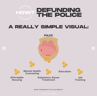
Figure 3.1
For example, there is a typical anatomy approach in this post on defunding the police. First and foremost, we can perceive the grey-pink background’s low saturation warm tone, which has mild and low-conflict emotion, in keeping with Instagram’s low saturation style with a bold, round, and stark font. It explains why and how the government should reduce the funding for the police and which other fields (housing, health, education, etc.) would receive more funding if police funding was reduced. Visually, the infographic places police funding at the top, implying a power-structural relation, as well as indicating a causal relationship between lower police budget and greater public well-being. Simplified and direct expression lowers the bar for users to comprehend and participate in political advocacy, but the knowledge of political viewpoints becomes too simple under such guidance, which may cause more people’s political feelings to become extreme and intense.
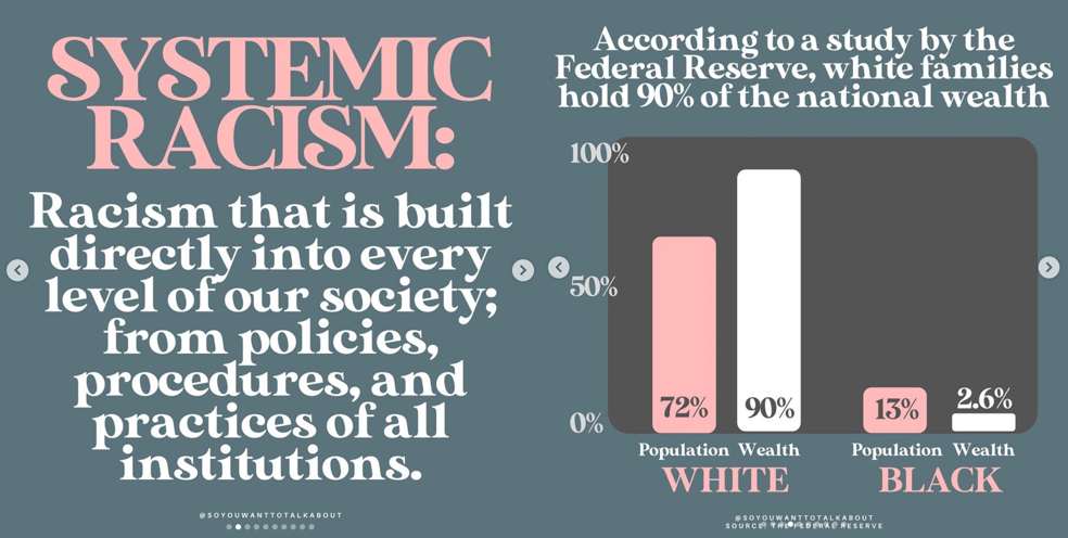
Figure 3.2
Similarly, this infographic, uploaded by the same information account, attempts to clarify what is systemic racism, also uses Morandi colors with low saturation and contrast. With a Disney-aesthetic artistic font, there is also no aggressive sense in the visual design of clear-cut and incisive content. The bar charts visually show the wide wealth distribution gap between whites and blacks, while other supporting data is also highlighted by bolding the font and changing the color. In this infographic, the concept of systemic racism is introduced to the public, combined with examples and specific data, through the anatomical approach of visualization.
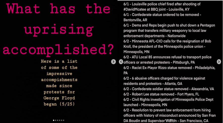
Figure 3.3
In another post, we can see a history of how individuals throughout the country engaged in the BLM movement and what transpired following the George Freud incident. It uses black as the base color, plus text in bright other colors to briefly outline the timeline. The political process in the creation of these resistance movements, as well as their repercussions, are described using time series visualizations. When data are stacked on a timeline, they frequently appear to be cause and effect, although this is not always the case (Amit-Danhi & Shifman, 2018). The fact that a police officer was found guilty of corruption following a protest, for example, does not necessarily imply a causative or direct relationship between the two occurrences, but they are grouped together due to their closeness in time. Time is the sole dimension that generates connections in such a condensed story, but it may lead the user to believe that specific activity or action is the only way to attain a specific goal.
Discussion
All in all, infographics have a similar appealing style, featuring bold fonts and interesting pallets of colors, however, there is not a real link between the content of the posts and the way they are presented. What can be noted is that there is a difference in how they try to contribute to the Black Lives Matter movement.
We could argue that organizational, personal, and in-depth infographics each contribute differently towards the Black Lives Matter movement, -whether online or offline. Infographics on Instagram functioned not only as an objective information display but also as a politicized persuasion tool. Posts that use a more personal approach and emotional rhetoric are directed to the individuals, for them to do better and to be impacted by the message that is conveyed. Finally, in-depth infographics are more informative, and are based on historical facts, socio-political analysis and aim at educating Instagram users through carousels.
While using infographics could be a succinct and straightforward way of delivering messages, the oversimplification of infographics might be counterproductive. Whether the use of infographics facilitates or undermines social movements depends on the quality of infographics and users’ capabilities to communicate infographics efficiently through social media platforms (Kennedy and Hill, 2017). Moreover, one major problem arises with the rise of infographics during contentious political periods on Instagram. In fact, tracking down misinformation is complicated to program on algorithms, as they are images and not text (Nguyen, 2020). Infographics are not neutral windows on data and can reinforce power relations due to lack of transparency (Kennedy and Hill, 2017).
Bibliography
Amit-Danhi, Eedan R, and Limor Shifman. 2018. “Digital Political Infographics: A Rhetorical Palette of an Emergent Genre.” New Media & Society 20 (10): 3540–59. https://doi.org/10.1177/1461444817750565.
Bailey, Holly. 2021. “George Floyd Died of Low Level of Oxygen, Medical Expert Testifies; Derek Chauvin Kept Knee on His Neck ‘Majority of the Time.’” Washington Post, April 8, 2021. https://www.washingtonpost.com/nation/2021/04/08/derek-chauvin-trial-2/.
Bowman Williams, Jamillah, Naomi Mezey, and Lisa Singh. 2021. “#BlackLivesMatter—Getting from Contemporary Social Movements to Structural Change.” SSRN Scholarly Paper ID 3860435. Rochester, NY: Social Science Research Network. https://doi.org/10.2139/ssrn.3860435.
celisiastanton. 2020. “MINNEAPOLIS PHOTOGRAPHER Op Instagram: ‘5 Ways White Women Center Themselves in Conversations about Race ⬇️ 1. Crying I Don’t Care Whether You’re Crying Because You Feel….’” https://www.instagram.com/p/CDRY_sqFa0u/.
Clark-Parsons, Rosemary, and Jessa Lingel. 2020. “Margins as Methods, Margins as Ethics: A Feminist Framework for Studying Online Alterity.” Social Media + Society 6 (1): 2056305120913994. https://doi.org/10.1177/2056305120913994.
Frazer-Carroll, Micha. 2021. “Can the Instagram Infographics Save Us?” The Independent. May 25, 2021. https://www.independent.co.uk/life-style/instagram-infographics-george-floyd-black-lives-matter-b1852915.html.
Hesse-Bibber, Sharlene Nagy, and Deborah Piatelli. 2012. “The Feminist Practice of Holistic Reflexivity.” In Handbook of Feminist Research: Theory and Praxis, by Sharlene Hesse-Biber, 557–82. 2455 Teller Road, Thousand Oaks California 91320 United States: SAGE Publications, Inc. https://doi.org/10.4135/9781483384740.n27.
Jackson, Sarah J. 2016. “(Re)Imagining Intersectional Democracy from Black Feminism to Hashtag Activism.” Women’s Studies in Communication 39 (4): 375–79. https://doi.org/10.1080/07491409.2016.1226654.
Kennedy, Helen, and Rosemary Lucy Hill. 2017. “The Pleasure and Pain of Visualizing Data in Times of Data Power.” Television & New Media 18 (8): 769–82. https://doi.org/10.1177/1527476416667823.
mireillecharper. 2020. “Mireille Cassandra Harper Op Instagram: ‘Social Media Has Been a Bit Overwhelming since I First Put up This Post so It Has Taken Some Time for Me to Post This. On Friday, I Shared….’” https://www.instagram.com/p/CA04VKDAyjb/.
Nguyen, Terry. 2020. “PowerPoint Activism Is Taking over Your Friends’ Instagram Accounts.” Vox. August 12, 2020. https://www.vox.com/the-goods/21359098/social-justice-slideshows-instagram-activism.
nnoorxo. 2020. “NOOR ☁️ Op Instagram: ‘#BLACKLIVESMATTER ✊🏾 I Noticed That Many People in Europe (Including Me) Wanted to Contribute to This Fight against Anti-Blackness, But….’” https://www.instagram.com/p/CA41eo8HgXh/.
officialmillennialblack. 2020. “Sophie W – Millennial Black Op Instagram: ‘All Lives Won’t Matter until Black Lives Matter. And Black Lives Will Continue to Not Matter until Non-Black People Start Stepping Into….’” https://www.instagram.com/p/CAuy2ogA3FF/.
oliviarodrigo. 2020. “Olivia Rodrigo Op Instagram: ‘Realized That My #blackouttuesday Post Didnt Effectively Link Anything Useful to the Movement. Here Is Some Helpful Information. Working My….’” https://www.instagram.com/p/CA8y_hUhUJl/.
pikkulattaripapu. 2020. “Zoraya Amaru Op Instagram: ‘‼️‼️‼️ JAKAKAA #joinus #blacklivesmatter #turku #blmturku #blmfinland.’” 2020. https://www.instagram.com/p/CBAzJ9TASl-/?igshid=1hli7zl87ukkf.
Poell, Thomas, and José van Dijck. 2017. “Social Media and New Protest Movements.” SSRN Scholarly Paper ID 3091639. Rochester, NY: Social Science Research Network. https://papers.ssrn.com/abstract=3091639.
Price, Emily. 2021. “The Politicization of Social Media.” JCRED. 2021. https://www.jcred.org/shortreads/politicization-of-social-media.
Schroeder, Roland. 2004. “Interactive Info Graphics in Europe–Added Value to Online Mass Media: A Preliminary Survey.” Journalism Studies – JOURNAL STUD 5 (November): 563–70. https://doi.org/10.1080/14616700412331296473.
Silverstein, Jason. 2021. “The Global Impact of George Floyd: How Black Lives Matter Protests Shaped Movements around the World.” April 6, 2021. https://www.cbsnews.com/news/george-floyd-black-lives-matter-impact/.
so. informed. 2020a. “So. Informed Op Instagram: ‘Several Top Trump Administration Officials Claimed Last Week That “Systemic Racism Is Not an Issue” Lol Let’s Talk!’” 2020. https://www.instagram.com/p/CBdFynenavH/.
———. 2020b. “So. Informed Op Instagram: ‘This Page Has Covered Police Brutality, Prison Reform, and Abolition… so, Let’s Talk about Defunding the Police.’” 2020. https://www.instagram.com/p/CDL1waEnkGP/.
vanessahudgens. 2020. “🔮Vanessa Hudgens🔮 Op Instagram: ‘When We All Stand Together, We Are Stronger and Louder than Ever. ✊🏻✊🏼✊🏽✊🏾✊🏿@springmagca #blacklivesmatter #endsystemicracism #endpolicebrutality.’” 2020. https://www.instagram.com/p/CBQ3cF8BYlv/.