Data Visualization: A Case Study of Information is Beautiful Awards
By Qianyu Feng, Dania Awin, Marta Espuny, Kirsten Hartman
Intro & conceptualization.
Living in a data-driven world, data visualization is becoming more and more relevant. Developed from scientific visualization, information visualization gained its popularity in the 2000s with the easy availability of big data sets via APIs provided by major social networks and new high-level programming languages, specially designed for visualization (Manovich 2011). It is an art of becoming visual, by understanding data and making it clear for others via data graphics (Sosulski).
Data visualization, which is mapping the gap between discrete data and visual representation (Manovich 2011), can be seen as a way to make complex information more accessible to people. Given the increasing popularity and importance of data visualization in recent years, it seems interesting to look into the question: how is data visualization conceptualized? In other words, what is the representation of data visualization within the different scientific disciplines?
In order to answer these questions, we will develop an explorative analysis of the concept of data visualization based on the case study “Information is Beautiful Awards” (IIBAwards) and focused on its internationalism. The analysis of this particular case studied is based on the relevance that this platform has acquired as a global reference within this sphere of influence since it is the one and only data visualization competition around the world. Set up in 2012 by David McCandless, who is a journalist and data visualizer, this yearly award celebrates excellence and beauty in data visualization, infographics, interactives, and information art.
“The graphic representation of quantitative information has deep roots, & these roots reach into the histories of the earliest map making and visual depiction, & later into thematic cartography, statistics and statistical graphics, medicine and other fields”
Friendly, 2006
Analysis of the typology of profiles who are engaged in this platform.
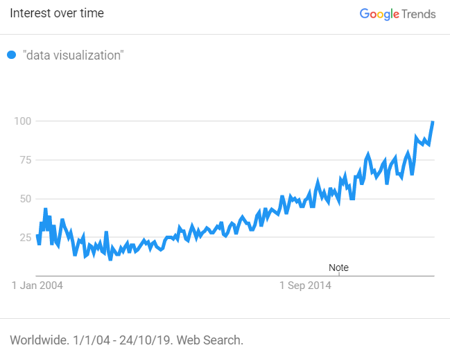
We have seen how Data Visualization is not just growing (Figure 1), but also becoming a multi-disciplinary research area (Friendly, 24). For this reason, the different fields that are engaged with it should also be analyzed in order to develop a broader understanding of those particular areas of knowledge. Regarding our case study, we have studied the typology of profiles who follow the IIBAwards on Twitter (11,6K users). We built a hashtag network based on the information displayed in their biographies, in order to see the relation between the different keywords that emerged among them*.
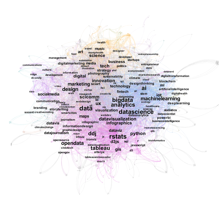
Prepared by the authors.
This network (Figure 2) was analyzed under the premise that if one person includes a hashtag (e.g. #artificialintelligence), it means that this person has a relation with the field. On this network, we can see two main clusters in pink and blue, and a third one in yellow.
The first group -pink- is more focused on data visualization itself, as a form of graphic design, with programming and visualization tools (rstats, tableau, python) and types (dataviz, infographics, maps); the only profession that appears here is journalism. The second cluster -blue- shows fields linked to data visualization and technology, since working in this field tends to imply a high level of expertise, especially linked to big data and data science. We can see keywords like data science, machine learning, IoT, big data, artificial intelligence, etc. Meanwhile, on the third one -yellow- we can see an emergent range of disciplines, such as science, art, music, politics, architecture and so on.
It is this last cluster that confirms the spread of data visualization that is taking place in recent years, adding a new set of fields beyond data analytics, computer science, and graphic design. In this respect, we can talk about the changes that are being made around the concept of data visualization, since more and more areas of knowledge are being engaged by this in recent years.
“In the digital age, data visualisation are becoming an increasingly prominent genre for the visual representation and mediation of collective life… more and more popular in the media and communications studies, and in the humanities and social sciences more broadly”
Gray 228
Analysis of the distribution of the categories deployed in the platform.
After the analysis of typologies, we can conclude that data visualization is effectively spreading across different fields. Getting back to our case study, our next step would be to study how this distribution is represented within the Information is Beautiful Awards platform, in order to examine if the categories are expanding in a diverse range of fields and how it is spreading.
To do so, we analysed the way in which the platform categorized the diversity of fields in which data visualization is deployed, focusing on these different categorisations made by the awards from 2012 to 2019, which are represented in two different formats in Figure 3**: the same data is plotted in both graphs, however, the first one is more suitable to understand the spread of data visualization among time, while in the second we can see a detailed progression of each separate category. Based on this information, we can confirm that the first half of the period (taking into account that the years 2012 and 2013 were excluded) the most common categories are developed around the concept of data visualization, whereas the second stage reflects that the categories were distributed among different areas of knowledge, depending on what was the data visualization about.
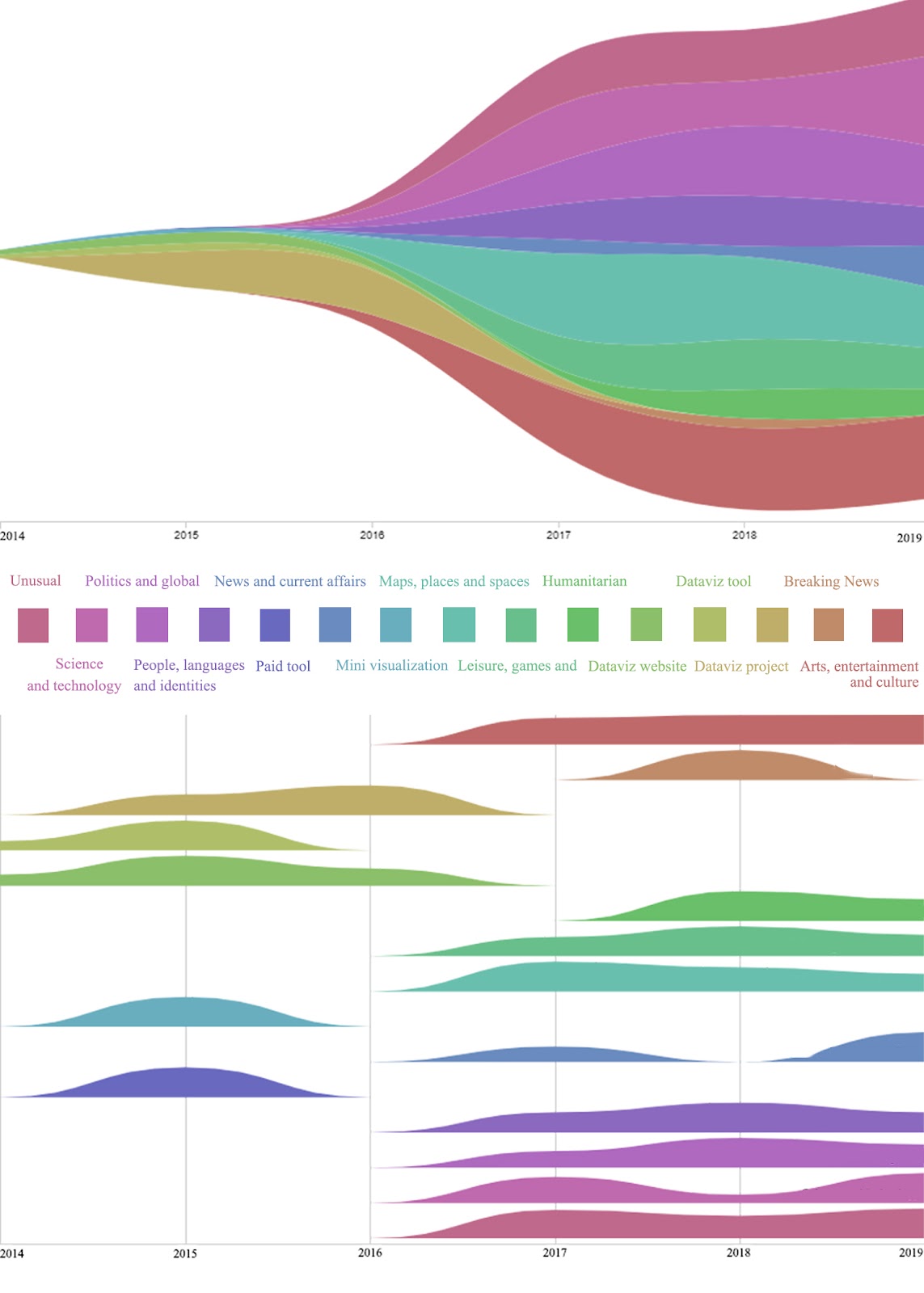
Prepared by the authors (RAWGraphs) based on the information collected from the platform.
In the first years of the project there was no categorization made, and after that time we can see different tendencies within the categorizations. In this sense, we found four main stages:
- Between the years 2012 and 2013 there was no categorization made.
- From 2014 to 2016 the classification is linked to the concept of data visualization linked to graphic design, with categories such us: ‘data visualization website’, ‘data visualization tool’, ‘paid tool’,’ data visualization project’, ‘mini visualization’, and ‘ data visualization tool.
- In 2017 there was a quantitative jump regarding the number of visualizations that participated in the awards, which could be considered as an increase of submissions. Also, there was a qualitative change here, since the categories started to concern multi-disciplinary fields, instead of those linked to graphic design. Regarding fields like ‘arts entertainment and culture’, ‘leisure games and sports, maps places, and spaces’, ‘news and current affairs’, ‘people languages and identities’, ‘politics and global’, ‘science and technology’, ‘unusual’.
- In the years that followed, new categories were introduced, such as ‘breaking news’, ‘humanitarian, people’, ‘visualization and information design’ and ‘news and current affairs’.
We have seen how in the last years the categorization was not focused on the design anymore but on the different areas of knowledge in which these visualizations could belong. Considering this scenario, we could confirm this spreading of data visualization in the last years. As we saw in the network above, there are more and more areas emerging related to data visualization. We can, therefore, confirm that visualizations are spreading in multidisciplinarity fields and expanded from the sciences into different disciplines like engineering, marketing and art and entertainment (Wright 5).
Analysis of the criteria of evaluation.
In order to study the representation and conceptualization of data visualization, it seems useful to discuss what is considered and evaluated as a good or high-quality data visualization. Focusing on our case study, a set of criteria are deployed by the platform for the evaluation of the different data visualizations, however, the whole process of evaluation remains relatively unclear***.
“It is not easy to come up with a definition which would work for all kinds of infoviz projects being created today.”
Manovich, 2011
Instead of giving specific guidance on ‘what is visualization’ and trying to distinguish scientific visualization, information design and graphs, the platform does not give an exact definition about their criteria, assuming that participants know how to do it properly, but at the same time keeps one rule: it needs to be a contemporary software-driven visualization (compared to manually created visualization) (Manovich 2011).
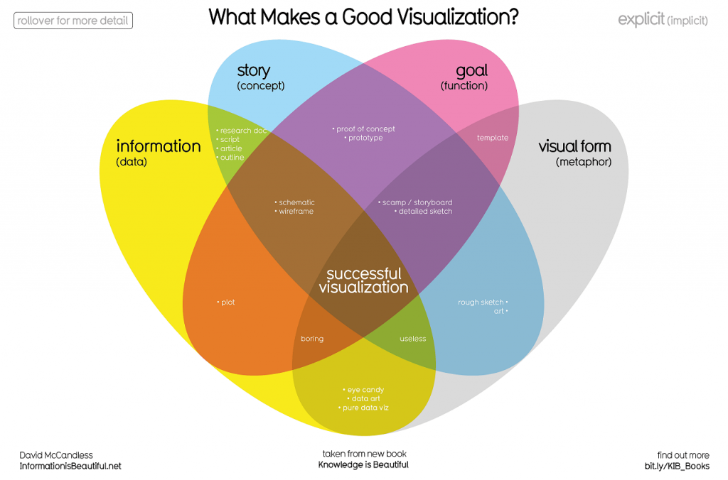
Figure 4. What our judges (and you) look out for in great visualization.
Source informationisbeautifulawards.com
Regarding the criteria of good visualization, the founder of IIBAwards David McCandless makes use of an infoviz to represent it (Figure 4). As it is depicted in the visualization, the four main parts of a good visualization are: information (data), story (concept), goal (function) and visual form (metaphor), and each of them respectively reflects the traditions of integrity, interestingness, usefulness, and beauty. Though the description of the criteria is short and concise, these criteria could find their theoretical traditions in the literature on visualization.
- Integrity also described as accuracy, consistency and honesty could refer to the discussion on ‘telling the truth about data’ (Tufte 2001) and this would link to the reliability of data source, the transformation, and selection of data (Gray et al. 2016).
- Interestingness is mentioned by Tufte referring to the substance, statistics and design of data presentation, while the award also put ‘new’ into these criteria. The development of new techniques allows us to deal with bigger amounts of data.
- Goal: Visualization design involves decisions about the representation of data that privileges certain perspectives and removes unnecessary graphical ornamentation (Wright 2008) and, at the same time, it shows only some of the available data (Kennedy Hill 2016), which Manovich called reduction. The award translates it into the goal (function) that emphasizes on the usefulness, efficiency of the designs.
- Visual form: While Manovich argued that visualization prioritizes spatial dimension over other visual dimensions, Kennedy found color choice important (Kennedy Hill 2016). Instead of pointing out its aesthetics of evaluation, the award opens a rather broad frame for visualization.
Although the award divides the criteria into four main parts and uses different colors and overlaps to depict the correlation between them, the relationship between these criteria could be more inseparable and complicated than the graph shows. In fact, the definition and evaluation of a good data visualization remain imprecise, since some authors refer to the aesthetics aspects, some to the amount of data that should be deployed, others to the reliability and so on. Although obscure, data visualization should not be seen as questionable or uncertain. This fact only proves that there are so many different forms of evaluation, depending on the perspective under which it is being considered.
Analysis of the exemplification of the criteria on the winner data visualization.
For the last part of our analysis, considering this lack of accuracy when it comes to the definition of norms and standards for the assessment what is a high-quality data visualization, we made an approach to how these requirements are objectified in this platform, with the aim of discussing the ways in which the platform contributes to the visual collective imagination.
First of all, it is interesting to see how over the years the number of entries for the award has increased tremendously, from 22 entries in 2012 to 744 entries in 2019. It could be said that IIBAwards has played an increasing role in the world of data visualization and, along with that, also the ways we produce knowledge.
Furthermore, it is interesting to see how each year winners come from different categories. As discussed before, and is shown in Figure 3, there have been changes in the categorizations for the Information is Beautiful Award over the years. This also means that there have been shifts in the categories of the winners of the awards. For instance, comparing the winners of 2018 with those of 2017 it becomes apparent that in 2017 ‘arts, entertainment & culture’ was an important category based on the number of award winners, while in 2018 this category was less significant regarding winning visualizations. This emphasis on specific categories based on winners each year may have an impact on the world of data viz, and what is regarded as a significant visualization. This is a relevant issue since the most important part of the platform is the winners of the awards, since the winning visualizations are the most relevant part of the website.
What is also important to note here, is that there are high criteria of evaluation for the Information is Beautiful Awards. As discussed in the previous part of our analysis, there are high standards, and many points of criteria are taken into consideration when choosing the winners of the awards. Basing our ideas on the premise that the top visualizations are based on these high criteria of evaluation, this may also have an influence on the ways in which we produce knowledge. The winning visualizations thus represent how these points of criteria are materialized. They stand for what the Information is Beautiful Awards qualifies as a ‘good’ visualization that is in line with their criteria. And this, in turn, may affect the ways in which we produce our knowledge around the concept of data visualization.
Conclusions & Further Steps.
All in all, it could be concluded that data visualizations play an increasingly important role in the digital world we live in. The Information is Beautiful Awards is a good example of a platform that represents this increasing significance of data visualizations in a few different ways. This platform can be considered as a pioneer in this field, since it is the first global competition worldwide, and it leads the way forward for the creation of the new versions of data visualization in the public imagination.
The consideration of data visualization as a multidisciplinary field enables us to congregate scientists and specialists from a wide range of disciplines. This marks a major shift in the way we understand data visualization, previously only connected to design and data science themselves.
This new way to look at data visualization is crucial to understand its progress, and it opens the door to new debates and theorizations about not just the methods, techniques and applications that we can use to visualize data, but also the implications that these representations may have in each branch of knowledge. That is to say, the consequences that the conceptualization of data visualization has in its own field and in the rest of science. Under this perspective, we could think about data visualization as a key actor in the production of knowledge in our current society.
In order to develop further analysis, it would be interesting to study each part of the analysis in greater depth, especially it would be interesting to:
- Built a network of conversations related to @infobeautyaward: main actors, associated narratives, in order to study the dissemination and popularization of the platform. This would enable us to place data visualization, linked to our case study, in a broader framework, taking into account its implications in terms of impact within Social Media.
- Given this ambiguity regarding the criteria of evaluation, the analysis of the winner data visualization aims to contextualize, on one side, the materialization of these criteria, under the premise that the winner data visualization are those which better fulfill these requirements and, on the other side, the impact that these awards may have considering that these winner data visualizations are what people are looking for when they come to this platform looking for inspiration and so. In this term, the winners are the reference for a high-quality data visualization, in other words, they are the example to prove how the platform of the Information is Beautiful Awards may contribute to the visual collective imagination.
References & footnotes.
(*) Due to the limitations of time and resources, the network is composed only by hashtags. However, it would be interesting to develop a deeper analysis by building a network based on the professions that appear on their bios.
(**) The years 2012 and 2013 have been excluded from the representation since no categorization was made in this period.
(***) Although the Information is Beautiful Awards team was asked for details about the criteria of evaluation on several occasions, we have not yet received a reply from them.
Figure 1. Source link: https://trends.google.com/trends/explore?date=all&q=%22data%20visualization%22
Figure 4. Source link: https://www.informationisbeautifulawards.com/news/236-voting-what-our-judges-and-you-look-out-for-in-great-visualization
Friendly, Michael. “A Brief History of Data Visualization.” Handbook of Data Visualization. Springer Handbook of Computational Statistics, 2008. 15-56.
Gray, Jonathan. “Ways of Seeing Data: Toward a Critical Literacy for Data Visualizations as Research Objects and Research Devices.” Innovative Methods in Media and Communication Research. Palgrave MacMillan, 2016. 227-251.
Kennedy, Helen and Hill, Lucy. “The Pleasure and Pain of Visualizing Data in Times of Data Power.” Television and New Media. (2016): 1-14.
Manovich, Lev. “What is visualization?” Visual Studies 26.1 (2011): 36-49.
Sosulski, Kristen. Data Visualization Made Simple. New York: Taylor & Francis, 2019.
Tufte, Edward R. The Visual Display of Quantitative Information. Chesire Connecticut: Graphics Press L.L.C, 2001.
Wright, Richard. “Data Visualization.” Software Studies. MIT Press, 2007. 1-8.