

Visualising music: the problems with genre classification
Want to listen to new music but sick of staring at your old MP3 collection?
Streaming applications like Spotify, Last.fm and Pandora (US only) recommend related artists.
Sites like The Hype Machine and Elbows aggregate music blogs for instant internet radio streaming.
More importantly, websites such as Musicovery (the original interface) and TuneGlue use information visualisation to enhance music discovery through network maps– using nodes and links from one artist to another. Musicovery interestingly uses colour to distinguish categories of music according to mood. Calm vs. Energetic, Dark vs. Positive.
The first question is: why should we visualise music at all?
Music is not visual after all. But when there are millions of songs, it is useful to have some tools to help with this process of discovery. Recommendation and playlists, through visualisation. Visualisations can “tell a story, and engage our pattern-matching brain” (Donaldson & Lamere, ISMIR 2009).
The second question is: how should we best visualise music discovery?
Long debates have taken place regarding music categorisation through Genre, as this is a very subjective matter.
The work of Schedl, Pohle, Knees & Widmer (2006) assigned and visualised music genres through co-occurrences of artist and genre names on music-related web pages and uses a probabilistic model to predict the genre of an arbitrary artist.
The work of Mörchen, Ultsch, Thies, Löhken, Nöcker, Stamm, Efthymiou & Kümmerer (2005) analysed and visualised timbre similarities of sound within a music collection. They argue there are many problems with genre classification:
The problem with this approach is the subjectivity and ambiguity of the categorization used for training and validation [Aucouturier and Pachet, 2003]. Often genres don’t even correspond to the sound of the music but to the time and place where the music came up or the culture of the musicians creating it. Some authors try to explain the low performance of their classi_cation methods by the fuzzy and overlapping nature of genres [Tzanetakis and Cook, 2002]. An analysis of musical similarity showed bad correspondence with genres, again explained by their inconsistency and ambiguity [Pampalk et al., 2003b].
Let’s look at few examples more closely:
NME’s Top Albums 1974 to 2010

http://lab.zoho.co.uk/lab/nme-top-albums/
This project shows the NME top albums from 1974 to 2010 categorised by genre (or genres in some cases). Genres were scraped from Wikipedia. If an album did not contain genre information, then the artist genre was used. If neither artist nor album had a listing then no genres were associated to it.
“I realized that this in itself is something that could be open to lots of interpretative “debate” so I settled on the idea of using Wikipedia to settle the argument.”
Once this was done I decided I would use a circular bubble chart to plot the music genres for each year. The size of the bubble would represent the number of times that genre had been associated to an album and the proximity to the middle would represent the weighting of the genre within the charts picks.
For the weighting I came up with a formula that would not only take into account the performance of each genre’s albums for that year but would also compare the performance across all years. So for instance the best performance of any music genre was “Rock” in 1974 with a count of 27/60 and a ranking of 91%.”
Last.fm Artist Map


http://sixdegrees.hu/last.fm/index.html
This project is an information visualisation of the similarity relationships between artists, from the database Last.fm.
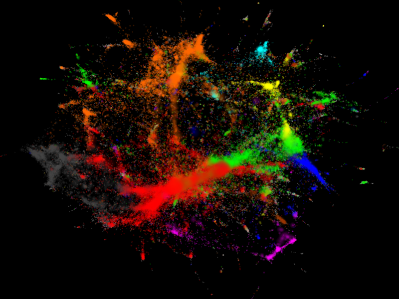
“The circles (vertices) on the left hand side figure are bands, musicians, composers, whatever you will find in the Music section of the site. Lines (edges) connect similar artists. In order not to make the whole thing an ugly hairball (well… it is still an ugly hairball, but not as ugly as it could be), only a subset of all existing connections are displayed. Last.fm quantifies artist similarities in a scale of 100 points – I dropped connections below 80, mostly because the degree distribution follows a nice power law at this cutoff level. Edges are colored according to their centrality in the network, from white to dark gray in a nice logarithmical gradient (the visualisation with black background use a different palette from black through red and yellow to white). Insignificant edges are more transparent than significant ones. Vertex sizes vary according to the popularity of the artists. It is not very surprising that the largest vertices are not those that were the most influential in the history of music ;) Vertex colors correspond to musical genres, identified by tags attached to the artists by the users of Last.fm – so don’t blame me if an artist is seemingly miscategorised :) Rock is red, metal is dark grey, electronic is orange, hip-hop and rap is blue, jazz is yellow, reggae and ska is magenta, classical music is cyan, country, folk and world music is brown, pop is green. Light grey vertices are unclassified. See the technical details if you are interested in how the categorisation was done.
The right hand side figure is almost the same, but the edges are not drawn and musicians are represented by small coloured dust particles where the area of the particle is proportional to the popularity of the given artist. Although every single dust cloud should be circular, the inhomogeneous density of the vertices give rise to that pattern you see – like some paint splatted on the wall. Actually, it looks better on black background.”
Genres were taken from Last.fm tags. For every artist, the top tags were collected and then the first tag was the one used to classify the artist. If the first tag was nowhere to be found, the second tag was used and so on. From the sample, there are still ~17000 unclassified artists; as those did not possess a single tag from the below list.
- Rock = rock, classic rock, hard rock, indie rock, garage rock, emo, punk, post-punk, alternative, progressive rock
- Pop = pop, indie pop, funk, latin, soul, rnb, r&b, jpop, j-pop
- Metal = metal, progressive metal, metalcore, power metal, symphonic metal, black metal, doom metal, death metal, heavy metal
- Electronic = electronic, electronica, electro, trance, house, techno, noise, drum and bass, dance, psytrance, ambient, chillout
- Hip-hop and rap = hip-hop, hip hop, rap
- Jazz = jazz
- Country, folk and world music = country, folk, world, world music
- Classical music = classic, classical, classical music
- Reggae and ska = reggae, ska
Interacting with linked data about music


http://kurtisrandom.blogspot.com/2009/04/websci09-report.html
This project represents artists on MySpace within their genres and how they are connected within the network. Each node in the visualisation depicts an artist. The genre labels are the first genre tag associated with the given artist in their Myspace page. The network connections are based on “top friend” relations and taken from the dbtune/myspace service.
We can also get a sense for what musical genres dominate this sample of the Myspace artist network. We can see that \Hip Hop” (yellow) and \Rap” (bright green) account for nearly half of all the genre labels in the data set. We also see that the rich club in the center of the visualization includes vertices with genre labels \Hip Hop”, \Rap”, \Soul”, \Reggae”, and\Hardcore” – a somewhat surprising addition to the list. Note that the genre label appears as text only for those genre labels that are associated with more than 1% of the vertices in the network. The data set actually includes 106 unique genre labels and therefore the visualization contains 106 distinct colors. However, it can be exceedingly difficult for the viewer to accurately distinguish between so many colors therefore text labels are used in favor of a color legend. The vertices are drawn to be translucent so the viewer can get a better sense vertex concentration where vertices fall on top of one another. In this visualization only 0:2% of the network edges are chosen uniformly at random and included in the visualization. The remainder of the edges are ignored.
In conclusion, music genre classification is a risky business, yet the visualisation of artists according to some kind of similarity is paramount in each of these examples. Whether it is mathematical algorithms, folksonomy or Wikipedia to collect the data, the struggle continues to reach a something we actually created ourselves.