Visualizing the network
 As a result of the course information visualization, a public screening was organized where all project teams involved got a chance to present their work at the Waag Society venue. Within a tight 6 minutes, concept explanation and implementation had to be given, in an almost pitch-like setting.
All projects result from a collaboration between the courses MHKU Editorial Design, MA Computer Science UvA and MA New Media UvA. Within this multidisciplinary setting, the assignment was to create an information visualisation application concerning the themes ‘visualizing the network’ or ‘browsing images within a network’. After a short introduction by Yuri Engelhardt and presentations by the hosts Mediaguild and WaagSociety, a hour of non-stop visualizers were shown. All projects are shortly described below, in a both textual and visual manner.
The projects (the first four):
MyDataBody
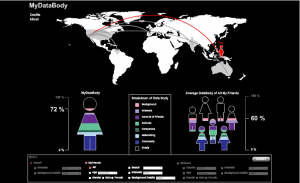
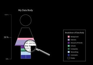
This DataBody comparing application starts with a metaphorical depiction of the user his or her own databody. The databody in this case is everything that is filled in on a MySpace profile. This can exist of for instance: Background Information, Comments, Interests, General Info, etc. Because the application starts ego-centric with the user as default it will encourage the user to explore his or her own databody. A magnifying glass can be used to zoom in on the DataBody and actual personal MySpace data is depicted.
Besides exploring his or her own DataBody, MyDataBody allows a user to compare their personal databody with the databody of his or her individual friends, the average body of all her friends, or a selected group of friends. Furthermore the average databody of 2 different countries or continents can be depicted. The application even allows the user to filter out a specific group of MySpace users based on Age, Location, Gender, or Interests.
MyDataBody serves several goals. First of all it will increase the awareness of MySpace users. It will make users think about online identity and data they have put on the web. We do not condemn anything about people their data online. Maybe this application will even encourage users to fill in their profile even more extensively in order to catch up with their friends or a countries average. Besides awareness MyDataBody also creates interesting insights in the different ways people use MySpace; with this application we can create insights in how users with specific cultural or demographic characteristics use MySpace in a different way.
Vriendjespolitiek.net (might be translated as ‘politics and pals’).
Since the coming of online social networking sites, lots of people have, quite unconsciously,
their likes and dislikes, on public display. They not only show with whom they affiliate, but also what kind of music, movies, food, or even brands they prefer.
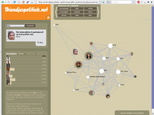
Since 1998 (and on paper since 1989), each general election in the Netherlands spawned a variety of so called voting recommendation machines. These systems typically ask the user to answer some questions after which they give the user a voting recommendation, based on the compatibility between his or her answers and the political parties. These questions are either based on party programs, or on the actual voting behavior in Parliament of the political party concerned over the last few years.
We have developed a post-demographic recommendation tool derived from these digital life software systems, while at the same time addressing them – based on the aggregated profiles of friends of political party leaders as they appear on the biggest Dutch online social network, Hyves. By providing appropriate visualizations we make both the demographics and relations of a group of friends apparent, and replicate the existing, arguably anti-participatory democratic, voting recommendation machines. Ultimately the goal is to create awareness of one’s digital public self – one’s data body (CAE, 95) – to create conscience of simple yet powerful profiling techniques, and the possibilities of the surveillance and control society. (Bogard 96, Deleuze 02). It is on purpose that we chose to highlight the entertaining quality and lightness of peer-based behavior this society is so immersed in.
Friendscape
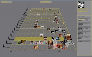
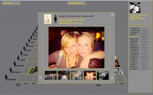
Friendscape is a new way to arrange photos on which you are together with your friends. It shows relationships between friends, the strength of their friendship and it shows changes in friendship over time. By using Hyves’ gespot-function, Friendscape produces an aggregate photo-album of a person. In this aggregate, not only the pictures put online by a Hyves-user will show, but all pictures in which he or she is spotted. Very much in line with the Hyves-spirit, where your identity is created by means of the network, so is you photographic identity. By turning the concept of friendship into a visualization, we aim to make Hyves-users reflect about who their friends are.
Kaboom
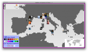
In this project we are dealing with the problem of image browsing. The problem is that we see different kinds of image browsing locally and online. Where online image browsing is mainly text based, with all limitations of text, we need to search for new possible alternatives. In order to make claims about possible alternatives we will take Flickr as object of study.
Without going to deep into local browsing systems the focus will be on different ways of browsing in Flickr. Our main research question will be whether visual browsing can have an added value over textual browsing.
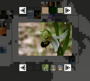
For our Kab00m visualization we intend to use the new geographical property of multimedia data and combine it with color information we extract. By combining the geographical information of a set of pictures with specific information about the colors of these pictures we are going to draw a color map of the world. A map colored with region-specific-color-schemes provided by Flickr users from around the globe. Our chosen image repository, Flickr, is a popular online community for photography.
A tag’s life
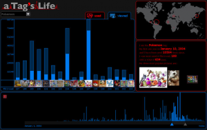
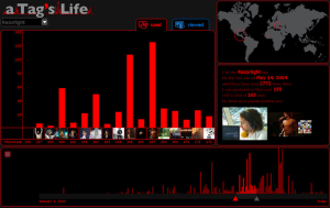
A tags Life is a is a tool to make quick and clear visualizations of trend development. It shows you how many times a certain tag is being used and viewed and how these numbers developed both over time and space. It takes it information from the largest on line photo database, Flickr.
The interface consist of four windows. The time line on the bottom shows the uses over the entire lifespan of Flickr, starting in February 2004 and ending today. Each bar represents one week. With the slider you can choose the selection you want to see in the main window. With the two triangles one can make the selection larger or smaller.
In the main window the selection you made in the time line is visible. On the bottom of the bars is the most popular picture of that week. Clicking on either the picture or the bar links you to the Flickr web page of the picture or all the pictures from that week.
Here you can also see how many times the pictures of that week have been viewed, by clicking on the view tab. In the view window, the light blue area represents the amount of views that the most popular picture has. The dark blue area represents the views of all the other photos of that week.
The third window is the map which visualizes the geo-data, if provided with the pictures. Here you can see how the uses of the tag develop in space. Finally there’s a window with some quick statistics.
With this tool you can easily see when and where people are uploading certain photos and what people are looking for when browsing the Flickr website.
LoOSN
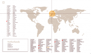
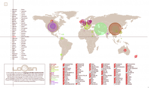
LoOSN which is abbreviation of ‘Languages of Online Social Networks’ is an information visualization project created to show where languages and online social networks are situated globally and to what extent the offering of a certain language by an SNS correlates with the presence and the popularity of that SNS in a country where that language is spoken.
The goal of this visualization is to give a view of the importance of languages within the social networking community.
The demo can be viewed and explored here.
Match Maker
The MatchMaker is a Hyves application that makes the rather static information about your friends and other Hyves-users more playful and interactive. With the MatchMaker, users can compare their profile information with the information of other hyves users in an attractive and visual way.
When clicking on the Matchmaker button on your profile page, a screen will pop up. In this overview one can see all their friends in a scatter plot. Every friend is represented by a small circle with the profile picture of that friend. The position of the circles will not only tell how many interests a user and his friends have in common (vertical axis) but will also tell how many friends the two of you have in common (horizontal axis).
Users can also click on specific tabs, which changes the horizontal axes to indicate only the match within the selected category. Individual friends are also clickable, which makes the complete section on the right change to indicate the detailed match information between the user and the selected friend. All these features make it possible for Hyves-users to navigate visually through the interests of their friends.
Screenshots in PDF can be found here:
overview-vol
mm-music
and a project movie can be found here:
An impression of the venue and the presentations can be found via this link.
