Mondrian in the age of Information Visualization.
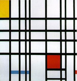
Dutch painter Piet Mondrian (1872-1944) started painting his artworks in the style of the Amsterdam Academy. He made dark realistic landscapes and later in his carer he painted more lighter paintings when he evolved towards De Stijl. From the year 1911 in Paris he became influenced by the styles of symbolism and cubism. Here he comes to a greater abstraction of his painted subjects through simplifying in lines and shapes. His studies of the Apple Tree show this evaluation of naturalistic representations within abstract rhythms of lines and squares. Mondrian calls this way of painting neoclassicism as he converts his art towards extreme simplicity of primary colours, horizontal and vertical lines[1]. Herewith essentially, Mondrian broke down natural given forms, reducing form to a pure abstract design. The painting Composition With Red, Yellow and Blue, one of Mondrian’s later works, is a good example of a simplification of the subject to colour and form only. By eliminating other than primary colours and organic shapes, he aimed to create new harmonious and universal relationships between the artwork and its spectator.[2] 
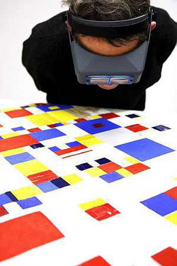
In this article I am exploring the thought of Mondrian’s works of art as an early example of Infoviz. In the light of Information, or Data Visualization Mondrian’s artworks can be thought of as an early form. ‘Data visualization is the process of representing data as pictures to support reasoning about the underlying data. For the interpretation to be as easy as possible, we need to be as close as possible to the original data’.[3] As seen above, according to Mondrian’s philosophy of De Stijl, his paintings exactly do so. Mondrian’s goal here is of breaking down the forms of nature. The representation of data in horizontal and vertical lines is a way of simplifying the presentation of data upon its miniature detail. The next step of Mondrian’s (data) visualization is to abstract these lines towards colour and shape only, with the goal to establish new relationships. The relationships that are represented in Mondrian’s paintings are examples of universal reality and an overall validity without coincidence and individualism that is displayed. In this manner the shapes and lines painted by Mondrian lost their reference to the physical world and map more of transcendental manifestations. This can be spotted in one of his latest works of art; the Victory Boogy Woogy. 

The diagonal lines in this painting can represent time and, as an attempt to visualize a more dynamic presentation of dynamic factors, data such as time. A new relation comes to shape here where time is mapped over space. The suggestion of adding time within De Stijl was inspired by Theo van Doesburg who suggested the diagonal lines to Mondrian. However, for Mondrian’s philosophy, his visual representations were principled not based on temporal aspects. This brings me to another important aspect of consideration in the field of Information Visualization, that of the suggestion of causality within the visualizations. According to Mondrian’s art work stated above, this suggestion of causality is between the factors of form, colour and time.
The ethical question here, which return within the infoviz debate is that of the disconnection that is made between existing data representations and the possible relations between the presented data. Since such is done within Mondrian’s painting when he breaks down natural forms by coming towards an abstract representation of the Apple Tree and as well within the chaotic representation of New York modernist life displayed in the Victory Boogy Woogy. Though, through the act of disconnecting related data, the correlated data gets divided into an anonymous manner. In this way, new connections can be made. That is, new will not always mean better. In doing so, one should carefully determine which message is send with the most suitable visualization. As Rieder suggest, in his Information Visualization class, the choice for a certain visualization is made in relation to what it is one wants to display. For some ways of presenting and visualizing do not match the message that one wants to get across. In this case, it is important to ask critical questions and test and rectify the posted claims and ideas before visualizing them. A good starting point for a critical analyses of the information visualization is posted by Hearst (2003), as mentioned by Mazza. ‘A key question in IV is how we convert data into a graphical representation, preserving the underlying meaning and, at the same time, providing new insight.’ From this perspective I think the paintings of Mondrian are a valid example here. Still the dispute between Mondrian and Van Doesburg about the diagonal or dynamic lines that represent time remains a point of discussion. Though, as Engelhardt explains ‘Many graphics combine physical and conceptual space. Representations of physical space do, by the way, not always have to express the true co-ordinate proportions of the represented objects.’ When returning to Mondrian, I can note that even if diagonal or dynamic presentation of time is part of the message of the Victory Boogy Woogy painting, this might not be an information visualization but rather an early form of information art. For Zhang. ‘Time is used as a variable that is mapped to the composition. There are a vast range of information sources that can be used in informative art, and since it is the different ways of mapping information to a composition the information should be seen as illustrations that can be substituted rather easily for other kinds of information as well.’ From this perspective the Mondrian paintings make a more closed claim of an early form of representation. As also Redström et all. suggest that Informative art is computer augmented, or amplified, works of art that not only are aesthetical objects but also information displays, in as much as they dynamically reflect information about their environment. Though Mondrian’s paintings are not computer augmented, they are works of art that not only are aesthetical but also contain information about their environment of what they represent. Even if this representation is more of a transcendental than a physical one, following Engelhardt this claim still stays I think.
So for now, I want to round up with mentioning the difference between early information art and data visualization. In the beginning of the 20th century the line between designers and artist became unclear. Such a shift of multiple disciplines come together as can be recognized nowadays in our digital age. According to this shift, Manovich notes that ‘just as in the first decades of the twentieth century modernist artists of the mapped the visual chaos of the metropolitan experience into simple geometric images, data visualization artists transform the informational chaos of data packets moving through the network into clear and orderly forms. Think of Mondrian, for instance, systematically abstracting the image of a tree in a series of paintings, data visualization is engaged in a similar reduction as it allows us to see patterns and structures behind the vast and seemingly random data sets.’ So even though there is no possibility of computer interaction with Mondrian’s paintings, I think they can be seen as an early form of infoviz. I may not be coincidence that one of the most popular Infoviz tools on the net is called Mondrian. For all the digital art lovers out there, with this website it is possible to make your own computed Mondrian-like visualization.
To round up this reading, the following map is a nice example of information visualization in a digital manner, where new combinations and representation can be made through manipulating given data due to its digital nature. Enjoy beautiful information.
Footnotes:
[1] Adriaans et all. “Kunst van Altamira tot Heden” 1988: p. 301.
[2] Williams & Wilson “From Caves to Canvas; an introduction to western art” 1996: p. 235.