What is data visualization’s goal? NGOs and real impact
The main goal of data visualization is to communicate information clearly and effectively through graphical means. (Friedman 2008)
Friedman’s definition is simple and concise, yet broad and applicable to any type of visualization. What it fails to provide is what happens after the communication act. Would it be reasonable to say that some data visualizations have the goal to be aesthetically pleasing, as expert David McCandless mentions in a TED Talk on The Beauty of Data Visualization? Possibly, although much of the visual data art I have witnessed was not just art for art’s sake – there were underlying meanings, debates. Does data visualization stop at the level of informing then, making readers acknowledge bits and thus live the illusion that mere understanding means making a change? In the same TED Talk, David points out how we have become accustomed to demand a visual aspect to information. My worry here would be the risk that online journalism, if it fails to produce valuable and interactive visualizations, will only become the same cold medium that makes the reader passively absorb information (remember McLuhan?). In yet another activity field, for-profit companies are picking up on infographics and the likes in their marketing strategy; ideally, for them this has a return of investment, making their target take action by buying.
What can one say about the various goals that data visualization has in different fields of activity? Does it aim at informing, at pleasing the eye, at shocking and surprising, at simply adding cultural capital? The goal, therefore, is a matter of defining the threshold where the impact of data visualization on its readers ends. Current academic literature, I believe, falls short of detailing at this and I will not take the task on myself.
What I do wish to discuss, however, is a case of data visualization whose goal is specifically to have a strong call-to-action and thus real-world reactions. This, I believe, is especially the case with non-profit actors using data visualizations in their campaigning. These actors ultimately ask for people to take actions, either by joining a movement, donating, reporting etc. I have recently discovered that the NGOs sector is empowering its campaigning by the use of data visualization. Even data visualization projects that do not present themselves as campaigns often have the right ingredients to make users take action.
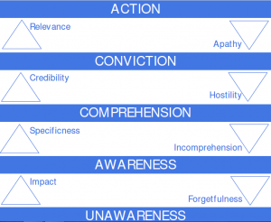
With non profit data visualization, one could see a pattern evolving: a call for action visualization needs first to inform, make an emotional appeal, convince. A yard before convincing, it needs to be visible, to be understandable and perhaps interactive enough to keep the user exploring. Therefore, we are looking at a sort of ladder with different steps, with data visualization goals aiming to go ever higher, from mere visibility to the final call to action.
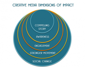
In the other fields, campaigns are structured in these types of steps. In communication theory (and applied practically in advertising,marketing and social media campaigns) the model is called “hierarchy of effects”or “communication ladder”. Each step is an objective which, if the campaign offers to the readers, then it will lead to the desired goal; otherwise, not only can it lose them, but create adverse opinions. The model is not fixed and other industries have appropriated it accordingly.The Fledging Fund, a creative foundation supporting documentaries and their makers, visualize the impact of films and media slightly different.
If we take Friedman’s definition of data visualization as a communication act, then I argue data visualization, especially in a campaign context, is efficient if it attends to the hierarchy of effects. There is no model available for data visualization, therefore I am proposing an exercise in outlining one:
- The step from seeing to exploring is made by a good choice of representation for the given data set and good balance between author and reader driven approaches (Segel and Heer 2010)
- The step from exploring to understanding (awareness) is done through good design interface, usability, aesthetics, clarity of data, good encoding, acknowledge of limitations, the overall conveying of a story.
- The step from understanding to conviction is made through trust in data sets and in the visuals.
- The step from conviction to action is made by the smoothness with which the data visualization directs you to immediately-available action points (click, donate, submit…)
In the following, I will take two examples of data visualizations as part of non-profit campaign and analyze them accordingly to the steps.
CASE STUDIES:
1. Amnesty International: Countries practising death penalty
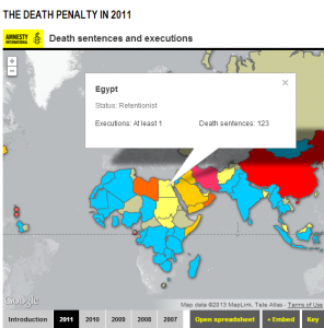
Amnesty International is powerful NGO which intervenes in world-wide issues. Fore some years, it has been employing data visualizations for its major campaigns. The visualization presented here explores which countries practice death penalty and in what numbers.
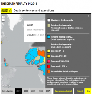
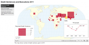
The visualization debuts with a two-minute video that acts as a splash screen for the user, providing context and numbers for the hot topic, as well as stating the NGOs official opposing to such measures. The video thus introduces the story; it is entirely author-driven, a tactic which leaves out details and raises questions to be explored by the user in the data visualization itself. After the video (itself an animation using interactive forms and icons), the user can explore the actual visualization and build on the story. The visualization is a world map with each country encoded by color, according to the numbers of executions per year. The data is available from 2007 to 2011 and can be opened as an Excel.
And here it stops. Although the map has so many opportunities for encoding further information, all it offers is a report on how many executions and death penalties each country holds for a period of 5 years. The reason for this is that much data is actually surrounding the visualization …as text. The site itself plays the major role. A 74 pages report offers an extensive analysis of the issue, and furthermore the left side of the page comprises further sections with data expressed in tables. Why has this data not been used for visualization?
Somewhere on the goal, this project is promising to reach to action with the video, while the map falls short of conveying any complex data, story or trust.
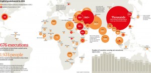
What could have been done for an improved impact? Have a look at several infographics The Guardian presents, based on the same data sets but revealing more information.
2. Janaagraha (non profit NGO) – I paid a Bribe
When I attended the Be Good Be Social event in Amsterdam earlier this month, open data enthusiast and speaker, Pelle Aardema , discussed a project entitled I paid a bribe, a site dedicated to Indian citizens anonymously reporting cases of bribing (developed by NGO Janaagraha, whose dedicated role is “improving the quality of citizenship and infrastructure and services in India’s cities”). Thus, the visualization’s role is to “uncover the market price of corruption” in country. All this crowd sourced data goes into the section “Bribing trends”, a constantly updated data visualization on analytics reports.
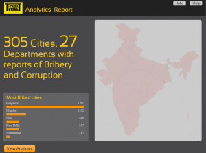
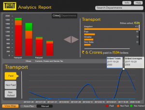
The first visualization gives overall information on what the reader is looking at: 305 cities and 23 departments in the Indian state, with a top of 5 most corrupt cities by bribe numbers – a good hint at what the story will reveal. The second slide of the visualization allows for in depth exploration with a mix of author and reader driven approach, analyzing either a city’s statistics or a department’s. The visualization is split in 3 dials: the first is a bar graph encoding the not paid, not asked and paid bribes (encoded by color) in each city/department. The second reveals the amount of money lost in bribe amount overall, as well as in each city and each department. The third acts as a timeline: showing trends in bribing in cities and departments since the project’s start. Exploration is further enhanced by choice of manual or automated presentation and an upper search box.
Apart from effectively communicating a story (and an unfolding one too!), the visualization has the powerful motivation to urge people in submitting a contribution – hopefully, the story will end when paid bribes on bar graphs reach 0.
The site itself supports the whole project very well, as anyone can actually read the submitted reports of bribery or good ethics. The site further includes articles on best practices in relation to authorities, awareness of laws – restrictions and rights – which makes this visualization useful not only to citizens, but also to authorities. The project is easy scalable and could be implemented in every country – in fact, some countries already have their own “I paid a bribe” platform.
CONCLUSION
Having worked in the non profit sector myself, I think it could benefit hugely from using data visualization for campaigning, transparency in reports or communication of goals and results. However, I see two important issues:
1. Lack of theoretical development on data visualization impact: how can we make data visualization reach the goal of action? There is no similar model to the ladder of communication, hence my experiment with the proposing one in this blog post.
2. Lack of skills in making data visualization. At the Big, Open and Beautiful conference last evening in Amsterdam, the moderator had a recurrent question for his speakers (mostly data journalists): what skills do you need to do this? The replies were either “one man good for everything: researcher, storyteller, programmer and designer” or team work with separated roles. Another option is simply outsourcing to a design/programming company. This is truly an issue for NGOs in terms of affording and evening finding the right collaborators. Bad visualizations are much worse than clean PDF reports in text, unless one is a perfectionist and manages well with online courses teaching the skills.
All in all, I believe NGOs could leverage the benefits of data visualizations in their campaigns, but are facing difficulties in making it right as the field is still developing theoretically, competitively and professionals that make them are just rising.
References:
McCandless, David. “The Beauty of Data Visualization”. TED.com. August 2010. 15 March 2013 <http://www.ted.com/talks/david_mccandless_the_beauty_of_data_visualization.html>
Friedman, Vitaly. “Data Visualization and Infographics”. Smashing Magazine. 2008. 15 March 2013 <http://www.smashingmagazine.com/2008/01/14/monday-inspiration-data-visualization-and-infographics/>
Segel, Edward, and Heer, Jeffrey. “Narrative visualization: Telling stories with data.” Visualization and Computer Graphics, IEEE Transactions 16.6 (2010): 1139-1148

